Design with AI
Generate a new design based on this screen using your own content.
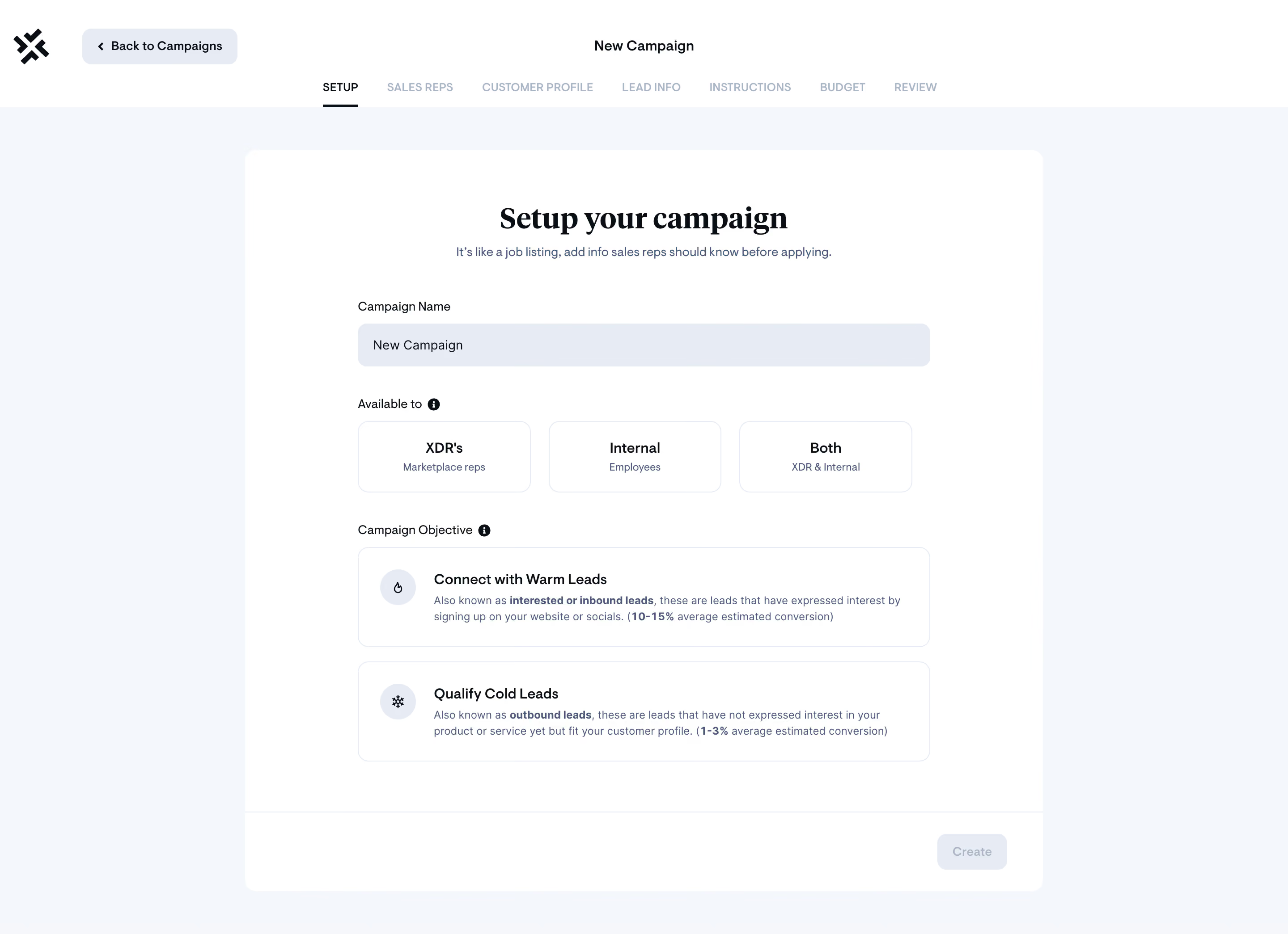
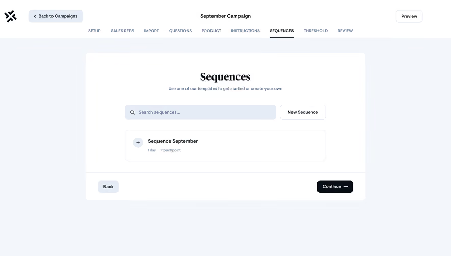
# Design from Reference: Sellx Campaign Setup
Create an original, high-fidelity visual design inspired by the reference. Prioritize composition, typography, colors, spacing, and component styling over technical implementation.
## Reference
- **Product:** Sellx
- **Category:** Add & Edit
- **Screenshot:** https://cdn.prod.website-files.com/5e9dc792e1210c5325f7ebbc/6acadab8d5603a17eba7e67b_6acada468abe3f93125d31c1_cms-5d77e88159adc729f837def8.webp
Analyze the screenshot first. If inaccessible, request it rather than guessing.
## Content
{{content.instructions}}
{{content.data}}
Preserve essential messaging and factual accuracy. Adapt structure and copy length for visual balance; never invent product claims.
## Visual Design
### Overall aesthetic
- **Character:** Calm campaign wizard with serif headline and pale blue form styling.
### Page composition
- **Canvas:** 2880 × 2090 screenshot px. Brand/back control and seven-step navigation above a centered white form card on pale background.
### Information hierarchy
- **Priority:** Setup is active; campaign name precedes three audience choices, two large objective choices, and a subdued Create footer action.
### Typography
- **Scale:** Estimated CSS at assumed 2× capture: serif heading 36 px, sans serif body 14 px, option titles 16 px, step labels 12 px uppercase. Families unverified.
### Colors & surfaces
- **Palette:** Sampled sRGB #FFFFFF, #F3F7FB, input #E6ECF5, #F6F7FB, dark #080F16, and secondary #495C78.
### Components
- **Details:** Estimated 890 CSS px card width, 12 px corners, 48 px input, three outlined audience tiles, icon-led objective cards, and separate action footer.
### Visual rhythm
- **Spacing:** Approximately 125 CSS px horizontal card padding and 32 px field-group gaps establish a spacious sequence.
### Responsive
- **Adaptation:** Mobile is not shown. Stack audience tiles and allow step navigation to scroll.
### Adaptation guidance
- **Transfer:** Preserve audience/objective distinction and explanatory option cards. Replace conversion claims with verified product content.
Use this context to reproduce the reference's visual language: layout, typography, colors, spacing, borders, radii, and distinctive elements. The screenshot takes priority if descriptions conflict.
## Direction
{{preferences.fidelityInstructions}}
## Output
{{output.instructions}}
Deliver a polished, cohesive design with precise alignment, hierarchy, and spacing. Produce the requested visual artifact, not just a description. If unsupported, explain the limitation.