Design with AI
Generate a new design based on this screen using your own content.
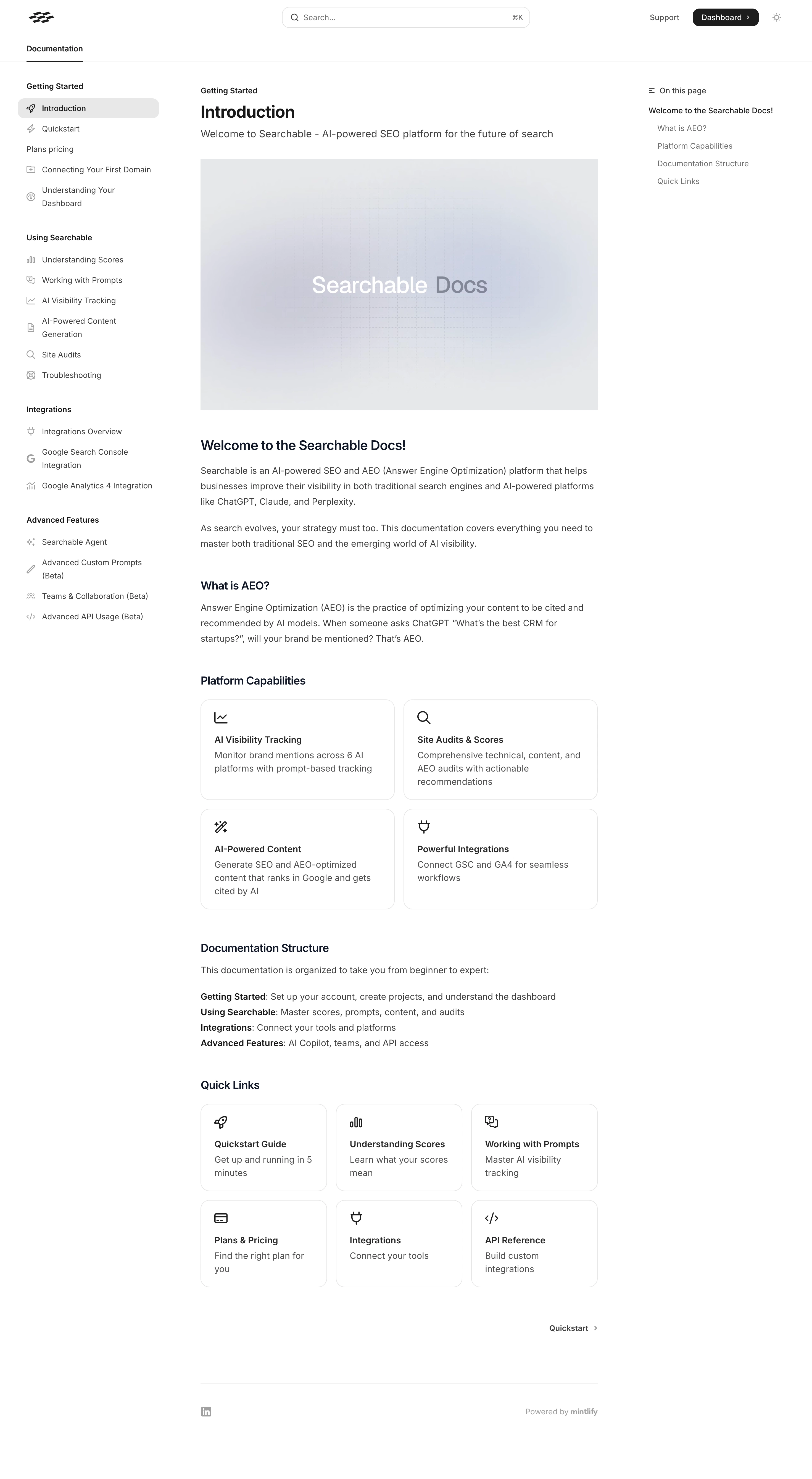
# Design from Reference: Searchable Documentation
Create an original, high-fidelity visual design inspired by the reference. Prioritize composition, typography, colors, spacing, and component styling over technical implementation.
## Reference
- **Product:** Searchable
- **Category:** Documentation
- **Screenshot:** https://cdn.prod.website-files.com/5e9dc792e1210c5325f7ebbc/6acad398c2028efdec71ae30_6acad1134d0bf53dfa2e7d0a_cms-0501f076c79ccf6ede2b0f96.webp
Analyze the screenshot first. If inaccessible, request it rather than guessing.
## Content
{{content.instructions}}
{{content.data}}
Preserve essential messaging and factual accuracy. Adapt structure and copy length for visual balance; never invent product claims.
## Visual Design
### Overall aesthetic
- **Style:** Minimal white documentation interface with restrained neutral colors and a three-column reading layout.
- **Character:** Text-first, compact navigation, thin outlines, small line icons, and a soft abstract hero image.
### Page composition
- **Canvas:** 2940 × 5354 image px; CSS estimates assume an unverified 2× capture.
- **Header:** Brand mark left, broad centered search, Support and dark Dashboard action right.
- **Left rail:** Approximately 300 CSS px wide with grouped documentation links.
- **Article:** Approximately 720 CSS px wide, with breadcrumb, Introduction title, subtitle, and landscape image.
- **Right rail:** Narrow On this page table of contents.
- **Article sequence:** Introductory paragraphs, explanatory section, two-by-two capability cards, documentation structure, three-by-two quick-link cards, next-page navigation, and small footer.
### Information hierarchy
- **Primary:** Article title and large hero image establish the active document.
- **Reading:** Bold section headings divide prose and link grids.
- **Navigation:** Selected Introduction link has a pale-gray rounded highlight.
- **Cross-links:** Capability and quick-link cards use icon, short heading, and description.
- **Secondary:** Right-hand anchors and footer are smaller and muted.
### Typography
- **Family:** Neutral sans serif; exact family unverified.
- **Article title:** Approximately 30 CSS px, bold under assumed 2×.
- **Subtitle:** Approximately 18px, regular.
- **Section headings:** Approximately 20–24px, semibold.
- **Body:** Approximately 16px with 27–28px line-height.
- **Navigation:** Approximately 14px; group labels semibold.
- **Card titles:** Approximately 16px, semibold.
- **Precision:** Sizes and weights are visual estimates.
### Colors & surfaces
- **Canvas and cards:** #FFFFFF.
- **Body text:** Approximately #3F3F3F.
- **Borders and muted surfaces:** Samples #E6E7EA, #E7E8EB, and #E5E6E9.
- **Hero image:** Subtle gray-lavender gradient with fine grid, not a flat surface.
- **Selected navigation:** Light neutral gray.
- **Headings:** Dark navy-black; exact token unverified.
- **Precision:** Neutral samples include border antialiasing and image shades.
### Components
- **Search:** Long rounded outlined field with magnifier and command-key hint.
- **Sidebar:** Group labels, small outline icons, and wrapped link labels.
- **Capability cards:** Two columns, thin border, approximately 16px radius and 24px padding under assumed 2×.
- **Quick links:** Three columns, same icon/title/description vocabulary.
- **Next link:** Quiet right-aligned label and chevron.
- **Footer:** Thin divider, social mark, and platform attribution.
### Visual rhythm
- **Spacing:** Consistent article left edge, generous gaps before section headings, compact paragraph spacing.
- **Grid:** Approximately 16px card gaps; cards share equal widths within each grid.
- **Reading width:** Long-form copy remains narrower than the full canvas.
- **Rails:** Left/right navigation balances the central article without enclosing it in a card.
### Responsive
- **Observed:** Desktop only.
- **Recommendation:** Collapse side navigation, hide or fold the table of contents, and reduce grids to one or two columns.
- **Search:** Keep readily accessible without crowding the header.
- **Prose:** Preserve readable line length and body size.
### Adaptation guidance
- **Preserve:** Article-first hierarchy, grouped navigation, subtle link cards, and restrained monochrome UI.
- **Content:** Use supplied documentation sections and links.
- **Artwork:** Keep introductory imagery quiet so it does not compete with technical prose.
- **Behavior:** Search, anchors, and next-page navigation are visually represented but not demonstrated.
Use this context to reproduce the reference's visual language: layout, typography, colors, spacing, borders, radii, and distinctive elements. The screenshot takes priority if descriptions conflict.
## Direction
{{preferences.fidelityInstructions}}
## Output
{{output.instructions}}
Deliver a polished, cohesive design with precise alignment, hierarchy, and spacing. Produce the requested visual artifact, not just a description. If unsupported, explain the limitation.