
Thank you! Your submission has been received!
Oops! Something went wrong while submitting the form.
Get SaaSFrame Pro
Monthly
$18
Quarterly
$48
Yearly
$180
Upgrade to access this feature
Browse all screens & flows
Filter and search screens & flows
Access Figma files
Access mobile versions
Bookmark screens & flows
Join now
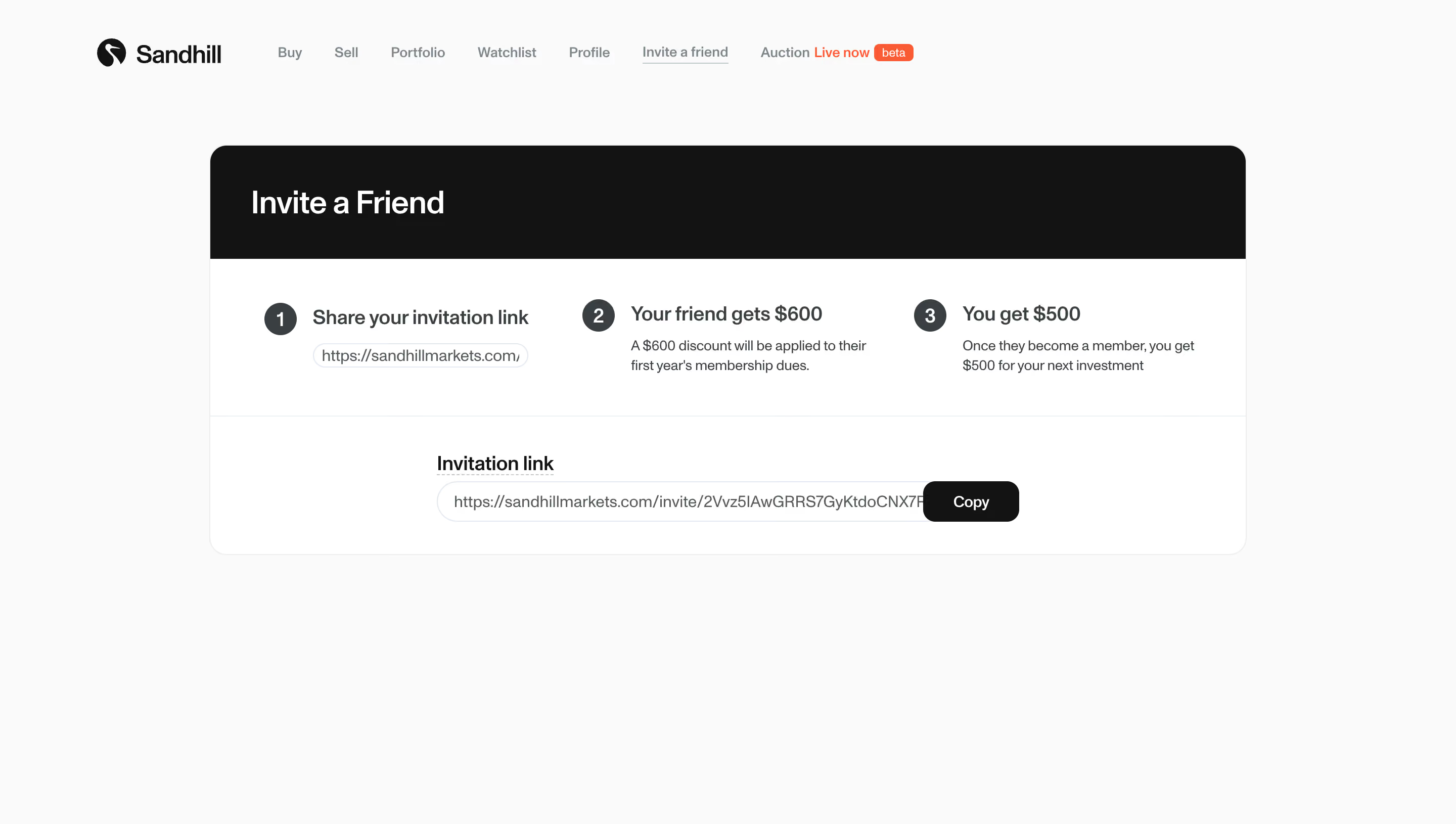
Sandhill Markets Invite a Friend

Sandhill Markets
Robinhood for Private Markets
Designed by
No items found.

Bookmark
Bookmark

Design with AI
Thank you! Your submission has been received!
Oops! Something went wrong while submitting the form.
# Design from Reference: Sandhill Markets Invite a Friend
Create an original, high-fidelity visual design inspired by the reference. Prioritize composition, typography, colors, spacing, and component styling over technical implementation.
## Reference
- **Product:** Sandhill Markets
- **Category:** Invite Team Members
- **Screenshot:** https://cdn.prod.website-files.com/5e9dc792e1210c5325f7ebbc/6acada19ca6d79c1e0c8a228_6acad9a573700052692a2933_cms-6ca3751d13c0f5cbf4b74b07.webp
Analyze the screenshot first. If inaccessible, request it rather than guessing.
## Content
{{content.instructions}}
{{content.data}}
Preserve essential messaging and factual accuracy. Adapt structure and copy length for visual balance; never invent product claims.
## Visual Design
### Overall aesthetic
- **Character:** A restrained referral page with an off-white canvas, a large black-topped white panel and a simple three-step explanation. Typography and alignment carry the design with little decoration.
- **Image basis:** Source dimensions are 2880 × 1630, inspected at approximately 1400 × 792. Dimensions below are inspection-pixel estimates; a double-density CSS capture is plausible but unverified.
### Page composition
- **Header:** A compact brand mark/wordmark sits left around x93, followed by a horizontal navigation row. Invite a friend is underlined; an auction link has a small orange live/beta accent.
- **Main panel:** A roughly 997 × 394 px card begins around x201, y140. Its black header band is about 109 px tall.
- **Steps:** Three horizontally aligned numbered explanations occupy the white middle region.
- **Invitation control:** A thin divider separates a centered lower block containing a label, long invitation-link field and attached Copy button.
- **Whitespace:** The lower page remains open; no footer or additional content is visible.
### Information hierarchy
- **Title:** A large white invitation heading anchors the black band.
- **Steps:** Dark numbered circles precede semibold labels; smaller copy explains the two reward stages. A short outlined link chip appears under the first step.
- **Primary task:** The labeled invitation field and black Copy action provide the concrete sharing mechanism.
- **Privacy:** The screenshot contains a unique invitation token. Its visual shape is relevant, but the token itself should not be reproduced.
- **Observed state:** The referral navigation item is active; no copied confirmation, error or expanded navigation state is shown.
### Typography
- **Panel title:** Approximately 30 px semibold white sans-serif.
- **Step labels:** Approximately 19–20 px semibold dark-gray text.
- **Descriptions:** Approximately 14 px regular with 20 px line-height.
- **Field and controls:** The invitation label is around 18 px semibold, field text around 15 px and Copy around 14 px medium. Header navigation is around 13–14 px. Exact family identity is unverified.
### Colors & surfaces
- **Measured foundations:** Near-white #FAFAFA forms the page, white #FFFFFF forms the card and near-black #131313 forms the header and Copy button.
- **Measured text:** Dark gray #393F41 and muted #535A5C appear in text/numbered markers.
- **Measured boundaries:** Pale #EDEDED, #E1E8F1 and #ECF1F7 appear in separators and field outlines.
- **Accent:** A small orange navigation accent is the only strong color; the main referral flow remains monochrome.
### Components
- **Panel frame:** Approximately 16 px outer corners and a fine light border; the black header inherits the rounded top corners.
- **Step markers:** Roughly 32 px dark-gray circles contain centered white numerals. Labels align beside them rather than beneath.
- **Step layout:** Three content groups have broad spacing, with descriptions aligned under their headings.
- **Invitation field:** A roughly 560 × 39 px pill-like outlined field is centered in the lower section. The long value is constrained within its available width.
- **Copy action:** Approximately 92 × 39 px, black filled with around 11 px corners, visually attached to the field's right edge.
- **Navigation:** The active referral item has a thin underline. The orange beta label is a small rounded badge. No hover or focus styles are visible.
### Visual rhythm
- **Container:** The referral card is centered with broad side margins and a large gap beneath the header navigation.
- **Grouping:** A strong black title band, white explanation area and divided link area form three clear horizontal layers.
- **Alignment:** Step numbers and headings share a baseline, and the invitation control is centered independently below.
- **Restraint:** Fine borders and ample whitespace replace shadows and illustration.
### Responsive
- **Evidence limit:** Only the wide page is observed.
- **Recommended steps:** Stack the three numbered items on narrow screens while preserving sequence and associated explanatory text.
- **Recommended field:** Let the invitation control fill the available width and handle long tokens without horizontal overflow.
- **Recommended copy:** Keep Copy visible and touch-friendly, with an accessible confirmation message after activation.
- **Recommended navigation:** Collapse or wrap the header while retaining the active referral destination.
### Adaptation guidance
- **Preserve:** Keep the three-step explanation, strong panel title band and clearly labeled copyable invitation.
- **Build:** Reuse numbered-step, referral-panel and copy-field components.
- **Content integrity:** Substitute synthetic referral values when demonstrating the design, and keep reward explanations accurate in a real implementation.
- **Validate:** Confirm copy behavior, keyboard feedback, long-value handling and narrow-screen step ordering.
Use this context to reproduce the reference's visual language: layout, typography, colors, spacing, borders, radii, and distinctive elements. The screenshot takes priority if descriptions conflict.
## Direction
{{preferences.fidelityInstructions}}
## Output
{{output.instructions}}
Deliver a polished, cohesive design with precise alignment, hierarchy, and spacing. Produce the requested visual artifact, not just a description. If unsupported, explain the limitation.


Category
Patterns
Tech Stack
No items found.
Added on
September 26, 2023
Similar screens
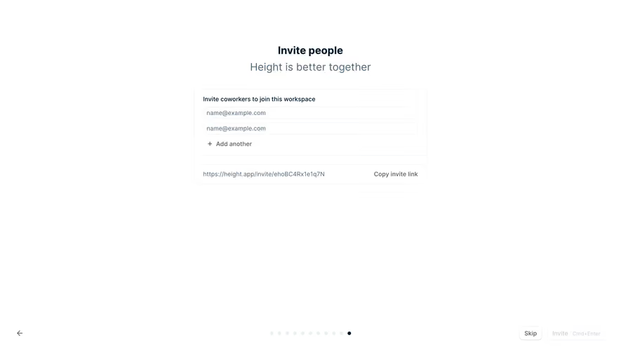


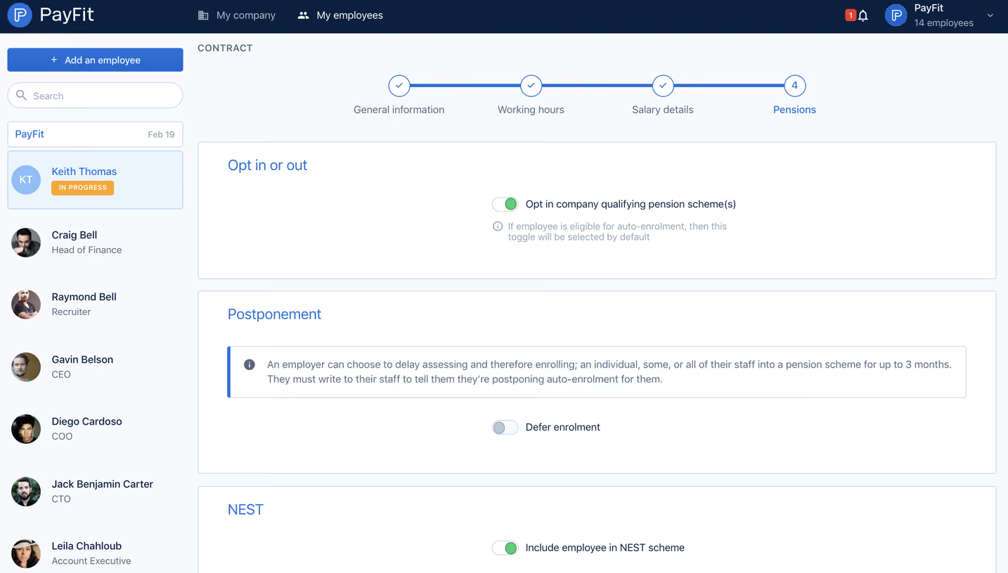



Upgrade to SaaSFrame Pro now to see similar examples.
Monthly
$18 /month
Billed $18 monthly
Browse all screens & flows
Filter and search screens & flows
Search text in screenshots
Access Figma files
Access mobile versions
Join now
Quarterly
$16 /month
Billed $48 quarterly
Browse all screens & flows
Filter and search screens & flows
Search text in screenshots
Access Figma files
Access mobile versions
Join now
Yearly
$15 /month
Billed $180 yearly
Browse all screens & flows
Filter and search screens & flows
Search text in screenshots
Access Figma files
Access mobile versions
Join now