
Thank you! Your submission has been received!
Oops! Something went wrong while submitting the form.
Get SaaSFrame Pro
Monthly
$18
Quarterly
$48
Yearly
$180
Upgrade to access this feature
Browse all screens & flows
Filter and search screens & flows
Access Figma files
Access mobile versions
Bookmark screens & flows
Join now
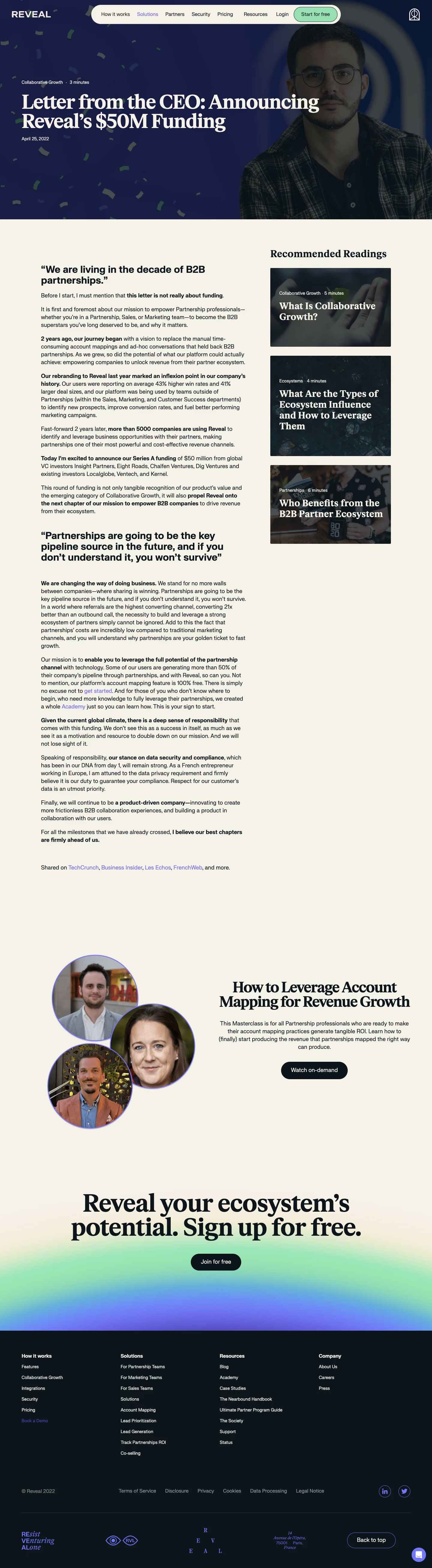

Reveal Blog Post

Reveal
Partnership, Growth, and Sales Ecosystem Solution
Designed by
No items found.

Bookmark
Bookmark

Design with AI
Thank you! Your submission has been received!
Oops! Something went wrong while submitting the form.
# Design from Reference: Reveal Blog Post
Create an original, high-fidelity visual design inspired by the reference. Prioritize composition, typography, colors, spacing, and component styling over technical implementation.
## Reference
- **Product:** Reveal
- **Category:** Blog Post
- **Screenshot:** https://cdn.prod.website-files.com/5e9dc792e1210c5325f7ebbc/6acbbe39476aea3982e3fa42_6acbbd64b340c5df5151128f_cms-7563e9f21f1180307b94540c.webp
Analyze the screenshot first. If inaccessible, request it rather than guessing.
## Content
{{content.instructions}}
{{content.data}}
Preserve essential messaging and factual accuracy. Adapt structure and copy length for visual balance; never invent product claims.
## Visual Design
### Overall aesthetic
- **Character:** A rich editorial article combines a dramatic navy portrait hero, warm cream reading surface, bold serif headlines, and a dark footer.
- **Evidence:** The screenshot measures 1440 × 5219 px and was inspected across four readable crops. Approximate dimensions below refer to source pixels; CSS scale is unverified.
- **Brand accents:** Mint signup, violet links, confetti, circular portraits, and a broad green/blue gradient provide expressive contrast.
### Page composition
- **Header:** Reveal wordmark sits left, a long cream navigation capsule spans the center, and a small outline emblem sits right.
- **Hero:** A full-width navy image region approximately 730 px high combines a large portrait on the right, scattered confetti, and left-aligned article category/read time, oversized title, and date.
- **Article:** A cream two-column area places long-form body text in a roughly 680 px left column and three recommended-reading image cards in a narrower right column.
- **Related promotion:** Below the article, three overlapping circular portraits sit left of a centered masterclass heading, paragraph, and dark watch action.
- **Closing CTA:** A huge centered serif signup message and dark pill action sit over a cream-to-green/blue glow.
- **Footer:** A dark section contains four link columns, legal/social row, divider, decorative brand typography, address, back-to-top control, and chat launcher.
### Information hierarchy
- **Article title:** Large cream serif lettering dominates the hero, with small category/read-time metadata above and date below.
- **Body:** Bold sans-serif subheads and inline emphasis punctuate regular paragraphs.
- **Recommendations:** A serif sidebar heading precedes darkened photographic cards with small metadata and large cream titles.
- **Promotional close:** Serif masterclass and signup headings return to the hero's editorial scale, paired with dark capsule actions.
- **Footer:** Bold group labels and white links remain subordinate to the preceding conversion region.
### Typography
- **Families:** Bold high-contrast serif type carries article/promotional headlines and recommendation titles. Body, metadata, navigation, and controls use sans serif. Exact identities are unverified.
- **Hero title:** Approximately 62–66 px bold with 64–68 px line-height.
- **Body:** Around 19–20 px with 26 px leading; major body subheads are about 32–34 px bold with close line-height.
- **Sidebar:** Heading around 34 px serif bold; card titles approximately 31–33 px with tight leading; metadata about 14 px.
- **Promotion:** Masterclass heading is around 48 px bold serif; final signup heading around 80–84 px.
- **Footer:** Links and small labels are approximately 14–16 px, with legal text around 16 px.
### Colors & surfaces
- **Measured palette:** Source samples include cream #F6F2E8, near-black blue #0C151B, navy #181D44, related #171D43 and #171D44, and warm pale #F6F1E6.
- **Semantic use:** Navy grounds the hero; cream forms the reading surface; blue-black fills the footer and pill actions.
- **Accents:** Violet marks inline links, portrait outlines, social outlines, and selected navigation. Mint fills the header signup action.
- **Imagery:** Dark overlays make cream text readable on recommended-reading photos. A diffuse mint-to-blue glow transitions the closing CTA into the footer.
### Components
- **Navigation capsule:** Approximately 830 × 64 px, cream, fully rounded, with compact links and an inset mint signup pill.
- **Hero portrait:** Large right-aligned crop darkened beneath the headline; confetti fills the left/background without enclosing the text.
- **Recommendation cards:** Roughly 400 × 260 px, small corner radii, photographic backgrounds, dark overlays, and inset metadata/title text.
- **Article links:** Violet inline text links appear within body copy and source references.
- **Masterclass portraits:** Three large overlapping circles with thin violet outlines form a collage.
- **Pill actions:** Dark rounded capsules with white labels, around 56–60 px high.
- **Footer controls:** Violet outlined social circles and back-to-top capsule contrast with the dark background; chat is a small filled violet circle.
### Visual rhythm
- **Article gutters:** Body begins near x137 px; the sidebar begins near x900 px, leaving a broad inter-column gap.
- **Paragraph cadence:** Tight editorial paragraphs are interrupted by larger bold pull-quote-like subheads.
- **Sidebar density:** Three stacked cards occupy the upper article area; the lower body continues beside open cream space.
- **Promotion spacing:** Large gaps separate the article end, masterclass, signup message, and footer.
- **Footer grid:** Four evenly spaced columns and a broad legal row restore structured rhythm after expressive promotional content.
### Responsive
- **Observed limit:** Only desktop is visible; actual menu, card, and mobile behavior are unverified.
- **Recommended article:** Move recommendations below the main text and reduce reading gutters to 20–24 CSS px.
- **Recommended hero:** Scale title fluidly, preserve image contrast, and crop the portrait without obscuring essential text.
- **Recommended promotions:** Stack portrait collage and copy, reduce final display size, and wrap footer/legal links.
- **Recommended navigation:** Replace the long capsule with an accessible compact menu when labels no longer fit.
### Adaptation guidance
- **Preserve:** Keep the navy/cream editorial contrast, serif/sans hierarchy, photographic recommendation cards, and expressive portrait/gradient close.
- **Build:** Separate article metadata, body content, recommendations, promotion, and footer into reusable regions.
- **Assets:** Use properly cropped portraits and photography; keep confetti and glow decorative.
- **Accessibility:** Check text-on-image contrast, link focus, readable body measure, image alternatives, and reduced-motion behavior if decorations animate.
- **Validate:** Confirm fonts, CSS scale, headline wrapping, sidebar stacking, and footer controls. Funding and commercial claims are observed article content rather than independently verified facts.
Use this context to reproduce the reference's visual language: layout, typography, colors, spacing, borders, radii, and distinctive elements. The screenshot takes priority if descriptions conflict.
## Direction
{{preferences.fidelityInstructions}}
## Output
{{output.instructions}}
Deliver a polished, cohesive design with precise alignment, hierarchy, and spacing. Produce the requested visual artifact, not just a description. If unsupported, explain the limitation.


Category
Patterns
No items found.
Tech Stack

Added on
February 11, 2023
Similar screens





Upgrade to SaaSFrame Pro now to see similar examples.
Monthly
$18 /month
Billed $18 monthly
Browse all screens & flows
Filter and search screens & flows
Search text in screenshots
Access Figma files
Access mobile versions
Join now
Quarterly
$16 /month
Billed $48 quarterly
Browse all screens & flows
Filter and search screens & flows
Search text in screenshots
Access Figma files
Access mobile versions
Join now
Yearly
$15 /month
Billed $180 yearly
Browse all screens & flows
Filter and search screens & flows
Search text in screenshots
Access Figma files
Access mobile versions
Join now