
Thank you! Your submission has been received!
Oops! Something went wrong while submitting the form.
Get SaaSFrame Pro
Monthly
$18
Quarterly
$48
Yearly
$180
Upgrade to access this feature
Browse all screens & flows
Filter and search screens & flows
Access Figma files
Access mobile versions
Bookmark screens & flows
Join now
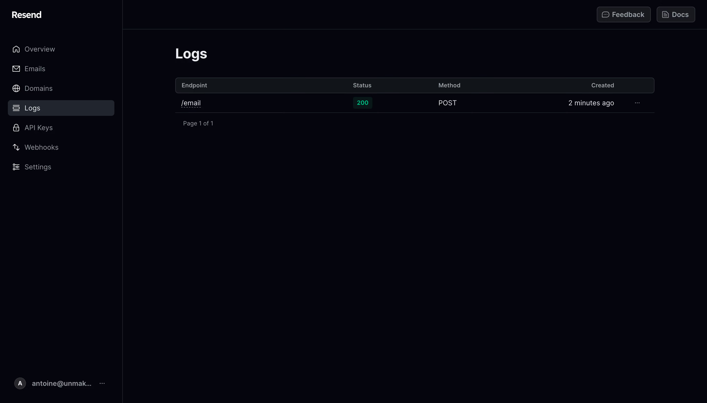
Resend Logs History

Resend
The email API for developers
Designed by
No items found.

Bookmark
Bookmark

Design with AI
Thank you! Your submission has been received!
Oops! Something went wrong while submitting the form.
# Design from Reference: Resend Logs History
Create an original, high-fidelity visual design inspired by the reference. Prioritize composition, typography, colors, spacing, and component styling over technical implementation.
## Reference
- **Product:** Resend
- **Category:** Table
- **Screenshot:** https://cdn.prod.website-files.com/5e9dc792e1210c5325f7ebbc/6acb6ae2bf2e69a0c03b6b23_6acb6a23adcf005a3c5f7470_cms-b90de666ae48759135433093.webp
Analyze the screenshot first. If inaccessible, request it rather than guessing.
## Content
{{content.instructions}}
{{content.data}}
Preserve essential messaging and factual accuracy. Adapt structure and copy length for visual balance; never invent product claims.
## Visual Design
### Overall aesthetic
- **Character:** A minimal developer log dashboard uses a near-black blue-tinted canvas, compact gray navigation and one sparse data row.
- **Capture scale:** The screenshot measures 2880 × 1642 image pixels. Approximate CSS dimensions assume a 1440 × 821 viewport at 2× density; the scale is unverified.
- **Tone:** Dense information styling within a largely empty workspace keeps the view functional and restrained.
### Page composition
- **Sidebar:** A roughly 250px CSS-wide dark rail contains the Resend wordmark, seven navigation destinations and an account block at the bottom.
- **Top bar:** A thin horizontal strip over the workspace holds Feedback and Docs actions at right.
- **Main heading:** Logs sits above a wide compact table.
- **Log table:** Endpoint, Status, Method and Created columns show one entry, followed by a small page-count line.
- **Open region:** The remainder of the main workspace is empty.
### Information hierarchy
- **Current area:** Logs is selected with a lighter dark navigation row.
- **Table header:** Muted compact labels establish the four data roles.
- **Visible entry:** A linked endpoint, green success badge, request method and relative timestamp form the single row.
- **Row utility:** A small overflow menu sits at the right edge.
- **Pagination:** Page 1 of 1 is shown without additional pagination controls.
### Typography
- **Family:** A neutral interface sans-serif is visible; exact identity is unverified.
- **Page heading:** Approximately 30px CSS, bold, with 38px line-height.
- **Navigation:** Approximately 14px regular, with brighter selected text.
- **Table headers:** Approximately 12px medium, muted gray.
- **Row values:** Approximately 14px regular; the endpoint has a dotted underline.
- **Footer/account:** Approximately 13–14px muted text, with truncated account labeling.
### Colors & surfaces
- **Canvas:** Sampled #05050C supplies the dominant near-black blue surface.
- **Table header:** Sampled #111418 supplies the slightly lighter header band.
- **Selected row:** Sampled #21252E supplies the navigation highlight.
- **Utility surfaces:** Sampled #18191E and #2D3238 contribute to button fills and boundaries.
- **Secondary text:** Sampled #949AA1 supplies muted navigation and headers.
- **Primary text:** Sampled #EAEBED supplies brighter headings and row text.
- **Success badge:** Sampled #081717 supplies a dark green-tinted backing beneath bright green status text.
### Components
- **Sidebar items:** Icon-and-label rows repeat at roughly 40px intervals; the selected item has around 6px radii.
- **Table header:** A thin outlined rounded band approximately 32px high spans the log columns.
- **Log row:** A compact approximately 40px-high row uses a bottom separator and right-aligned timestamp/overflow area.
- **Status badge:** A small dark green rounded rectangle contains the success code in bright green.
- **Top utilities:** Feedback and Docs are compact outlined dark buttons with leading icons.
- **Account block:** A small circular initial precedes truncated account text and an overflow icon at the sidebar bottom.
### Visual rhythm
- **Main inset:** Approximately 108px CSS separates the content from the sidebar edge.
- **Heading gap:** Around 32px separates Logs from the table header.
- **Compact data:** One short row and a small page-count line occupy little vertical space.
- **Boundary consistency:** Fine dark-gray rules separate sidebar, top bar and data regions.
- **Whitespace:** The large empty lower region reinforces the limited log history.
### Responsive
- **Evidence limit:** Only a desktop one-row state is observed; log details and mobile layouts are unverified.
- **Navigation recommendation:** Collapse the sidebar into a drawer at narrow widths.
- **Table recommendation:** Preserve endpoint and status readability, allowing horizontal scrolling for secondary columns.
- **Action recommendation:** Keep overflow and documentation controls keyboard accessible and clearly labeled.
- **Contrast recommendation:** Ensure muted labels remain readable against the dark canvas.
### Adaptation guidance
- **Log model:** Keep endpoint, response status, method and creation time as distinct fields.
- **State semantics:** Pair success color with the explicit status code and accessible description.
- **Component system:** Reuse dark utility buttons, selected navigation rows and compact table bands.
- **Accessibility:** Provide semantic table headers, focus states and meaningful overflow labels.
- **Scope:** The screenshot shows log history only; it does not establish request execution, delivery outcomes or additional detail panels.
Use this context to reproduce the reference's visual language: layout, typography, colors, spacing, borders, radii, and distinctive elements. The screenshot takes priority if descriptions conflict.
## Direction
{{preferences.fidelityInstructions}}
## Output
{{output.instructions}}
Deliver a polished, cohesive design with precise alignment, hierarchy, and spacing. Produce the requested visual artifact, not just a description. If unsupported, explain the limitation.


Category
Patterns


Added on
May 19, 2023
Similar screens
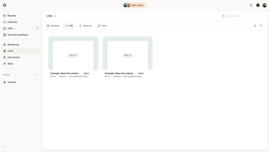




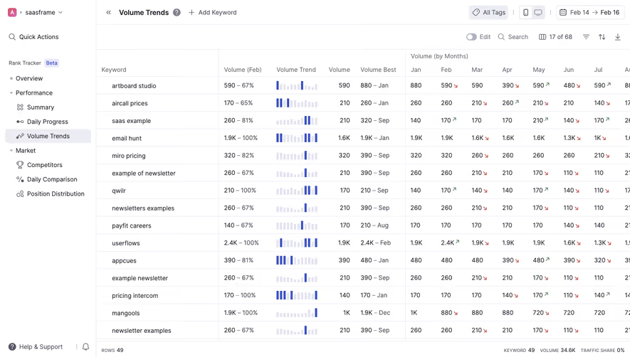

Upgrade to SaaSFrame Pro now to see similar examples.
Monthly
$18 /month
Billed $18 monthly
Browse all screens & flows
Filter and search screens & flows
Search text in screenshots
Access Figma files
Access mobile versions
Join now
Quarterly
$16 /month
Billed $48 quarterly
Browse all screens & flows
Filter and search screens & flows
Search text in screenshots
Access Figma files
Access mobile versions
Join now
Yearly
$15 /month
Billed $180 yearly
Browse all screens & flows
Filter and search screens & flows
Search text in screenshots
Access Figma files
Access mobile versions
Join now