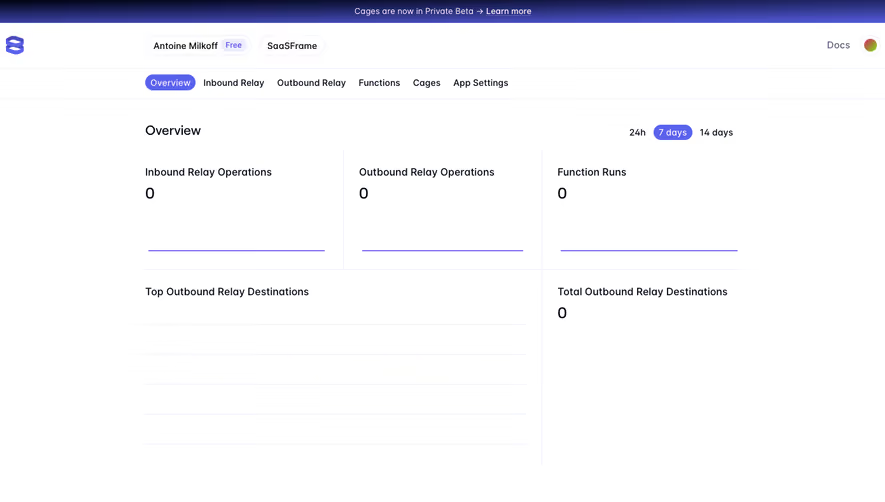
Design with AI
Generate a new design based on this screen using your own content.
# Design from Reference: Remote Welcome Dashboard
Create an original, high-fidelity visual design inspired by the reference. Prioritize composition, typography, colors, spacing, and component styling over technical implementation.
## Reference
- **Product:** Remote
- **Category:** Dashboard
- **Screenshot:** https://cdn.prod.website-files.com/5e9dc792e1210c5325f7ebbc/6acad7a1fbf1299940aab68b_6acad653b08637d50f28f0e5_cms-8a89f9e65f51b0dc2eb4ca4a.webp
Analyze the screenshot first. If inaccessible, request it rather than guessing.
## Content
{{content.instructions}}
{{content.data}}
Preserve essential messaging and factual accuracy. Adapt structure and copy length for visual balance; never invent product claims.
## Visual Design
### Overall aesthetic
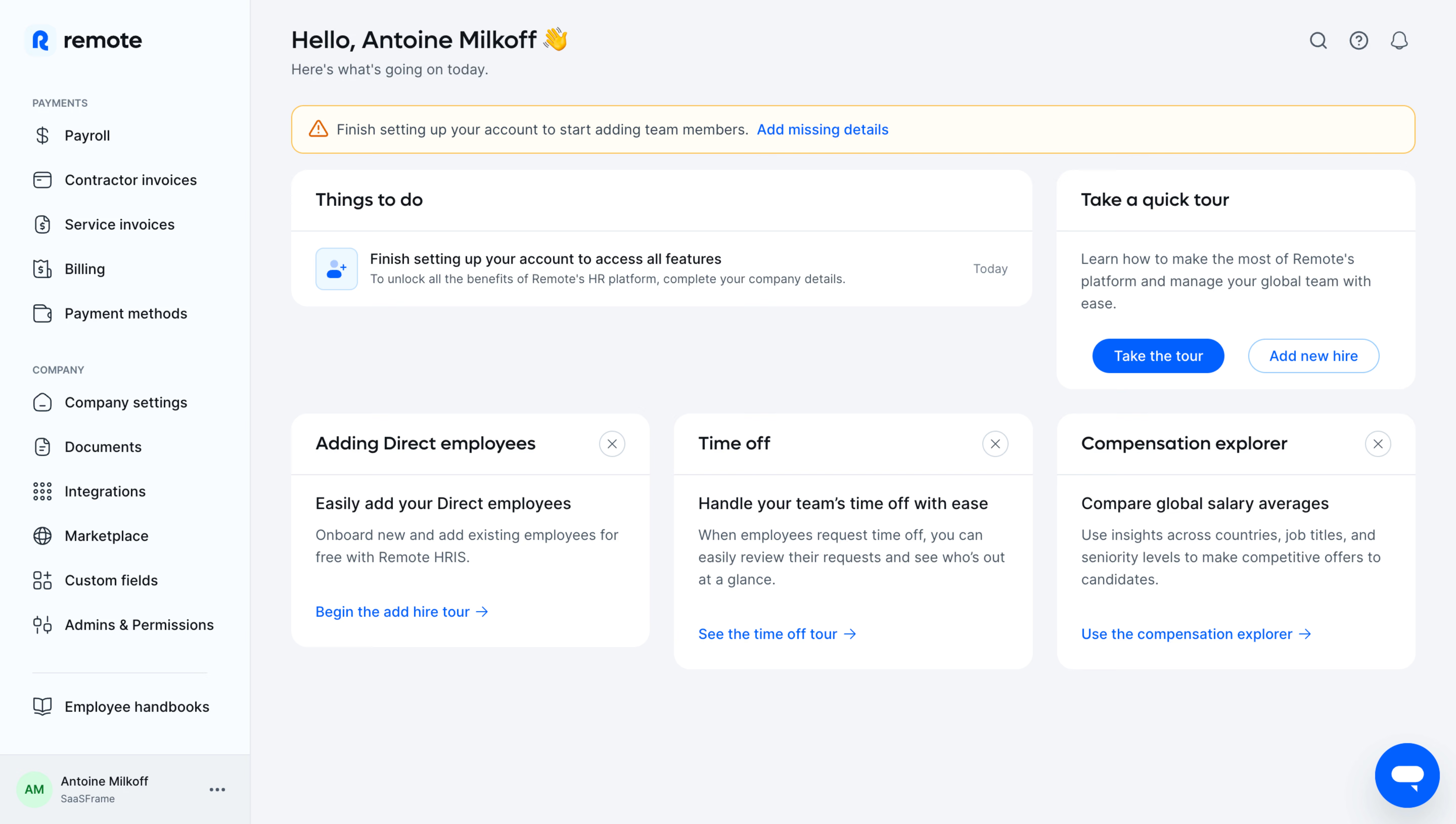
- **Style:** Friendly HR welcome dashboard with pale blue-gray canvas, white rounded cards, blue links and a warm warning banner.
- **Scale:** Source 5760 × 3260px. Sizes below refer to the 1200px-wide inspection rendering; CSS/device scale is unverified.
### Page composition
- **Sidebar:** A roughly 206px rail groups payment and company tools, with handbook link and account row below.
- **Header:** Personal greeting and short subtitle sit left; search/help/notification icons right.
- **Content:** A setup-warning strip precedes a wide Things to do card and narrower quick-tour card. Three resource cards form the next row.
### Information hierarchy
- **Required setup:** Warning and task card both prioritize completing company/account details.
- **Orientation:** Quick tour offers Take the tour and Add new hire.
- **Resources:** Direct employees, Time off and Compensation explorer explain separate capabilities with blue destination links.
### Typography
- **Family:** Rounded sans-serif; exact font identity is unverified.
- **Roles:** At inspection scale, greeting around 20px semibold, card headings 16px, body 12–13px/18px and sidebar 13px.
- **Grouping:** Small uppercase sidebar labels distinguish Payments and Company.
### Colors & surfaces
- **Sampled palette:** ICC-aware sRGB samples include #F3F4F8, white #FFFFFF, pale blue #F8FCFF, warm #FFFCF4 and #EDF2F6.
- **Accents:** Bright blue identifies actions; orange outline/icon marks setup warning; account avatar uses mint.
- **Depth:** Cards rely on rounded silhouettes and faint header rules rather than strong shadows.
### Components
- **Warning:** Thin orange outlined rounded strip with warning icon, short explanation and blue missing-details link.
- **Task card:** Wide white panel with title band and one task row containing blue icon, copy and Today metadata.
- **Tour card:** Compact text panel with filled-blue and outlined-blue pill actions.
- **Resource cards:** Three white rounded panels, each with title, close icon, explanation and lower blue arrow link.
- **Chat:** Large blue circle with white speech icon floats lower right.
### Visual rhythm
- **Grid:** Consistent 20–24px gutters align warning, task/tour pair and three-column resources.
- **Whitespace:** Broad empty lower canvas keeps the welcome state uncluttered.
### Responsive
- **Recommended adaptation:** Only desktop is observed. Collapse sidebar and stack task, tour and resources.
- **Priority:** Keep incomplete-setup guidance first and allow warning text to wrap.
### Adaptation guidance
- **Preserve:** Keep required setup separate from optional tours and feature discovery.
- **Adapt:** Use actual account tasks and supported HR features; avoid inventing pending actions or employee data.
Use this context to reproduce the reference's visual language: layout, typography, colors, spacing, borders, radii, and distinctive elements. The screenshot takes priority if descriptions conflict.
## Direction
{{preferences.fidelityInstructions}}
## Output
{{output.instructions}}
Deliver a polished, cohesive design with precise alignment, hierarchy, and spacing. Produce the requested visual artifact, not just a description. If unsupported, explain the limitation.