Generate a new design based on this screen using your own content.
Thank you! Your submission has been received!
Oops! Something went wrong while submitting the form.
# Design from Reference: Remote Add A New Hire
Create an original, high-fidelity visual design inspired by the reference. Prioritize composition, typography, colors, spacing, and component styling over technical implementation.
## Reference
- **Product:** Remote
- **Category:** Add & Edit
- **Screenshot:** https://cdn.prod.website-files.com/5e9dc792e1210c5325f7ebbc/6acad79dfbf1299940aab622_6acad64f61ef6b95a39ba9b7_cms-154540314dfca8dd5902f2b9.webp
Analyze the screenshot first. If inaccessible, request it rather than guessing.
## Content
{{content.instructions}}
{{content.data}}
Preserve essential messaging and factual accuracy. Adapt structure and copy length for visual balance; never invent product claims.
## Visual Design
Use this context to reproduce the reference's visual language: layout, typography, colors, spacing, borders, radii, and distinctive elements. The screenshot takes priority if descriptions conflict.
## Direction
{{preferences.fidelityInstructions}}
## Output
{{output.instructions}}
Deliver a polished, cohesive design with precise alignment, hierarchy, and spacing. Produce the requested visual artifact, not just a description. If unsupported, explain the limitation.
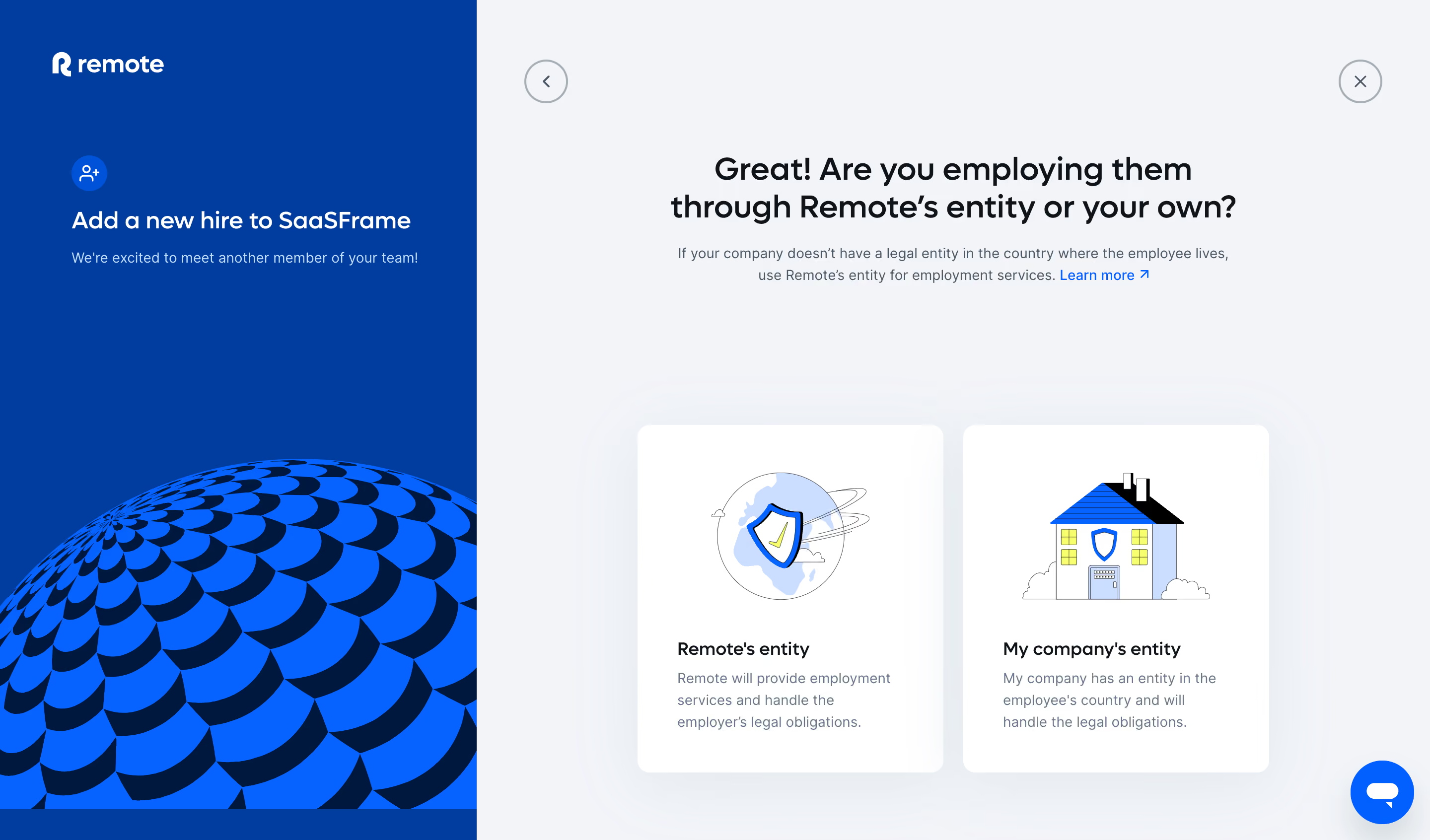
Employ Remote’s onboarding page embodies a crisp, minimalist sensibility rooted in modern professionalism. Clean lines, generous white space, and subtle shadows create an inviting atmosphere that feels both accessible and efficient. There’s a quiet confidence to the design—a focus on clarity and simplicity that foregrounds usability without sacrificing visual polish. ###
Layout and Structure
The layout is streamlined and purposeful. The top navigation bar is fixed, subtly styled for maximum legibility, while the sidebar gently anchors the workflow. A prominent progress indicator at the top orientates users within a step-by-step form journey—no distractions, just smooth progression. Content is sectioned logically, guiding you through each employment detail in focused segments, ensuring cognitive load stays low. ###
Visual Elements
Custom icons add warmth and clarity, sprinkled thoughtfully to illustrate specific actions or benefits. Simple illustrations—never overpowering—lighten the interface and bring human-centered accents without detracting from the task at hand. Animations are understated but effective, with micro-interactions like button highlights and smooth error messaging that reinforce feedback and engagement. ###
Color Palette and Typography
The color palette leans into confident blues and soft grays with lively accent hues for actionable elements—subtle but effective uses of teal and indigo signal interactivity and focus. Typography is clean and authoritative: sans-serif fonts with ample hierarchy, bold headlines, and legible body text enhance both scanability and professionalism. ###
User Experience Patterns
Navigation remains accessible via a sticky sidebar, and the primary CTA is persistently visible, reducing friction for completion. The form uses logical grouping, in-line validation, and instantly actionable dropdowns to guide users intuitively. The overall experience is friendly yet efficient—made for busy team leads who want onboarding done right, fast. ###
Unique or Notable Design Choices
A standout detail is the progress tracker that not only displays your stage in the workflow but also encourages forward movement with concise microcopy. The absence of overwhelming visuals or dense information earns trust, while subtle animations and hints of color in empty states gently encourage user action. The result: a confident, calming user journey that feels reliable and ready for scale.