
Thank you! Your submission has been received!
Oops! Something went wrong while submitting the form.
Get SaaSFrame Pro
Monthly
$18
Quarterly
$48
Yearly
$180
Upgrade to access this feature
Browse all screens & flows
Filter and search screens & flows
Access Figma files
Access mobile versions
Bookmark screens & flows
Join now
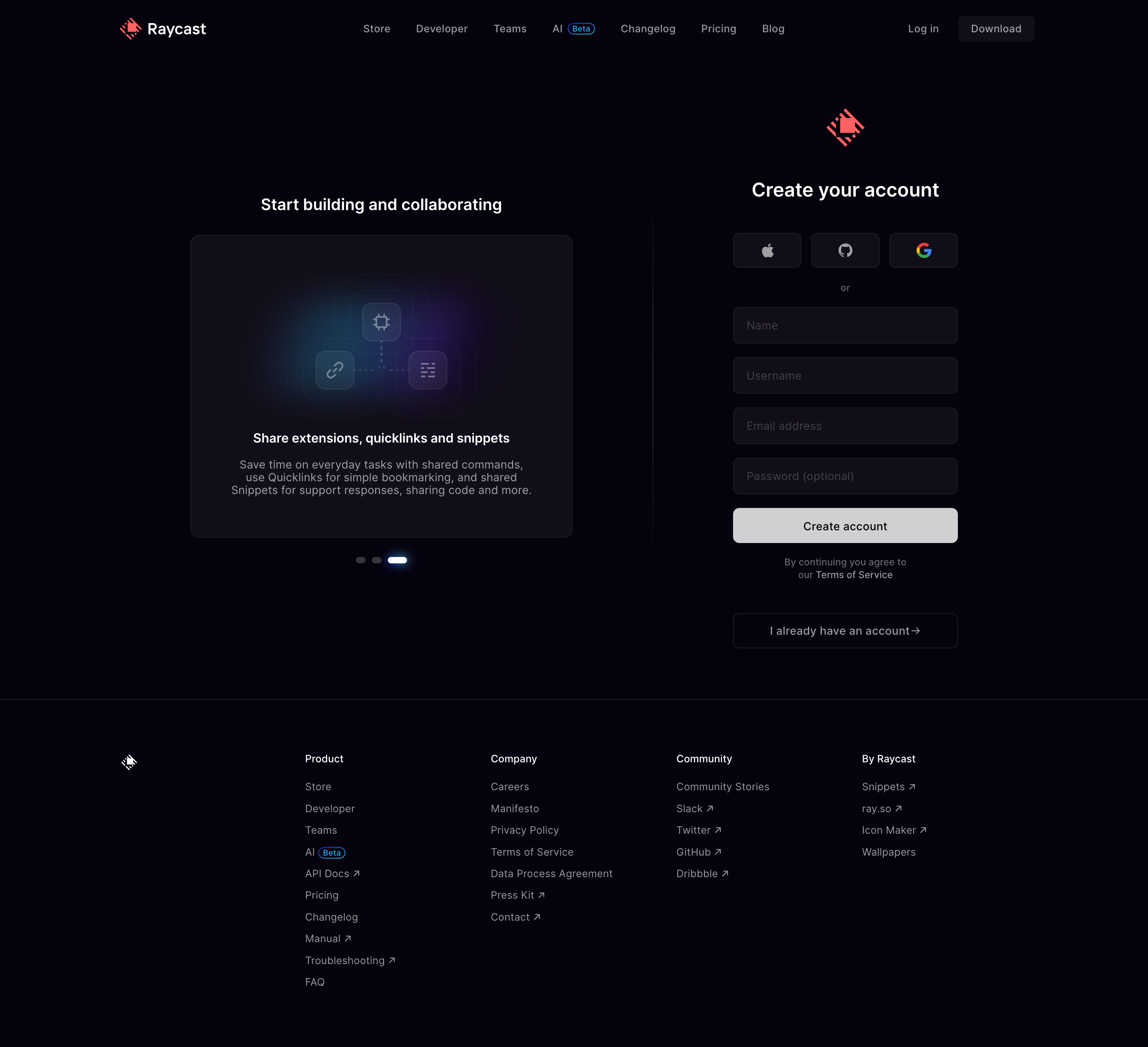
Raycast Signup

Raycast
Supercharged productivity
Designed by
No items found.

Bookmark
Bookmark

Design with AI
Thank you! Your submission has been received!
Oops! Something went wrong while submitting the form.
# Design from Reference: Raycast Signup
Create an original, high-fidelity visual design inspired by the reference. Prioritize composition, typography, colors, spacing, and component styling over technical implementation.
## Reference
- **Product:** Raycast
- **Category:** Signup
- **Screenshot:** https://cdn.prod.website-files.com/5e9dc792e1210c5325f7ebbc/6acb6d89b206c0d3f8f39fd4_6acb6b94d8a653ae3d58dbfc_cms-31419cfaf99ab8b93b589001.webp
Analyze the screenshot first. If inaccessible, request it rather than guessing.
## Content
{{content.instructions}}
{{content.data}}
Preserve essential messaging and factual accuracy. Adapt structure and copy length for visual balance; never invent product claims.
## Visual Design
### Overall aesthetic
- **Style:** Dark developer-product signup page with a restrained purple-black palette.
- **Character:** Crisp white headings, muted gray navigation, rounded dark controls, and red branding.
- **Decoration:** A compact feature illustration uses cyan and violet glows inside a promotional card.
- **Balance:** Persuasive content at left and a narrow account form at right.
### Page composition
- **Canvas:** 2880 × 2626 image px; CSS estimates assume an unverified 2× capture.
- **Container:** Approximately 1140 CSS px wide, centered.
- **Header:** Logo at left, product navigation across the middle, login and download at right.
- **Main section:** Two columns separated by a faint vertical rule near x=820 CSS px.
- **Promotional column:** Heading over a card approximately 480 × 380 CSS px, followed by three carousel indicators.
- **Form column:** Approximately 282 CSS px wide, with a red logo, account heading, social options, four inputs, submit button, terms, and existing-account link.
- **Footer:** Thin top divider, small logo, and four navigation groups across a broad horizontal layout.
### Information hierarchy
- **Primary:** Create your account heading and light Create account button.
- **Alternatives:** Three social-provider buttons appear above an or separator.
- **Form order:** Name, username, email, optional password, submit, terms, and existing-account action.
- **Support:** Feature promotion explains collaboration benefits without competing with the form.
- **Footer:** Lower-contrast links remain subordinate to signup.
### Typography
- **Family:** Neutral sans serif with compact interface proportions; exact family is unverified.
- **Form title:** Approximately 24 CSS px, weight 600, line-height 32px.
- **Promotional heading:** Approximately 20 CSS px, weight 600.
- **Feature-card title:** Approximately 16 CSS px, weight 600.
- **Body and controls:** Approximately 14 CSS px, line-height 16–20px.
- **Terms:** Approximately 12 CSS px, centered.
- **Footer headings:** Approximately 13 CSS px, medium; links approximately 13px with 27–28px vertical pitch.
- **Precision:** Typography and CSS dimensions are reconstruction estimates under the assumed 2× scale.
### Colors & surfaces
- **Canvas:** #06010E.
- **Card and field surfaces:** #130E1A.
- **Subtle borders:** Approximately #1F1A26.
- **Primary text:** #FFFFFF.
- **Submit-button fill:** #D0CFD1.
- **Secondary text:** Approximately #9B999E.
- **Muted text:** Approximately #A09FA3, with darker placeholders.
- **Brand red:** #FF525B.
- **Illustration:** Soft cyan-to-violet light pools behind outlined feature icons; no single flat color describes the glow.
- **Color precision:** Hex values sampled after embedded-profile conversion where present; glow colors vary spatially.
### Components
- **Social buttons:** Three equal buttons approximately 86 × 44 CSS px with Apple, GitHub, and Google marks.
- **Inputs:** Approximately 282 × 46 CSS px, 8px radius, dark fill and subtle border.
- **Input spacing:** Approximately 17 CSS px between fields.
- **Submit:** Approximately 282 × 44 CSS px, light gray surface, dark centered label, 8px radius.
- **Existing-account action:** Full-width outlined control, approximately 44 CSS px tall.
- **Promotional card:** Approximately 12px radius, thin outline, illustration above centered copy.
- **Carousel indicators:** Three small horizontal pills; selected marker is white with cyan glow.
- **Footer:** Four link groups with understated external-link arrows.
### Visual rhythm
- **Header:** Compact horizontal spacing contrasts with the generous main-section margins.
- **Form:** Repeated equal-width fields create a strong vertical rhythm.
- **Grouping:** Space separates social signup, manual fields, legal copy, and the existing-account action.
- **Promotional card:** Illustration occupies the upper half; short title and centered paragraph fill the lower area.
- **Footer separation:** A full-width thin rule marks the transition below signup.
### Responsive
- **Observed:** Desktop only.
- **Recommendation:** Prioritize the signup form in a single column, collapsing navigation and moving promotional content below or omitting it.
- **Form width:** Preserve a comfortable maximum width with approximately 20px viewport margins.
- **Footer:** Wrap navigation groups into fewer columns.
- **Accessibility:** Keep muted copy legible and touch controls at least approximately 44px tall.
### Adaptation guidance
- **Preserve:** Two-column signup structure, dark surfaces, light submit action, and compact social alternatives.
- **Brand:** Substitute supplied marks and illustration while retaining restrained accent use.
- **Starting scale:** 282px form width, 44–46px controls, 8px input radius, and 14px interface text under assumed 2×.
- **Content:** Use actual signup requirements and supported providers.
- **Fidelity:** Do not infer carousel animation or authentication behavior from this static screen.
Use this context to reproduce the reference's visual language: layout, typography, colors, spacing, borders, radii, and distinctive elements. The screenshot takes priority if descriptions conflict.
## Direction
{{preferences.fidelityInstructions}}
## Output
{{output.instructions}}
Deliver a polished, cohesive design with precise alignment, hierarchy, and spacing. Produce the requested visual artifact, not just a description. If unsupported, explain the limitation.


Category
Patterns
Tech Stack

Added on
May 3, 2023
Similar screens
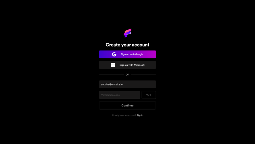


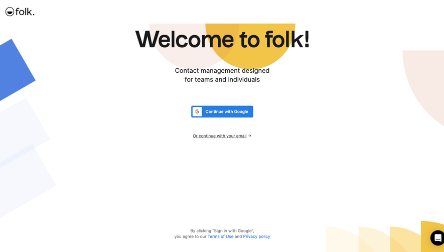

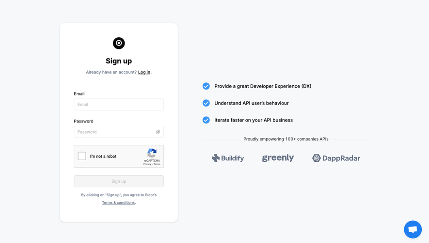

Upgrade to SaaSFrame Pro now to see similar examples.
Monthly
$18 /month
Billed $18 monthly
Browse all screens & flows
Filter and search screens & flows
Search text in screenshots
Access Figma files
Access mobile versions
Join now
Quarterly
$16 /month
Billed $48 quarterly
Browse all screens & flows
Filter and search screens & flows
Search text in screenshots
Access Figma files
Access mobile versions
Join now
Yearly
$15 /month
Billed $180 yearly
Browse all screens & flows
Filter and search screens & flows
Search text in screenshots
Access Figma files
Access mobile versions
Join now