Design with AI
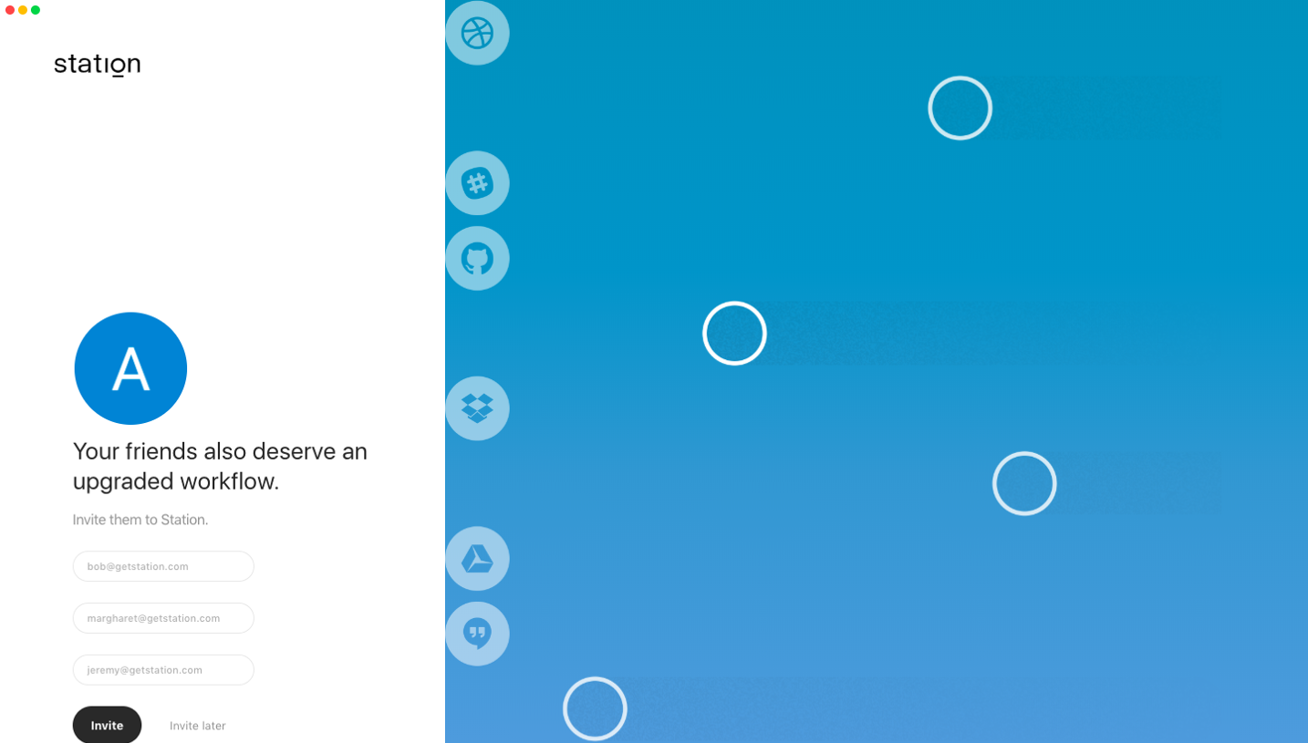
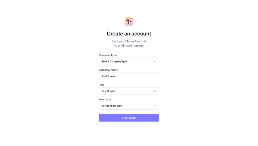
Generate a new design based on this screen using your own content.
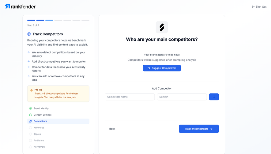
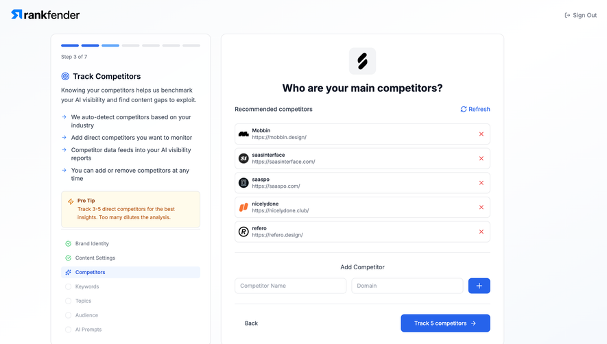
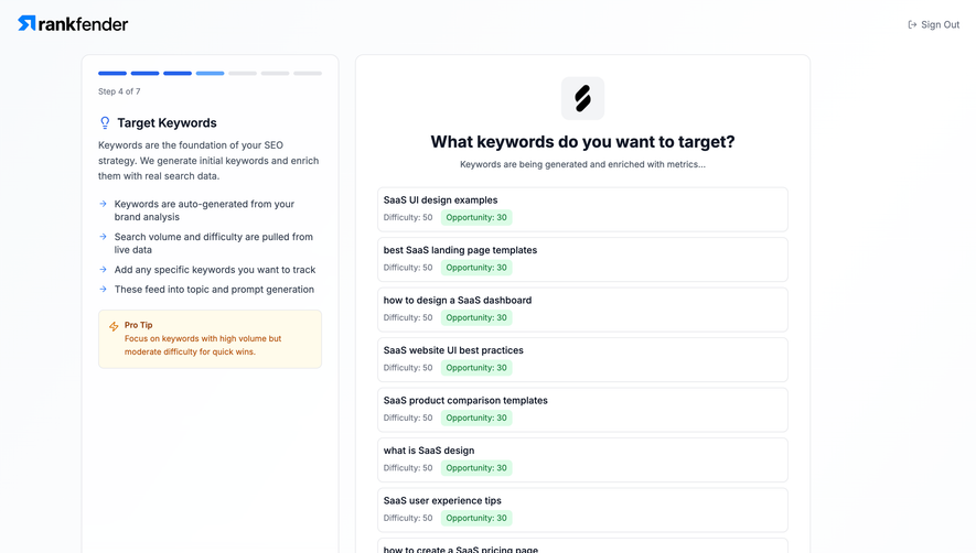
# Design from Reference: Rankfender Review Brand Book
Create an original, high-fidelity visual design inspired by the reference. Prioritize composition, typography, colors, spacing, and component styling over technical implementation.
## Reference
- **Product:** Rankfender
- **Category:** Account Setup
- **Screenshot:** https://cdn.prod.website-files.com/5e9dc792e1210c5325f7ebbc/6acbcc5de761f7d027b78943_6acad10c0c49d10a7abd1f74_cms-2dbd70b7b0da3ce416882629.webp
Analyze the screenshot first. If inaccessible, request it rather than guessing.
## Content
{{content.instructions}}
{{content.data}}
Preserve essential messaging and factual accuracy. Adapt structure and copy length for visual balance; never invent product claims.
## Visual Design
### Overall aesthetic
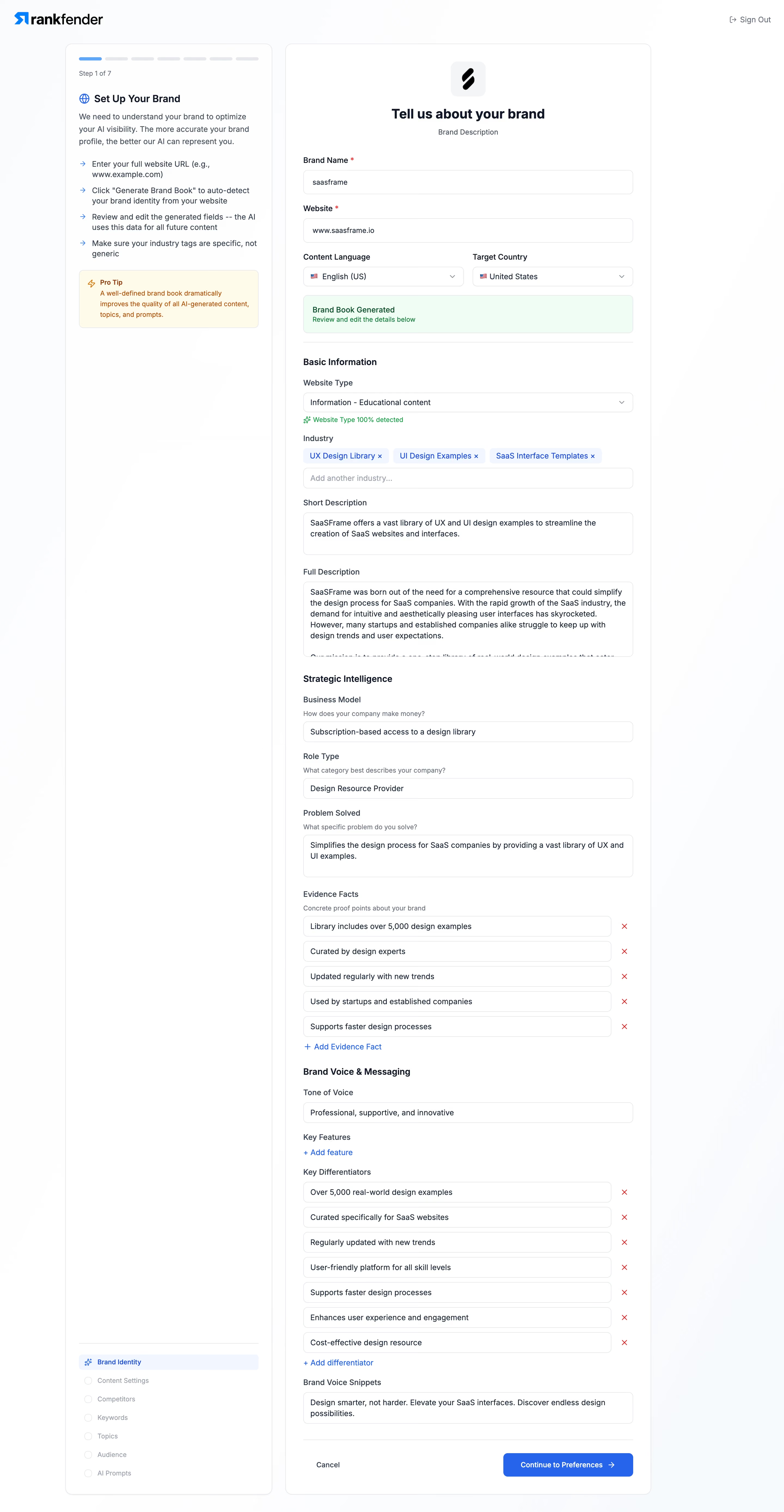
- **Character:** Detailed brand-review wizard with a stable instructional rail and a long editable form.
### Page composition
- **Canvas:** 2880 × 5550 screenshot px; CSS estimates assume 2× capture.
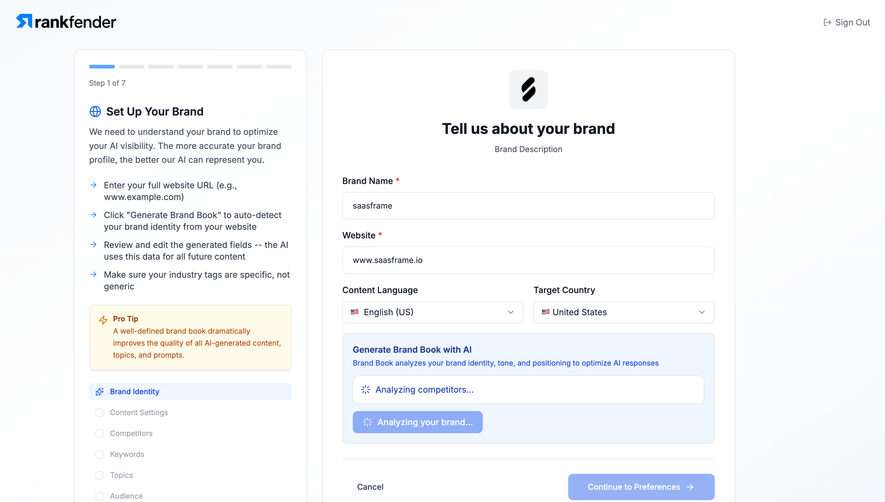
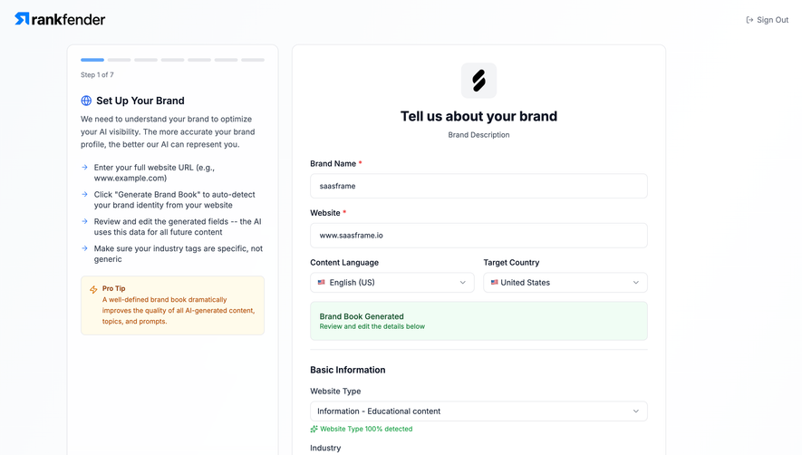
- **Structure:** Two outlined white panels; left seven-step guidance/tip and bottom checklist; right brand header, name/site/localization fields, success banner, Basic Information, Strategic Intelligence and Brand Voice sections, then footer actions.
### Information hierarchy
- **Priority:** Bold section labels divide lengthy inputs. Green generated/detected feedback distinguishes system status; repeatable facts and differentiators have red remove controls.
### Typography
- **Family:** Neutral interface sans serif, exact font unverified.
- **Scale:** Estimated CSS main heading 24 px, section headings 16–18 px, field labels/body 14 px and helper 12 px.
### Colors & surfaces
- **Sampled palette:** White #FFFFFF with near-white #FCFDFE/#FBFCFE surrounding tones.
- **Accents:** Blue primary action/active step/tag chips, pale-green success banner and cream/orange tip card. Exact accent hex values not sampled.
### Components
- **Fields:** Full-width inputs/textareas, paired language/country dropdowns, blue removable industry tags, repeatable evidence rows and add-item links.
- **Geometry:** Estimated CSS left panel 380 px, form panel 670 px, 24 px gap and 12 px corner radii; thin gray outlines.
- **Footer:** Cancel text left and blue Continue to Preferences button right after a divider.
### Visual rhythm
- **Spacing:** Approximately 20–28 CSS px between form groups; repeated field geometry and bold section breaks organize the unusually long scroll.
### Responsive
- **Observed:** Desktop only.
- **Adaptation:** Move guidance into a compact expandable block, stack localization fields and keep repeatable-item remove controls reachable.
### Adaptation guidance
- **Preserve:** Sectioned review process, editable generated content and explicit progress/status cues.
- **Replace:** Use verified brand data; do not reuse generated evidence statements from the reference.
Use this context to reproduce the reference's visual language: layout, typography, colors, spacing, borders, radii, and distinctive elements. The screenshot takes priority if descriptions conflict.
## Direction
{{preferences.fidelityInstructions}}
## Output
{{output.instructions}}
Deliver a polished, cohesive design with precise alignment, hierarchy, and spacing. Produce the requested visual artifact, not just a description. If unsupported, explain the limitation.