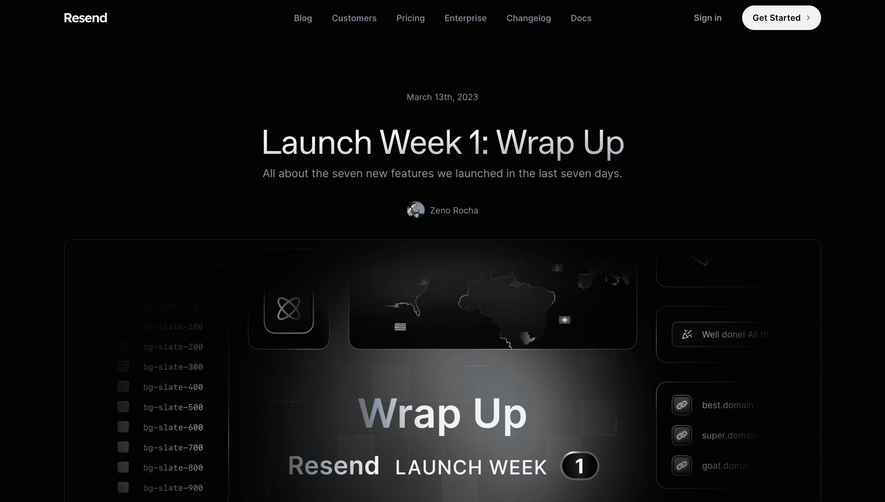
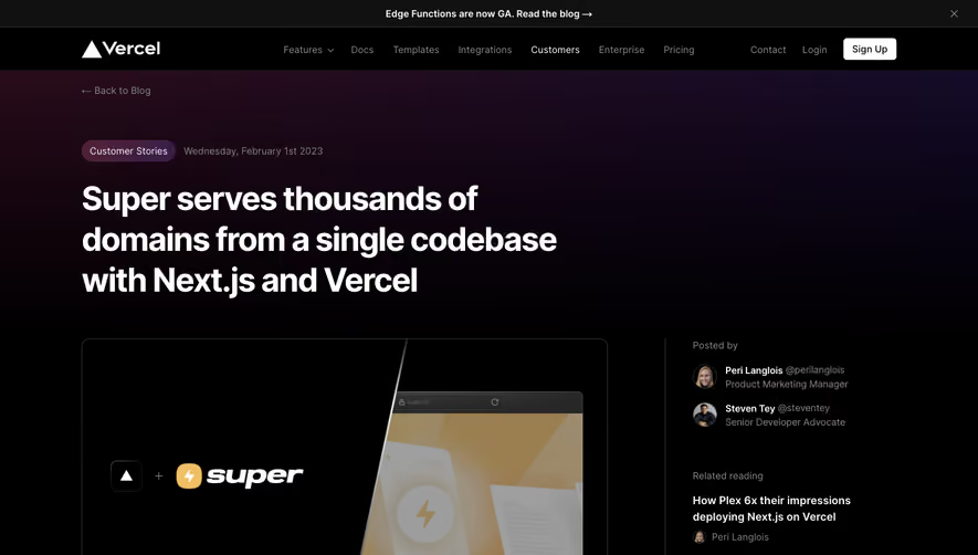
Generate a new design based on this screen using your own content.
Thank you! Your submission has been received!
Oops! Something went wrong while submitting the form.
# Design from Reference: Qovery Blog Post
Create an original, high-fidelity visual design inspired by the reference. Prioritize composition, typography, colors, spacing, and component styling over technical implementation.
## Reference
- **Product:** Qovery
- **Category:** Blog Post
- **Screenshot:** https://cdn.prod.website-files.com/5e9dc792e1210c5325f7ebbc/62ecbb593da29e1876f6c770_1659680788889-screenshot-device-9e3fb77ab59e6c3021d180218be3c208-1659680382483.webp
Analyze the screenshot first. If inaccessible, request it rather than guessing.
## Content
{{content.instructions}}
{{content.data}}
Preserve essential messaging and factual accuracy. Adapt structure and copy length for visual balance; never invent product claims.
## Visual Design
Use this context to reproduce the reference's visual language: layout, typography, colors, spacing, borders, radii, and distinctive elements. The screenshot takes priority if descriptions conflict.
## Direction
{{preferences.fidelityInstructions}}
## Output
{{output.instructions}}
Deliver a polished, cohesive design with precise alignment, hierarchy, and spacing. Produce the requested visual artifact, not just a description. If unsupported, explain the limitation.
Qovery’s blog page radiates a modern and minimalist aesthetic, blending a professional tone with subtle playfulness. The design leans on clean lines and generous white space, ensuring high readability while feeling innovative and contemporary. Subtle microinteractions add a tech-forward touch without overwhelming the content.
Layout and Structure
The page leverages a focused vertical layout, beginning with a bold hero section that instantly communicates the news with impactful headline typography. The body content is meticulously sectioned, mixing large pull quotes, supplemental info blocks, and plenty of breathing room to guide the reader’s eye. There’s clear emphasis on narrative flow—cta banners and related-story links are seamlessly woven in to invite deeper engagement.
Visual Elements
Illustrative accents and sleek, geometric iconography punctuate the content, maintaining a cohesive visual language. SVG graphics and color gradients echo the brand’s focus on the future of cloud technology. The use of a featured image in the hero keeps things approachable and memorable, anchoring the story visually.
Color Palette and Typography
Qovery’s palette is tech-inspired—blues, purples, and deep charcoal—giving off a sense of trust and reliability, with vibrant accent buttons for CTAs ensuring high contrast. Sans-serif fonts deliver clarity and modernity, deploying varying font weights and text sizes to create a clear hierarchy from headers to body text.
User Experience Patterns
Navigation is intuitive, with sticky headers and uncluttered menus. Prominent CTAs stand out without distractions. The scroll experience is smooth, with contextual signposting via accent colors and interactive highlights guiding users naturally through the narrative.
Unique or Notable Design Choices
A standout is the harmonious blending of blog content with product messaging—without resorting to intrusive pop-ups. The page feels both editorial and product-driven, establishing Qovery as an innovative, authoritative, and user-centric SaaS brand.