Overall Style and Aesthetic
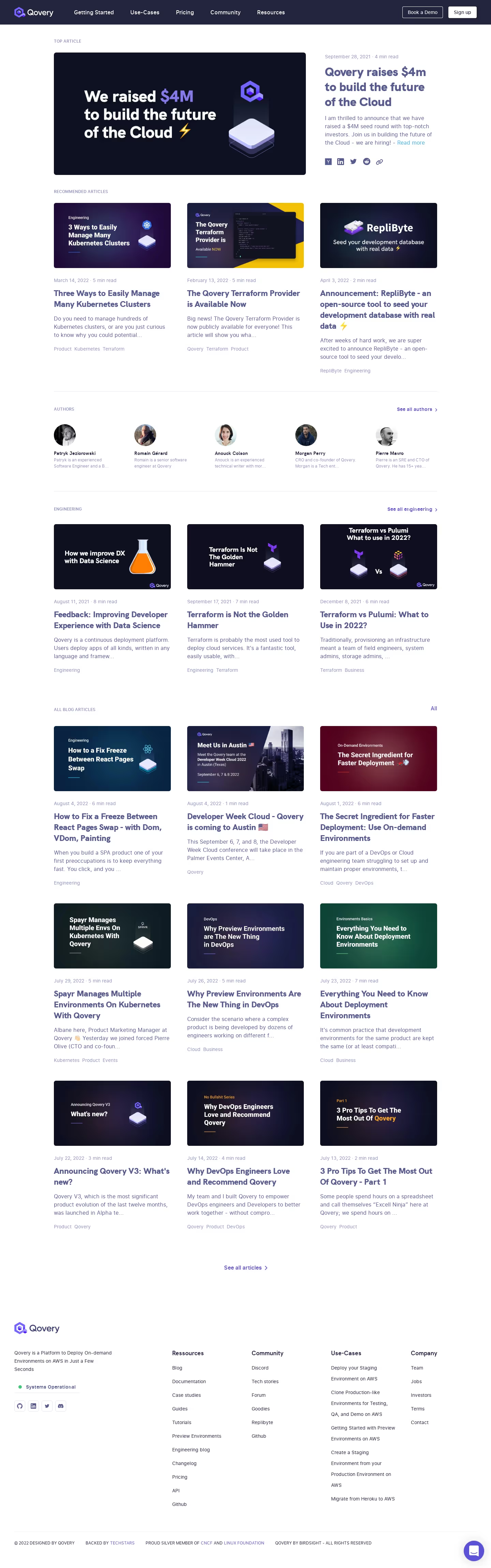
Qovery’s blog page exudes a sleek, modern, and approachable professionalism, ideal for SaaS brands targeting developers and tech-savvy audiences. The minimalist design uses generous whitespace and precise alignment, lending clarity and sophistication without feeling cold or sterile. Subtle gradients and gentle drop shadows give the page depth without overwhelming the content, achieving a visually light yet engaging atmosphere. Layout and Structure
Upon arrival, visitors are met with a concise hero header featuring a recognizable blog icon and summary, immediately establishing context. Content follows a modular grid layout, with each blog post showcased through visually distinct cards—complete with a feature image, category tag, title, snippet, and metadata—organized for easy scanning. A sticky filtering bar enables users to swiftly access categories or trending topics, minimizing friction for exploration. The footer blends clean navigation, social links, and a newsletter sign-up, neatly anchoring the page. Visual Elements
Vibrant feature images for each post inject color and personality, contrasting with the otherwise understated aesthetic. Friendly icons and playful illustration motifs soften the tech-centric feel. Animations are subtle: image hover states and button interactions provide feedback, guiding curiosity without distracting from the main content. Color Palette and Typography
The core palette features deep blues, whites, and accent purples, balancing authority with energy. Accent gradients add visual interest to buttons and selection states. Typography is modern and legible, using a bold sans-serif for headlines and airy body copy. Hierarchy is carefully managed through varying font weights, sizes, and subtle color shifts. User Experience Patterns & Unique Touches
Navigation feels effortless—top-level menus are sticky yet discreet, search functionality is instantly accessible, and calls to action (like newsletter signup) are clear but not obtrusive. Standout touches include the card-based blog feed, consistent iconography, and the sticky filter bar, all optimizing the browsing experience for discovery and engagement. The overall tone is innovative and trustworthy, yet welcoming—an exemplary model for SaaS brands seeking to balance professionalism with a touch of creative flair.