


```html

Thank you! Your submission has been received!
Oops! Something went wrong while submitting the form.
Get SaaSFrame Pro
Monthly
$18
Quarterly
$48
Yearly
$180
Upgrade to access this feature
Browse all screens & flows
Filter and search screens & flows
Access Figma files
Access mobile versions
Bookmark screens & flows
Join now
Qatalog Press Page

Qatalog
Your Bespoke Operating System for Work
Designed by
No items found.

Bookmark
Bookmark
Design with AI
Thank you! Your submission has been received!
Oops! Something went wrong while submitting the form.
# Design from Reference: Qatalog Press Page
Create an original, high-fidelity visual design inspired by the reference. Prioritize composition, typography, colors, spacing, and component styling over technical implementation.
## Reference
- **Product:** Qatalog
- **Category:** Press Page
- **Screenshot:** https://cdn.prod.website-files.com/5e9dc792e1210c5325f7ebbc/6acb6ea42837b9f3168fb608_6acb6c8637c9ce1b57c109bb_cms-f181c14cdf368a8aefac1651.webp
Analyze the screenshot first. If inaccessible, request it rather than guessing.
## Content
{{content.instructions}}
{{content.data}}
Preserve essential messaging and factual accuracy. Adapt structure and copy length for visual balance; never invent product claims.
## Visual Design
### Overall aesthetic
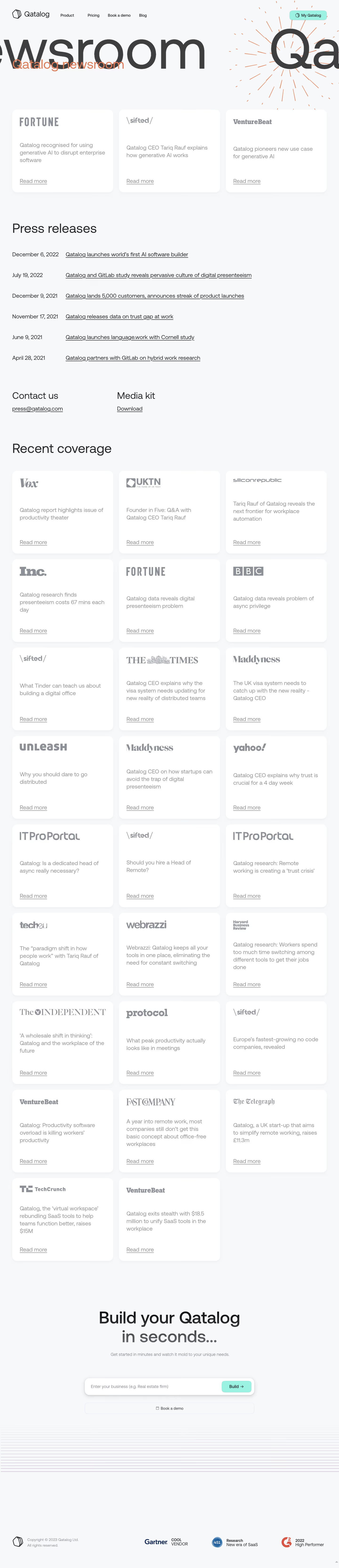
- **Character:** An expansive editorial newsroom combines oversized cropped lettering, a restrained cool background, and a highly regular publication-card grid.
- **Evidence:** The screenshot measures 1440 × 6668 image pixels. Approximate dimensions below refer to source pixels; equivalence to CSS pixels and device pixel ratio remain unverified.
- **Expression:** Orange radial linework and mint actions provide sparse brand accents; monochrome publication logos keep the long coverage archive visually consistent.
### Page composition
- **Header:** A horizontal navigation bar begins around 52 px from the left with the Qatalog logo, four compact navigation items, and a right-aligned mint account button.
- **Hero:** Enormous dark text extends beyond both horizontal edges. An orange newsroom label overlays it near the left margin, while radiating orange lines occupy the right side. Motion cannot be inferred.
- **Lead coverage:** Three equal white cards sit directly below the hero, spanning approximately 1336 px with roughly 24 px gutters.
- **Press resources:** A large press-releases heading introduces six date-and-title rows. Contact and media-kit link groups form a separate two-column strip below.
- **Archive and close:** A long three-column recent-coverage grid ends with two cards in the last row. A centered builder CTA, decorative horizontal lines, and a spacious copyright/awards footer conclude the page.
### Information hierarchy
- **Main landmarks:** Large regular-weight section headings distinguish releases from recent coverage. The hero's cropped display text supplies atmosphere while the smaller orange label identifies the page.
- **Card order:** Publisher logo appears first, article summary occupies the center, and an underlined Read more link anchors the bottom. Consistent placement makes a long archive scannable.
- **Release order:** Dates occupy a narrow left column; underlined titles share a wider right column. Resource headings and links sit outside this list.
- **Conversion:** The closing two-line message is larger and centered, with a business-description input and mint Build action above a secondary demo control.
### Typography
- **Family:** A rounded geometric-looking sans serif runs through navigation, headings, summaries, and links; exact font identity is unverified. Publisher marks retain their own lettering.
- **Display:** Cropped hero letters are approximately 220–250 px tall; the orange overlay is approximately 52 px. Section headings are approximately 54 px with around 64 px line-height and regular weight.
- **Body:** Coverage summaries and release rows are approximately 23–24 px with 31–33 px line-height; card links use a similar size and underline.
- **Utility and CTA:** Navigation and footer copy are about 16 px. The closing headline is around 70–74 px, medium weight, with approximately 80 px line-height; its second line is visibly lighter in color.
### Colors & surfaces
- **Measured foundations:** Frequent sampled source colors include cool near-white #F6F8FA and #F5F7F9, white #FFFFFF, dark gray #3E3E3E, summary gray #949494, and logo/utility gray #8D9097.
- **Brand accents:** Orange hero labeling and linework contrast with mint account and Build buttons. These accent descriptions are visually observed; exact accent hex values have not been verified.
- **Depth:** White cards have soft gray shadows concentrated below their lower edge. Surfaces use tonal separation instead of strong outlines.
- **Footer detail:** Thin low-contrast purple horizontal lines grow more visible toward the bottom of the decorative band; award marks introduce small blue and red accents.
### Components
- **Coverage cards:** Approximately 430 × 350 px, with 20 px corner radii and roughly 32 px internal padding. Logos align to the upper-left and links to the lower-left.
- **Logo areas:** Differently shaped publication marks share a bounded top zone rather than identical width. Summaries wrap across two to four lines without breaking the grid.
- **Release rows:** Approximately 88 px vertical pitch, with the title column starting near x280 px. Underlines communicate the click target without filled buttons.
- **Builder control:** A centered white rounded input shell about 720 × 72 px contains a business placeholder and inset mint action around 125 × 48 px. The shell carries a stronger diffuse shadow than archive cards.
- **Secondary controls:** The demo action is a full-width outlined rectangle below the input, approximately 48 px high with a small calendar icon. Header account control is a compact rounded mint rectangle.
### Visual rhythm
- **Grid:** Roughly 52 px page gutters, 24 px column gaps, and 24 px row gaps create a consistent modular frame.
- **Section spacing:** Larger breaks of approximately 100–150 px separate major content groups, contrasting with tightly aligned release rows and archive cards.
- **Card rhythm:** Large blank areas between publisher, summary, and link preserve equal heights even when summaries differ in length.
- **Closing space:** The CTA sits well below the archive. The decorative line band and substantial empty footer space deliberately slow the end of the page.
### Responsive
- **Observed limit:** The supplied image shows desktop only; actual responsive rules and any marquee behavior are unverified.
- **Recommended grid:** Reduce coverage to two columns at intermediate widths and one column on small screens; preserve logo-summary-link order and let card height follow content where needed.
- **Recommended releases:** Stack dates above titles when the date column would squeeze links. Reduce page gutters to 20–24 CSS px.
- **Recommended hero and CTA:** Constrain intentional display overflow to its decorative region, keep the page label readable, and stack input/action controls when required. Collapse navigation without hiding essential account access.
### Adaptation guidance
- **Preserve:** Retain the contrast between expressive oversized hero typography and a quiet, rigorously repeated archive grid.
- **Build:** Use a reusable coverage-card component with separate logo, summary, and link regions. Use responsive grid columns and a shared spacing scale rather than fixed positioning.
- **Resources:** Model release dates/titles and contact/media-kit blocks independently from coverage cards; their editorial hierarchy is different.
- **Validate:** Check muted-text contrast, visible keyboard focus, descriptive link names, input labeling, and long-title wrapping. Hover, focus, submitted, and error states are not shown.
- **Assets:** Use actual publisher logo artwork and award assets; do not recreate their identities as a single shared font or infer interactions from decorative linework.
Use this context to reproduce the reference's visual language: layout, typography, colors, spacing, borders, radii, and distinctive elements. The screenshot takes priority if descriptions conflict.
## Direction
{{preferences.fidelityInstructions}}
## Output
{{output.instructions}}
Deliver a polished, cohesive design with precise alignment, hierarchy, and spacing. Produce the requested visual artifact, not just a description. If unsupported, explain the limitation.
Category
Patterns
No items found.
Tech Stack
No items found.
Added on
March 15, 2023
Similar screens





Upgrade to SaaSFrame Pro now to see similar examples.
Monthly
$18 /month
Billed $18 monthly
Browse all screens & flows
Filter and search screens & flows
Search text in screenshots
Access Figma files
Access mobile versions
Join now
Quarterly
$16 /month
Billed $48 quarterly
Browse all screens & flows
Filter and search screens & flows
Search text in screenshots
Access Figma files
Access mobile versions
Join now
Yearly
$15 /month
Billed $180 yearly
Browse all screens & flows
Filter and search screens & flows
Search text in screenshots
Access Figma files
Access mobile versions
Join now