Generate a new design based on this screen using your own content.
Thank you! Your submission has been received!
Oops! Something went wrong while submitting the form.
# Design from Reference: Proof Academy
Create an original, high-fidelity visual design inspired by the reference. Prioritize composition, typography, colors, spacing, and component styling over technical implementation.
## Reference
- **Product:** Proof
- **Category:** Academy
- **Screenshot:** https://cdn.prod.website-files.com/5e9dc792e1210c5325f7ebbc/6acbd5c969afe7296a94f853_6acbd32979661806cceadd38_cms-99b65ad8589d65952becddf8.webp
Analyze the screenshot first. If inaccessible, request it rather than guessing.
## Content
{{content.instructions}}
{{content.data}}
Preserve essential messaging and factual accuracy. Adapt structure and copy length for visual balance; never invent product claims.
## Visual Design
Use this context to reproduce the reference's visual language: layout, typography, colors, spacing, borders, radii, and distinctive elements. The screenshot takes priority if descriptions conflict.
## Direction
{{preferences.fidelityInstructions}}
## Output
{{output.instructions}}
Deliver a polished, cohesive design with precise alignment, hierarchy, and spacing. Produce the requested visual artifact, not just a description. If unsupported, explain the limitation.
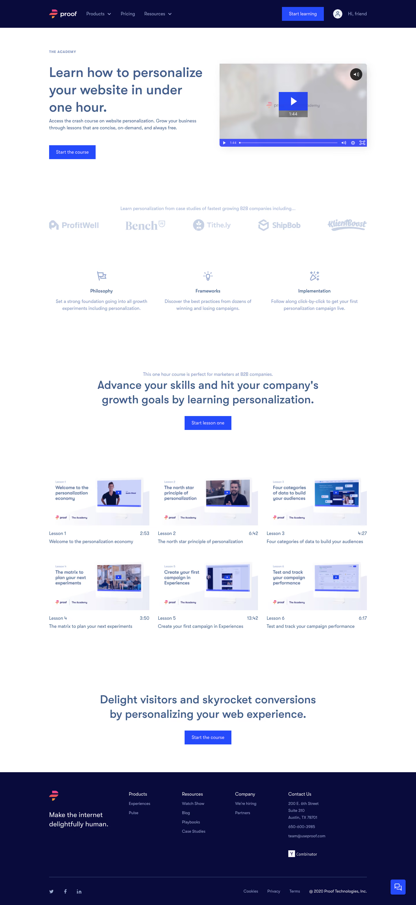
Proof's Academy landing page is a masterclass in restraint. The hero section pairs a bold serif headline with an embedded video preview, immediately telling you what you're getting: a free crash course on website personalization. That deep indigo CTA button pops hard against the white background.
Trust and Structure
Below the fold, a logo bar featuring ProfitWell, Bench, Tithe.ly, ShipBob, and KlientBoost builds credibility fast. Then three pillars break the course down: Philosophy, Frameworks, Implementation. Simple icons, short descriptions. No fluff.
The Lesson Grid Does the Heavy Lifting
Six lesson cards with real video thumbnails and timestamps give you the full picture at a glance. You can see this thing is genuinely under one hour. Each card shows lesson number, title, and duration. It feels approachable, not overwhelming.
What Makes It Stand Out
The typography mix works well. Big serif headings for emotional pull, clean sans-serif for body copy. The consistent use of that indigo/purple accent color ties everything together without feeling monotonous. Two CTA placements feel natural, not pushy.