Generate a new design based on this screen using your own content.
Thank you! Your submission has been received!
Oops! Something went wrong while submitting the form.
# Design from Reference: Prelude Verifications
Create an original, high-fidelity visual design inspired by the reference. Prioritize composition, typography, colors, spacing, and component styling over technical implementation.
## Reference
- **Product:** Prelude
- **Category:** Empty State
- **Screenshot:** https://cdn.prod.website-files.com/5e9dc792e1210c5325f7ebbc/697b764983a3c28b4dc0319e_1JOe2AQhDgJBBsQPcDGvvmIbzpF8JQa4yka1EWB_m-M.avif
Analyze the screenshot first. If inaccessible, request it rather than guessing.
## Content
{{content.instructions}}
{{content.data}}
Preserve essential messaging and factual accuracy. Adapt structure and copy length for visual balance; never invent product claims.
## Visual Design
Use this context to reproduce the reference's visual language: layout, typography, colors, spacing, borders, radii, and distinctive elements. The screenshot takes priority if descriptions conflict.
## Direction
{{preferences.fidelityInstructions}}
## Output
{{output.instructions}}
Deliver a polished, cohesive design with precise alignment, hierarchy, and spacing. Produce the requested visual artifact, not just a description. If unsupported, explain the limitation.
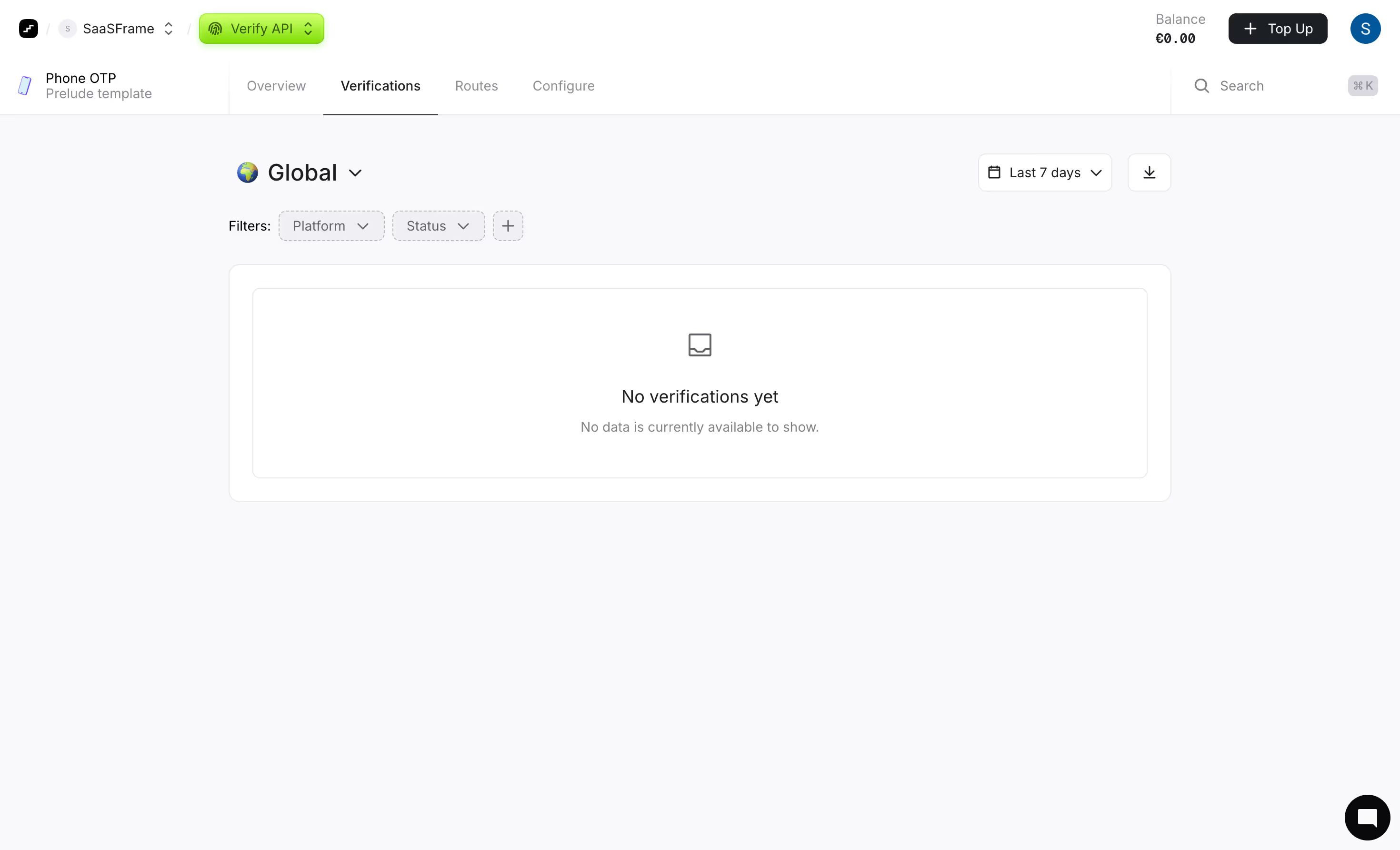
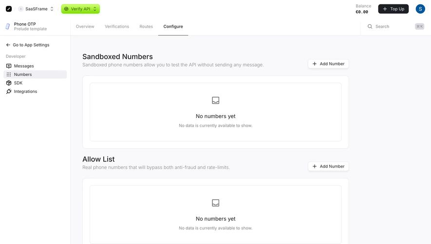
This is the Verify API dashboard from what looks like Prelude's Phone OTP product. First thing you notice is how restrained everything is. White space doing heavy lifting here. The layout is dead simple: top nav, tab bar, filters, then a centered empty state. No clutter, no filler.
Smart Use of Hierarchy
The green "Verify API" pill in the top nav pops against the neutral gray surroundings. It's the only real color on the entire page and it immediately tells you where you are. The tab structure with Overview, Verifications, Routes, and Configure keeps navigation predictable. Typography is small but readable, leaning on weight differences rather than size to create hierarchy. The "Global" dropdown with the globe icon is a thoughtful touch for a product dealing with international phone verification.
What Makes It Stand Out
The empty state illustration is minimal without feeling lazy. Dashed border around the content area subtly signals "something will go here." Filter chips for Platform and Status sit ready but unobtrusive. The balance indicator reading €0.00 top right is brutally honest. This feels like a dashboard that will scale well once data fills it in.