Design with AI
Generate a new design based on this screen using your own content.
# Design from Reference: Prelude Team Members
Create an original, high-fidelity visual design inspired by the reference. Prioritize composition, typography, colors, spacing, and component styling over technical implementation.
## Reference
- **Product:** Prelude
- **Category:** Team Members
- **Screenshot:** https://cdn.prod.website-files.com/5e9dc792e1210c5325f7ebbc/697b765784049b42b20dde35_BLGkZmApU-rlMO08yPa-6rtiJm7Se8TUIy7CR5wUUFI.avif
Analyze the screenshot first. If inaccessible, request it rather than guessing.
## Content
{{content.instructions}}
{{content.data}}
Preserve essential messaging and factual accuracy. Adapt structure and copy length for visual balance; never invent product claims.
## Visual Design
### Overall aesthetic
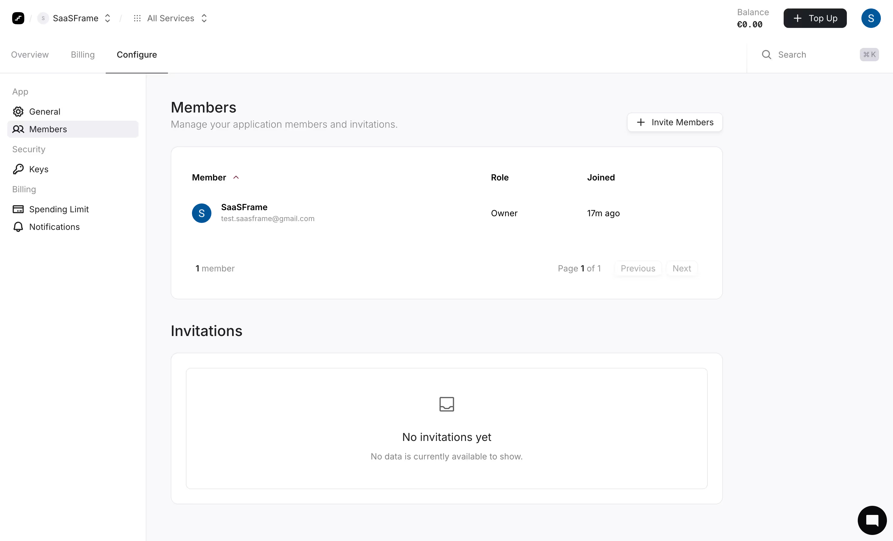
- **Character:** A restrained member-management screen uses white cards, very pale gray-lilac canvas, dark neutral text and minimal accent color.
- **Evidence:** The source measures 2940 × 1784 pixels. CSS sizes assume an unverified approximately 2× density; the inspection rendering was scaled to 1400 pixels wide.
### Page composition
- **Header:** Workspace/service selectors sit left, balance/top-up/avatar right; a second row contains three main tabs and search.
- **Sidebar:** A roughly 240-pixel configuration rail groups general/member, security and billing links.
- **Content:** Members title/subtitle and invite action precede a single-member table; an Invitations heading and large empty-state card follow.
- **Utility:** A black circular chat launcher sits lower right.
### Information hierarchy
- **Location:** Configure is underlined in the top row and Members highlighted in the sidebar.
- **Member data:** Name/email occupy the largest table column, followed by role and joined time.
- **Empty invitations:** A centered tray icon, No invitations yet heading and muted sentence communicate absence clearly.
### Typography
- **Headings:** Members and Invitations are approximately 24–26 CSS pixels, medium weight.
- **Table/body:** Around 14–16 pixels, with names/headers semibold and helper copy muted.
- **Chrome:** Compact navigation is roughly 14 pixels; exact sans-serif identity is unverified.
### Colors & surfaces
- **Measured palette:** ICC-to-sRGB sampling identifies #FFFFFF as cards/chrome, #F9F9FB as canvas and #E8E8EC as outlines.
- **Measured foreground:** #1C2024 is dark text, #F0F0F3 a selected-area neutral and #09090B a near-black utility tone.
- **Accents:** Blue avatar circles are the main saturated elements; otherwise the screen is intentionally neutral.
- **Depth:** Rounded cards use fine borders; small action buttons have soft shadows.
### Components
- **Member table:** A broad white rounded panel contains three headers, one avatar/name row and a bottom count/pagination strip.
- **Invite action:** A small outlined rounded button includes a plus symbol.
- **Invitation card:** An outer rounded panel encloses a second thin outlined rectangle with centered empty-state content.
- **Pagination:** Previous/Next appear pale and disabled-looking beside Page 1 of 1.
- **Header tools:** A dark Top Up button includes plus; search shows a keyboard-shortcut chip.
### Visual rhythm
- **Alignment:** Titles, table and empty-state card share the same left/right edges.
- **Spacing:** Generous card padding and broad gaps between sections keep one-member data from feeling cramped.
- **Nested boundaries:** Thin borders distinguish shell, table and invitation empty state without heavy fills.
### Responsive
- **Observed scope:** One desktop state is shown; invite dialog and populated invitations are not visible.
- **Recommended layout:** Collapse the rail, stack header utilities and allow table columns to wrap or scroll.
- **Recommended access:** Preserve explicit empty-state text and semantic pagination disabled states.
### Adaptation guidance
- **Management pattern:** Keep existing members and pending invitations separate, with one clear invite entry point.
- **Data fidelity:** Use sample names/emails when recreating the layout.
- **Implementation:** Verify font/density and define invitation, sorting and focus states beyond the captured resting view.
Use this context to reproduce the reference's visual language: layout, typography, colors, spacing, borders, radii, and distinctive elements. The screenshot takes priority if descriptions conflict.
## Direction
{{preferences.fidelityInstructions}}
## Output
{{output.instructions}}
Deliver a polished, cohesive design with precise alignment, hierarchy, and spacing. Produce the requested visual artifact, not just a description. If unsupported, explain the limitation.