
Thank you! Your submission has been received!
Oops! Something went wrong while submitting the form.
Get SaaSFrame Pro
Monthly
$18
Quarterly
$48
Yearly
$180
Upgrade to access this feature
Browse all screens & flows
Filter and search screens & flows
Access Figma files
Access mobile versions
Bookmark screens & flows
Join now
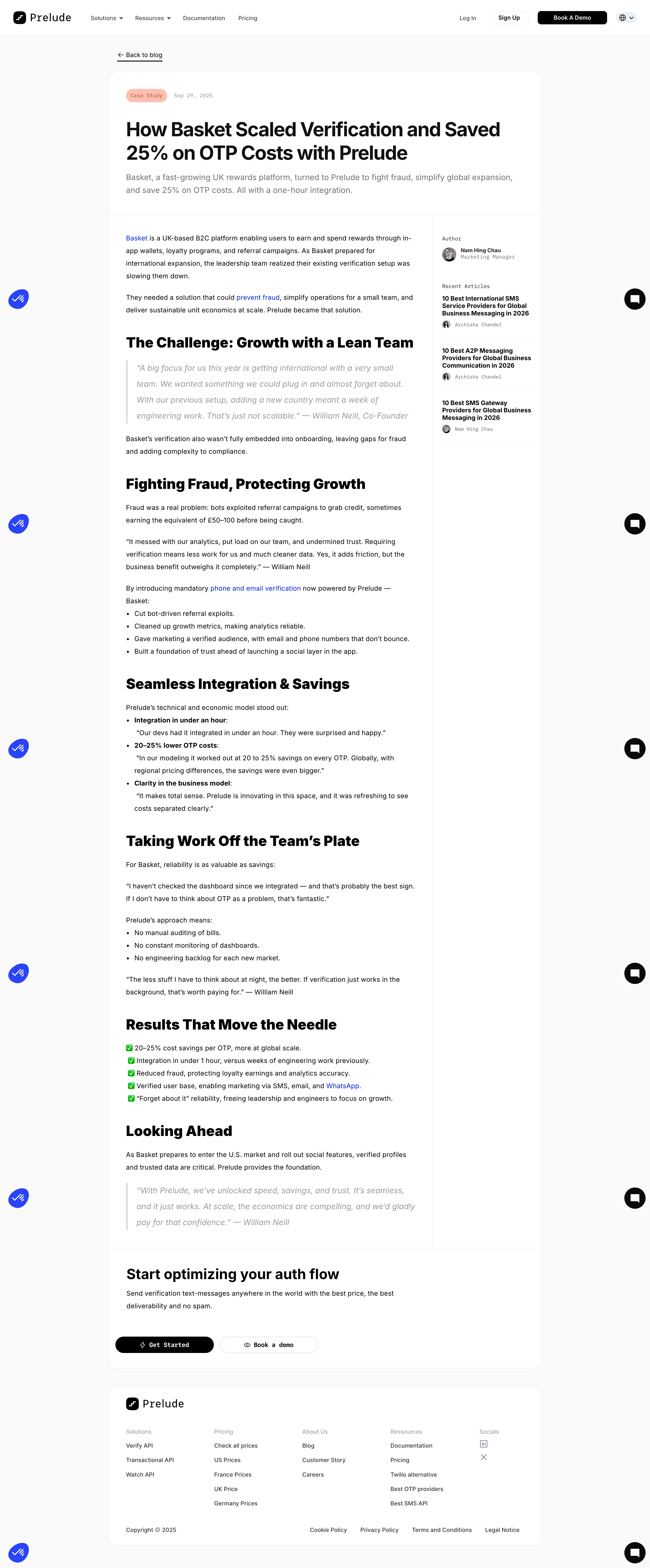

Prelude Blog Post

Prelude
Send verification phone messages
Designed by
No items found.

Bookmark
Bookmark

Design with AI
Thank you! Your submission has been received!
Oops! Something went wrong while submitting the form.
# Design from Reference: Prelude Blog Post
Create an original, high-fidelity visual design inspired by the reference. Prioritize composition, typography, colors, spacing, and component styling over technical implementation.
## Reference
- **Product:** Prelude
- **Category:** Blog Post
- **Screenshot:** https://cdn.prod.website-files.com/5e9dc792e1210c5325f7ebbc/6acad3a9c2028efdec71b020_6acad1535af75170c4bc13cd_cms-719ad37ca7011d15417b16a8.webp
Analyze the screenshot first. If inaccessible, request it rather than guessing.
## Content
{{content.instructions}}
{{content.data}}
Preserve essential messaging and factual accuracy. Adapt structure and copy length for visual balance; never invent product claims.
## Visual Design
### Overall aesthetic
- **Style:** Minimal case-study article with strong black headings, a white rounded reading card, a pale gray page and restrained peach/blue accents.
- **Scale:** Source screenshot 2940 × 7088px. Sizes below estimate a 1470px-wide CSS layout at 2× capture scale.
### Page composition
- **Header:** A white navigation bar contains Prelude branding, product/resource links, documentation and pricing left; login, signup, black demo action and language selector right.
- **Article card:** A centered roughly 980px-wide white card sits beneath Back to blog. The full-width opening header leads to a roughly 735px article column and 245px author/recent-articles sidebar.
- **Closing regions:** An integrated conversion band closes the article card. A separate rounded white footer below contains branding, five link/social groups and a legal row.
- **Capture overlays:** Blue circular utility widgets at left and black chat circles at right recur down the long screenshot; these are floating controls repeated by capture, not inline article sections.
### Information hierarchy
- **Opening:** A peach Case Study pill and small date precede a bold two-line customer-outcome headline and muted summary.
- **Article progression:** Sections cover the challenge, fraud, integration/savings, reduced workload, results and future plans. Paragraphs alternate with quotes, standard bullets and a green-check results list.
- **Sidebar:** Author portrait/name/role appears above three compact recent-article links separated by fine rules.
- **Conversion:** Start optimizing your auth flow introduces brief copy and adjacent Get Started and Book a demo pills.
### Typography
- **Family:** Modern sans-serif with heavy headings; selected metadata, badges and action labels have a monospaced appearance. Exact families are unverified.
- **Roles:** Estimated title 44–46px bold with tight tracking; section headings around 32px heavy; body 15–16px/28px; summary about 18px/28px.
- **Quotes and metadata:** Blockquotes are larger gray italic text around 18px/36px. Dates, author labels and sidebar metadata are approximately 12px.
### Colors & surfaces
- **Sampled palette:** ICC-aware sRGB samples include white #FFFFFF, background #FAFAFA, black #000000, dark #111111, divider #EDEDED and muted gray #999999.
- **Accents:** A soft peach category badge contrasts with bright blue inline links. Green check symbols introduce the results list.
- **Structure:** Thin pale borders divide header, body/sidebar and CTA. Rounded cards have little or no visible shadow.
### Components
- **Article container:** Approximately 20px corners, fine neutral outline and around 40px internal padding in the title and text regions.
- **Blockquotes:** A narrow pale-gray vertical rule sits beside indented italic copy; quotations remain unboxed.
- **Lists:** Standard bullets use bold lead-ins for integration benefits; the results summary substitutes green check icons without additional cards.
- **Sidebar links:** Compact bold multiline titles, small author avatars and metadata, separated vertically by light rules.
- **CTA and footer:** Black filled Get Started and white outlined Book a demo actions are pill-shaped, approximately 36–38px tall. Footer columns use small gray group headings and black links.
### Visual rhythm
- **Reading cadence:** Large bold headings divide long text at regular intervals, with around 36–44px above sections and tighter paragraph/list spacing.
- **Balance:** The sidebar carries content only near the top, leaving a quiet empty right column as the main article continues.
- **Boundaries:** Full-width rules distinguish article opening and conversion; the separate footer repeats the same width and rounded-corner language.
### Responsive
- **Recommended adaptation:** Only desktop is observed. Move author/recent articles below the article, reduce title size and collapse the footer into fewer columns.
- **Controls:** Let CTA pills stack and ensure floating widgets do not cover text or actions. Preserve readable quotes and list indentation.
### Adaptation guidance
- **Preserve:** Keep clear case-study metadata, strong section hierarchy, quote styling, a concise results summary and a final product action.
- **Adapt:** Use verified customer outcomes and approved quotations. Replace sidebar resources and dates with actual content; avoid repeating capture artifacts as page decoration.
Use this context to reproduce the reference's visual language: layout, typography, colors, spacing, borders, radii, and distinctive elements. The screenshot takes priority if descriptions conflict.
## Direction
{{preferences.fidelityInstructions}}
## Output
{{output.instructions}}
Deliver a polished, cohesive design with precise alignment, hierarchy, and spacing. Produce the requested visual artifact, not just a description. If unsupported, explain the limitation.


Category
Patterns
No items found.


Added on
January 7, 2026
Similar screens




Upgrade to SaaSFrame Pro now to see similar examples.
Monthly
$18 /month
Billed $18 monthly
Browse all screens & flows
Filter and search screens & flows
Search text in screenshots
Access Figma files
Access mobile versions
Join now
Quarterly
$16 /month
Billed $48 quarterly
Browse all screens & flows
Filter and search screens & flows
Search text in screenshots
Access Figma files
Access mobile versions
Join now
Yearly
$15 /month
Billed $180 yearly
Browse all screens & flows
Filter and search screens & flows
Search text in screenshots
Access Figma files
Access mobile versions
Join now