Design with AI
Generate a new design based on this screen using your own content.
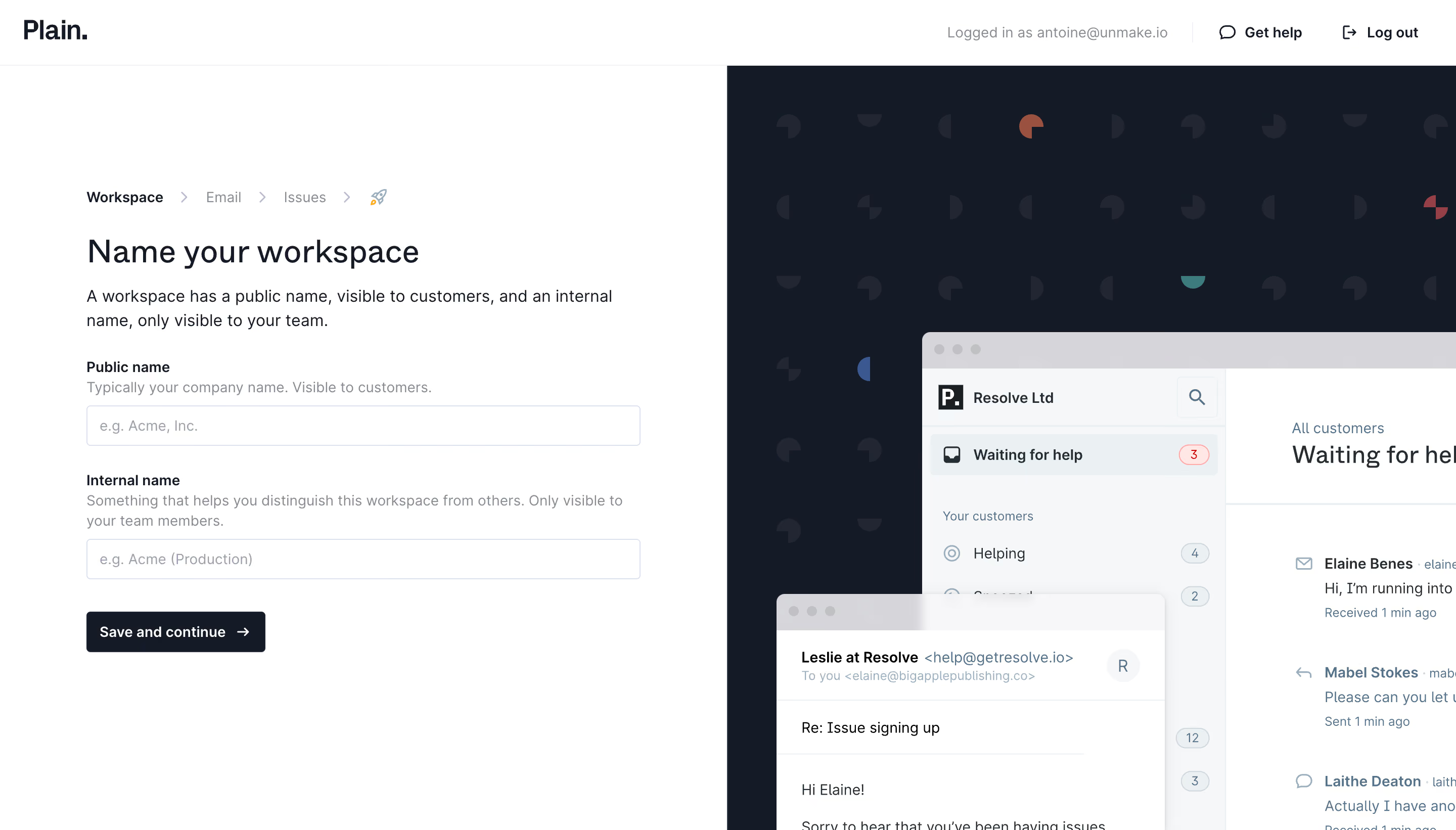
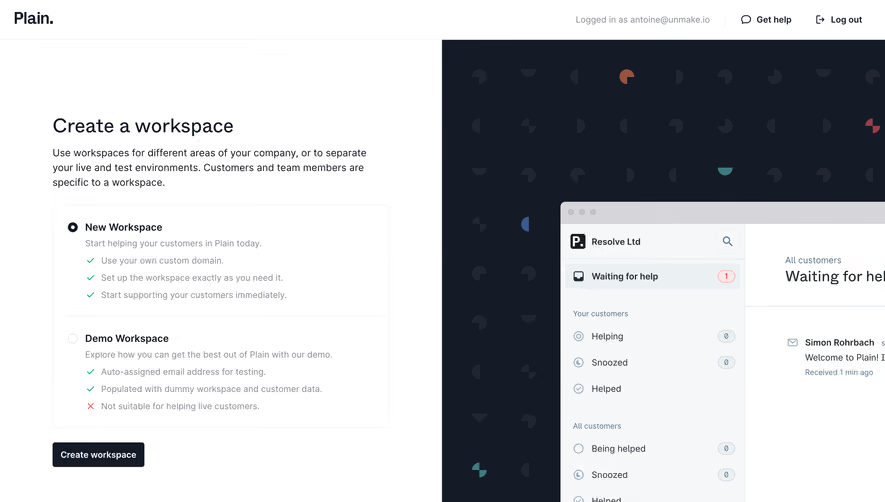
# Design from Reference: Plain Account Setup
Create an original, high-fidelity visual design inspired by the reference. Prioritize composition, typography, colors, spacing, and component styling over technical implementation.
## Reference
- **Product:** Plain
- **Category:** Account Setup
- **Screenshot:** https://cdn.prod.website-files.com/5e9dc792e1210c5325f7ebbc/6acbbcfd3b6b24eada5486f3_6acbbbb12ee20aade8edd10f_cms-3782e6934350ba2ba47c4b48.webp
Analyze the screenshot first. If inaccessible, request it rather than guessing.
## Content
{{content.instructions}}
{{content.data}}
Preserve essential messaging and factual accuracy. Adapt structure and copy length for visual balance; never invent product claims.
## Visual Design
### Overall aesthetic
- **Style:** Clean workspace-naming step with white form and dark patterned product-preview panel.
### Page composition
- **Canvas:** 2880 × 1642 image px; CSS estimates assume an unverified 2× capture.
- **Split:** Equal white/dark halves below thin account header.
- **Form:** Breadcrumb progress, title, explanation, public-name field, internal-name field, and Save and continue.
- **Preview:** Cropped support window and overlapping message card on dark geometric pattern.
### Information hierarchy
- **Primary:** Name your workspace title.
- **Fields:** Public/internal distinction reinforced by helper sentences.
- **Action:** Dark Save and continue.
- **Progress:** Workspace current, Email and Issues next.
### Typography
- **Family:** Neutral sans serif; exact family unverified.
- **Title:** Approximately 32 CSS px, medium.
- **Body:** Approximately 16px with 24px line-height.
- **Labels:** Approximately 14px, semibold.
- **Helpers:** Approximately 14px, muted.
- **Precision:** Values and scale are estimates.
### Colors & surfaces
- **Form:** #FFFFFF.
- **Preview backdrop/action:** #151A27.
- **Preview surfaces:** #F6F7F9 and #EBF0F3.
- **Window chrome:** #D6D5DA.
- **Pattern:** #212632.
- **Border shade:** #DDE1EB.
- **Precision:** Flat screenshot samples.
### Components
- **Inputs:** Approximately 550 × 40 CSS px under assumed 2×, thin cool border and small radius.
- **Action:** Compact dark rectangle with right arrow.
- **Progress:** Small labels and chevrons.
- **Preview:** Large app window cropped to right; smaller email window overlaps lower-left.
### Visual rhythm
- **Spacing:** Broad top margin, consistent label/helper/input spacing, and larger gap before action.
- **Alignment:** Form shares one left edge.
- **Balance:** Text-light form contrasts with detailed preview.
### Responsive
- **Observed:** Desktop only.
- **Recommendation:** Prioritize form; move/hide decorative preview on small screens.
- **Fields:** Keep public/internal helper text visible.
### Adaptation guidance
- **Preserve:** Clear naming distinction, simple progression, and product context.
- **Privacy:** Replace names, account identifiers, and preview conversations.
- **Behavior:** Saving and validation unverified.
Use this context to reproduce the reference's visual language: layout, typography, colors, spacing, borders, radii, and distinctive elements. The screenshot takes priority if descriptions conflict.
## Direction
{{preferences.fidelityInstructions}}
## Output
{{output.instructions}}
Deliver a polished, cohesive design with precise alignment, hierarchy, and spacing. Produce the requested visual artifact, not just a description. If unsupported, explain the limitation.