Generate a new design based on this screen using your own content.
Thank you! Your submission has been received!
Oops! Something went wrong while submitting the form.
# Design from Reference: Pitch Workspace Members
Create an original, high-fidelity visual design inspired by the reference. Prioritize composition, typography, colors, spacing, and component styling over technical implementation.
## Reference
- **Product:** Pitch
- **Category:** Team Members
- **Screenshot:** https://cdn.prod.website-files.com/5e9dc792e1210c5325f7ebbc/6acad46e886583e9d96b6ffc_6acad370610f0f51f4ee5034_cms-e636b4f5abce5d2b86ddea2b.webp
Analyze the screenshot first. If inaccessible, request it rather than guessing.
## Content
{{content.instructions}}
{{content.data}}
Preserve essential messaging and factual accuracy. Adapt structure and copy length for visual balance; never invent product claims.
## Visual Design
Use this context to reproduce the reference's visual language: layout, typography, colors, spacing, borders, radii, and distinctive elements. The screenshot takes priority if descriptions conflict.
## Direction
{{preferences.fidelityInstructions}}
## Output
{{output.instructions}}
Deliver a polished, cohesive design with precise alignment, hierarchy, and spacing. Produce the requested visual artifact, not just a description. If unsupported, explain the limitation.
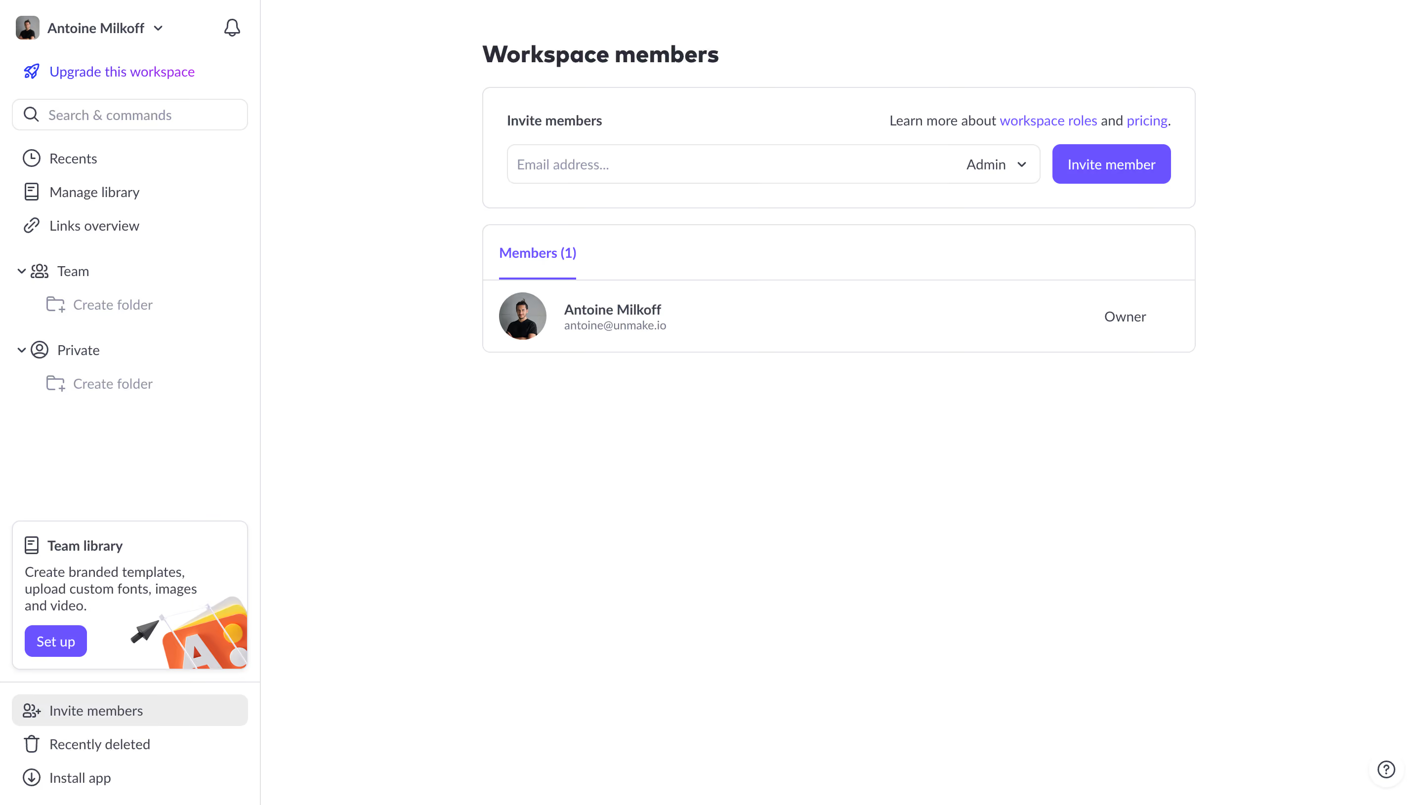
This is a solid member management screen from what looks like a design or content tool. The layout is dead simple. You've got the invite section up top, member list below. No clutter, no confusion. The purple accent color on the "Invite member" button and the active tab underline gives just enough visual punch without going overboard.
Typography that stays out of the way
The type hierarchy is quiet but effective. Bold header, medium-weight names, lighter email addresses in gray. Everything reads fast. The role label "Owner" sits right-aligned, which keeps the scan pattern predictable. You always know where to look.
The sidebar does a lot without feeling heavy
Left nav packs in search, library management, team folders, and a promo card for "Team library" with a friendly illustration and a small purple CTA. That bottom section with "Invite members," "Recently deleted," and "Install app" feels practical. It's not trying to impress you. It just works. The whole page feels like it respects your time.