Design with AI
Generate a new design based on this screen using your own content.
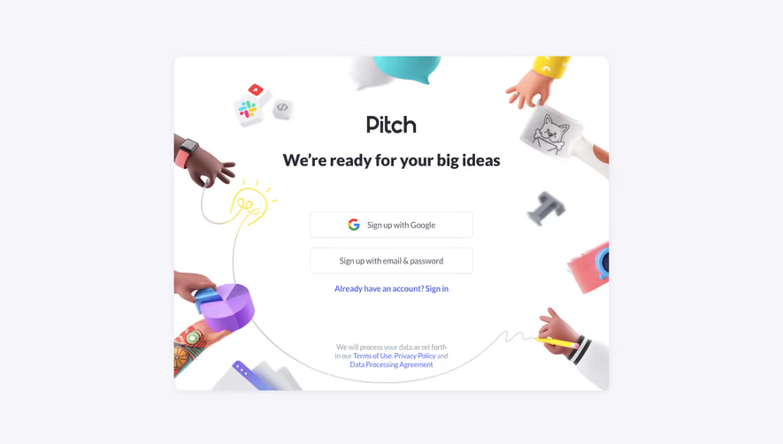
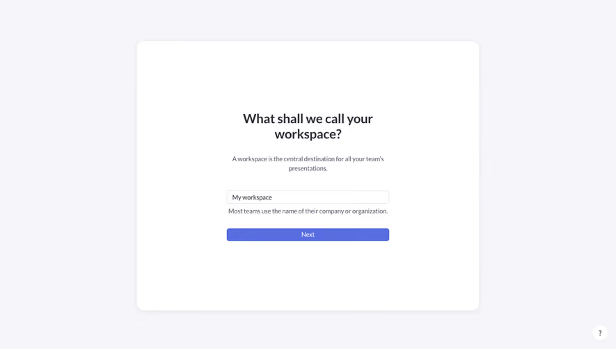
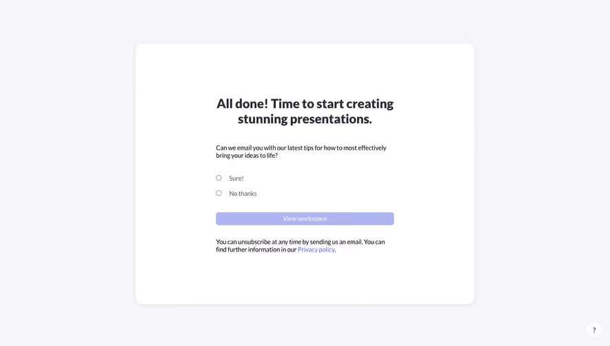
# Design from Reference: Pitch Sign Up Flow
Create an original, high-fidelity visual design inspired by the reference. Prioritize composition, typography, colors, spacing, and component styling over technical implementation.
## Reference
- **Product:** Pitch
- **Category:** Account Setup
- **Screenshot:** https://cdn.prod.website-files.com/5e9dc792e1210c5325f7ebbc/6acbbed039e7f22db4028a6f_6acbbe17aa23dc1cf5a935ed_cms-7a094284bf94015526ddd3b9.webp
Analyze the screenshot first. If inaccessible, request it rather than guessing.
## Content
{{content.instructions}}
{{content.data}}
Preserve essential messaging and factual accuracy. Adapt structure and copy length for visual balance; never invent product claims.
## Visual Design
### Overall aesthetic
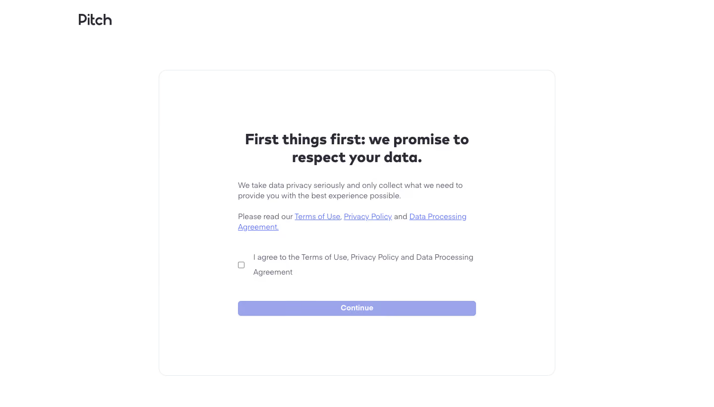
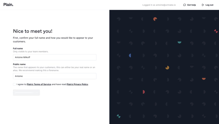
- **Character:** A minimal signup consent screen uses an almost entirely white canvas, a thin outlined panel and a muted lavender action.
- **Tone:** Friendly bold typography and generous whitespace make the legal acknowledgement feel calm and focused.
### Page composition
- **Capture:** The source measures 1440 × 821 image pixels. Observed dimensions below approximate CSS only under an unverified 1× capture assumption.
- **Brand:** A dark Pitch wordmark sits near x=155, y=26, outside the main panel.
- **Panel:** A centered white rectangle approximately 800 × 615 px begins around x=320, y=140, with a fine gray outline and roughly 16 px corners.
- **Content column:** A roughly 480 px wide inner block contains a centered two-line heading, left-aligned explanatory paragraphs, an unchecked agreement row and a full-width Continue button.
### Information hierarchy
- **Heading:** A bold two-line privacy reassurance is the primary visual anchor.
- **Supporting copy:** A short explanation precedes a paragraph containing three underlined policy links.
- **Consent:** A small unchecked box aligns beside a two-line agreement label, clearly separated from the policy paragraph.
- **Continuation:** The lavender button sits below the acknowledgement with a broad vertical gap. Its muted appearance is visible; disabled behavior cannot be confirmed from pixels alone.
### Typography
- **Family:** A rounded-looking sans serif is used, with a heavier display treatment for the heading. Exact font identity is unverified.
- **Heading:** Approximately 30 px, bold, with around 36 px line height and centered alignment.
- **Body:** Approximately 16 px with 21–22 px leading, using muted blue-gray text.
- **Action:** The Continue label is white, approximately 16 px and semibold, centered in the control.
### Colors & surfaces
- **Measured foundation:** ICC-aware sRGB sampling yields white #FFFFFF and border gray #E6E9EB.
- **Measured heading:** Dark blue-black #2B2A35 anchors the wordmark and heading.
- **Measured action:** The broad button uses lavender #9CA5EC, with related edge pixels including #969EDE.
- **Links and copy:** Policy links use a brighter violet-blue with visible underlines; supporting copy uses a muted gray-violet.
### Components
- **Outlined panel:** A single hairline border defines the container without a prominent shadow or contrasting fill.
- **Policy links:** Three inline underlined links wrap naturally across two lines rather than appearing as separate buttons.
- **Agreement control:** A small square outline checkbox sits left of a multiline label, with approximately 18 px separation.
- **Continue button:** A roughly 480 × 30 px rectangle has approximately 6 px corners and a very subtle lower shadow.
### Visual rhythm
- **Panel padding:** Large top and bottom insets surround the compact consent block, leaving substantial breathing room.
- **Content gaps:** The heading is followed by roughly 30–35 px before body copy; the consent row and continuation action each receive larger pauses.
- **Alignment:** Paragraphs, checkbox and button share the inner column edges, while the heading alone is centered.
### Responsive
- **Evidence boundary:** Only one desktop state is visible; responsive behavior is a recommendation.
- **Fluid container:** Reduce outer panel margins and padding on narrow screens, keeping the inner content fluid.
- **Text wrapping:** Allow policy links and the agreement label to wrap without truncation or separating the checkbox from its label.
- **Touch targets:** Increase the practical checkbox and button hit areas for touch devices while preserving the restrained visual style.
### Adaptation guidance
- **Consent structure:** Keep explanation, policy access, explicit acknowledgement and continuation in a clear sequence.
- **Accessible interaction:** Associate the entire agreement label with its checkbox and provide visible keyboard focus on links and controls.
- **State design:** Define checked, enabled, disabled and error states explicitly; only the unchecked static state is shown.
- **Content management:** Use maintained policy labels/URLs and application-specific copy rather than treating screenshot text as legal guidance.
- **Scale calibration:** Validate the observed dimensions against the target viewport before assigning CSS values.
Use this context to reproduce the reference's visual language: layout, typography, colors, spacing, borders, radii, and distinctive elements. The screenshot takes priority if descriptions conflict.
## Direction
{{preferences.fidelityInstructions}}
## Output
{{output.instructions}}
Deliver a polished, cohesive design with precise alignment, hierarchy, and spacing. Produce the requested visual artifact, not just a description. If unsupported, explain the limitation.