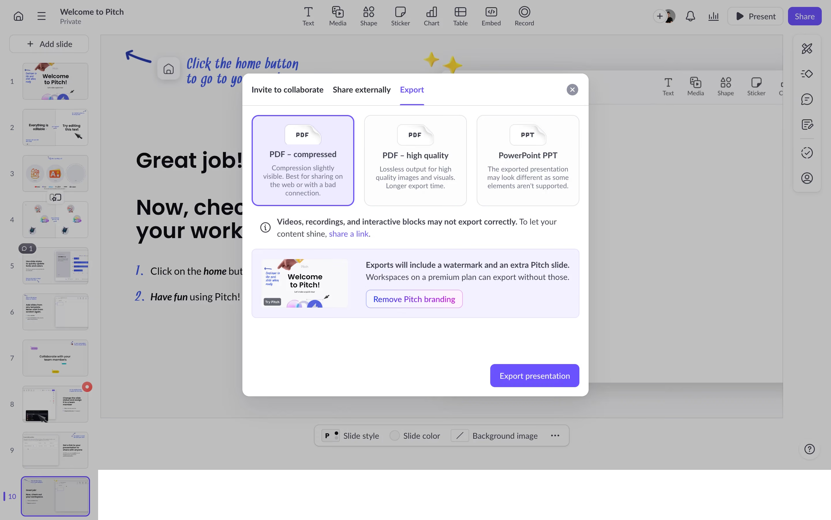
Generate a new design based on this screen using your own content.
Thank you! Your submission has been received!
Oops! Something went wrong while submitting the form.
# Design from Reference: Pitch Export Presentation
Create an original, high-fidelity visual design inspired by the reference. Prioritize composition, typography, colors, spacing, and component styling over technical implementation.
## Reference
- **Product:** Pitch
- **Category:** Share
- **Screenshot:** https://cdn.prod.website-files.com/5e9dc792e1210c5325f7ebbc/6aca27ebaca7079066e8e84f_6aca270d0ec993085a6cfcf6_cms-199ed5ca6c98f22c458cf590.webp
Analyze the screenshot first. If inaccessible, request it rather than guessing.
## Content
{{content.instructions}}
{{content.data}}
Preserve essential messaging and factual accuracy. Adapt structure and copy length for visual balance; never invent product claims.
## Visual Design
Use this context to reproduce the reference's visual language: layout, typography, colors, spacing, borders, radii, and distinctive elements. The screenshot takes priority if descriptions conflict.
## Direction
{{preferences.fidelityInstructions}}
## Output
{{output.instructions}}
Deliver a polished, cohesive design with precise alignment, hierarchy, and spacing. Produce the requested visual artifact, not just a description. If unsupported, explain the limitation.
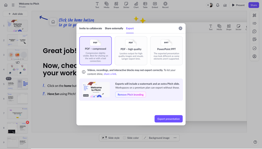
This is Pitch's export dialog and it's a great example of how to handle a multi-option selection without overwhelming the user. Three export formats laid out as cards with clear icons, short descriptions, and just enough context to make a decision. The selected state on "PDF – compressed" uses a subtle blue border that feels intentional without screaming at you.
Smart Visual Hierarchy
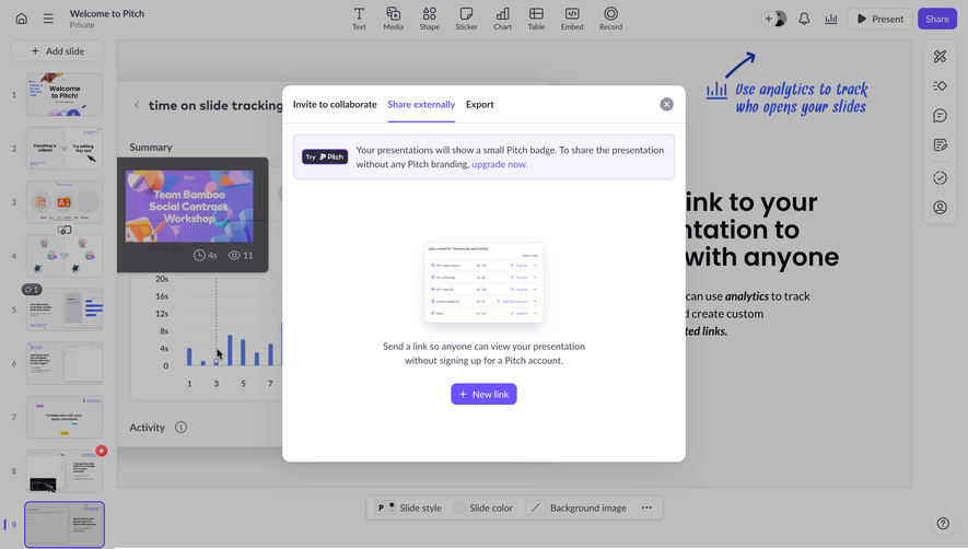
The warning about videos and interactive blocks sits right where you need it. Yellow-ish info icon, plain text, inline link. No drama. Below that, the upsell for removing Pitch branding is boxed but not aggressive. It shows a preview thumbnail of the watermarked slide which is a clever touch. The purple "Export presentation" button anchors everything at the bottom right. Your eye naturally flows: pick format, read caveats, hit export.
Typography and Color That Stay Out of the Way
Soft grays for secondary text, darker weights for card titles. The purple accent is consistent with Pitch's brand throughout. Tab navigation up top keeps things organized. Functional and honest design.