Overall Style and Aesthetic
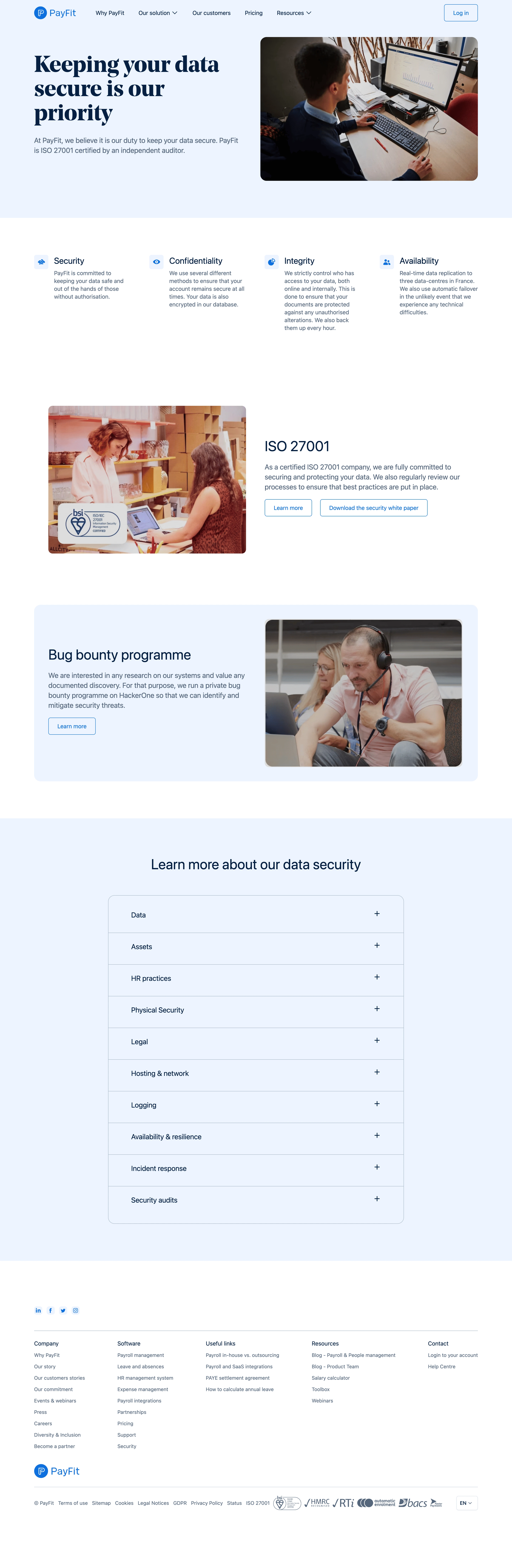
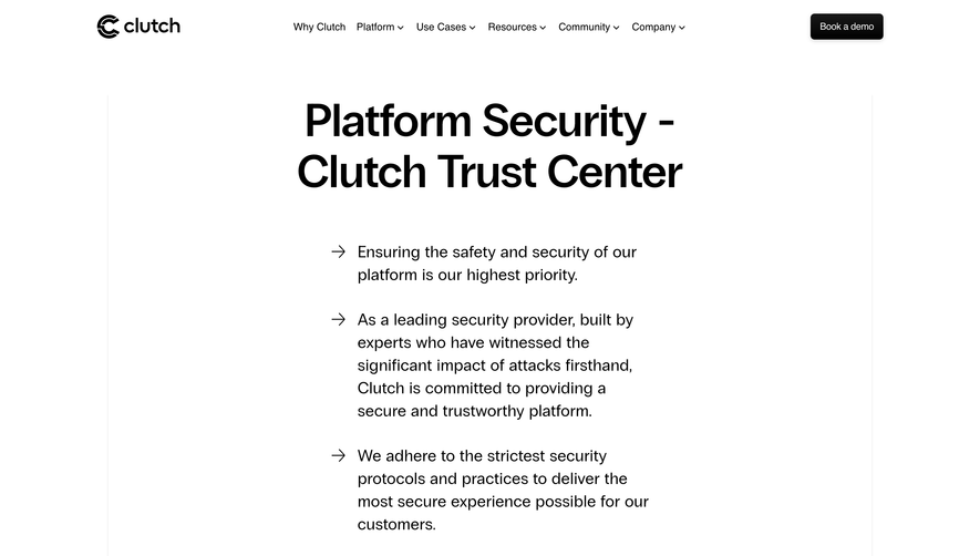
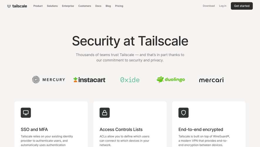
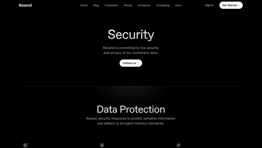
PayFit’s security page exudes a clean, minimalist professionalism with subtle hints of brand character. The modern design employs generous white space and balanced proportions, creating a sense of trust, clarity, and calm. The aesthetic merges technical seriousness—vital for a security-focused SaaS—with approachable, effortless navigation. Layout and Structure
The structure is immediately logical and reassuring. A commanding hero section introduces the page with a bold headline and transparent reassurance, supported by a subheading and a prominent visual (illustration). As you scroll, content is organized into clearly segmented sections for security standards, certifications, data privacy, and compliance, each supported by succinct text blocks and pertinent icons. No testimonials or pricing clutter; the focus remains singular and impactful. The footer is comprehensive yet unobtrusive, consolidating secondary links and corporate information. Visual Elements
Custom illustrations and icons play a starring role, reinforcing abstract security concepts with engaging, on-brand visuals. Soft, geometric vectors blend seamlessly with the interface, while occasional micro-animations add dynamism without distraction. There’s a deliberate absence of photography or video, driving focus on clarity and simplified trust. Color Palette and Typography
A restrained palette of blues and whites underscores trust and security, subtly accented by the brand’s signature colors for highlights and interactive elements. Typography is crisp and readable: a modern sans-serif for headings, slightly softer for body text. Hierarchies are clear, leveraging boldness and spacing rather than overwhelming size shifts. User Experience Patterns & Unique Choices
Navigation is intuitive, with a sticky header for easy access to sections. Calls-to-action are sparing but noticeable, geared toward further reading or contact, never intrusive. Notably, the page prioritizes educational content and transparency, exuding authority while remaining welcoming—a design that feels secure, not intimidating.