Design with AI
Generate a new design based on this screen using your own content.
# Design from Reference: Payfit Invite Team Members
Create an original, high-fidelity visual design inspired by the reference. Prioritize composition, typography, colors, spacing, and component styling over technical implementation.
## Reference
- **Product:** Payfit
- **Category:** Invite Team Members
- **Screenshot:** https://cdn.prod.website-files.com/5e9dc792e1210c5325f7ebbc/6acbbf764d71070f5fd414b3_6acbbe9f0938cef5945ace9c_cms-4962a25aa08eea7677a59b9b.webp
Analyze the screenshot first. If inaccessible, request it rather than guessing.
## Content
{{content.instructions}}
{{content.data}}
Preserve essential messaging and factual accuracy. Adapt structure and copy length for visual balance; never invent product claims.
## Visual Design
### Overall aesthetic
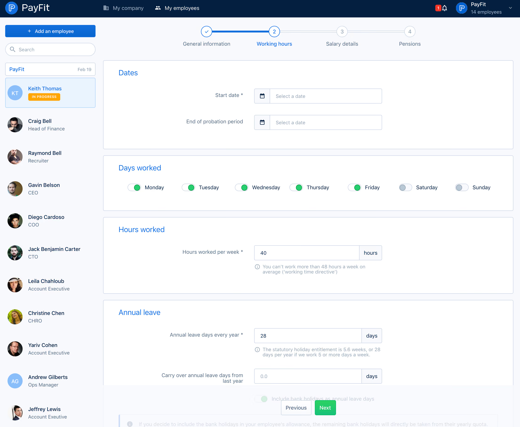
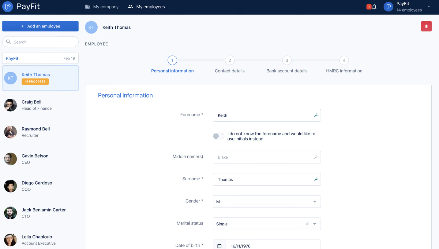
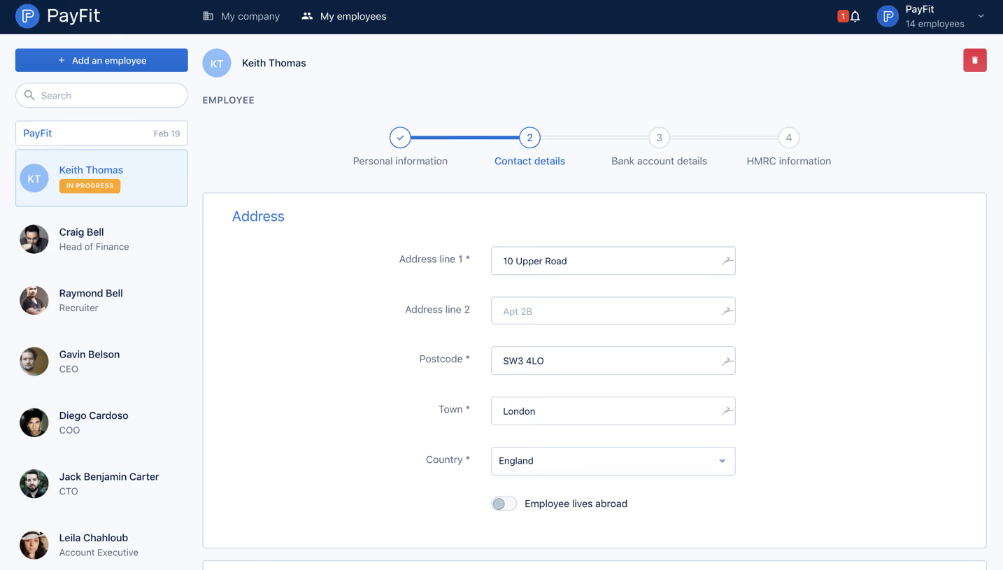
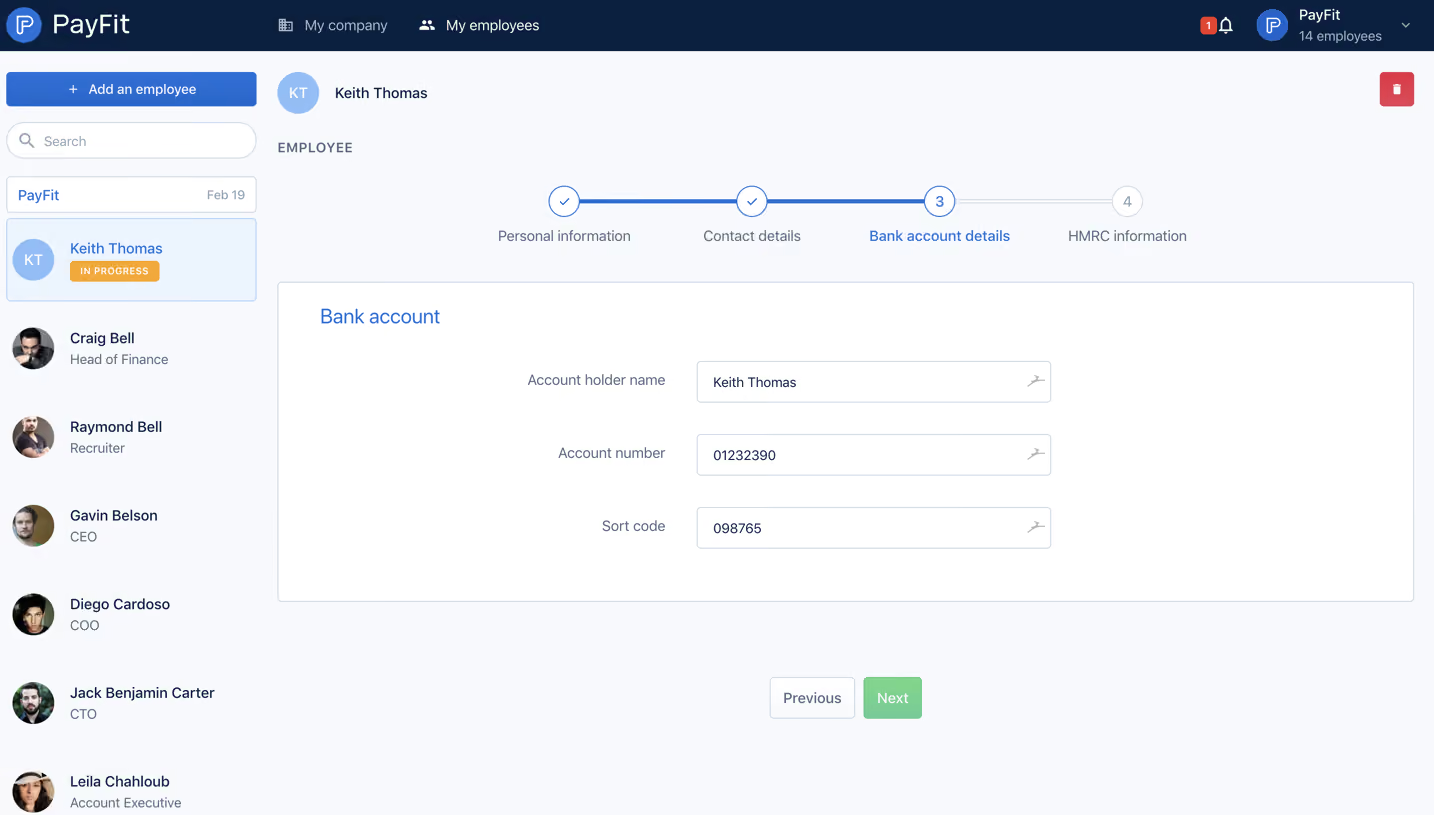
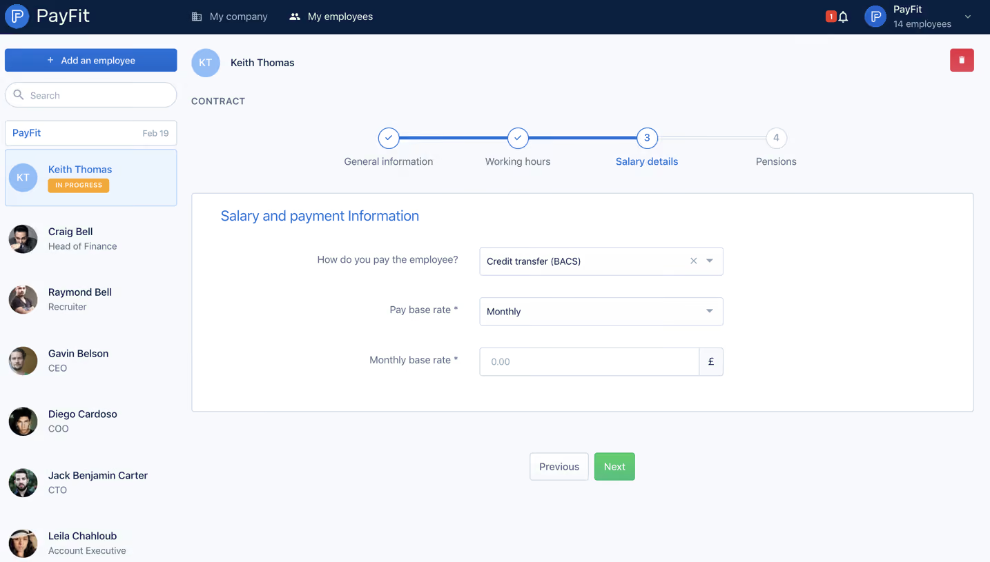
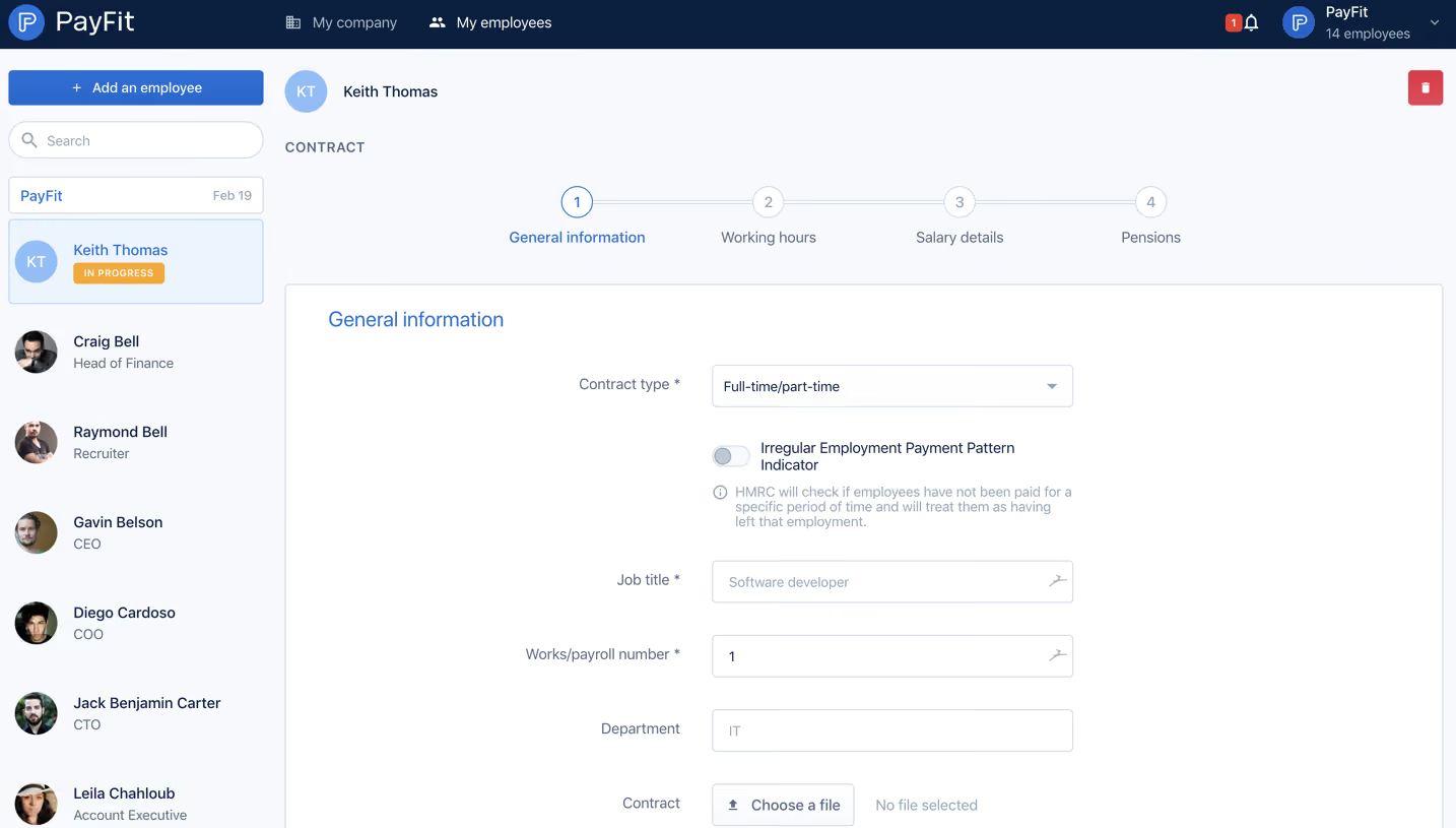
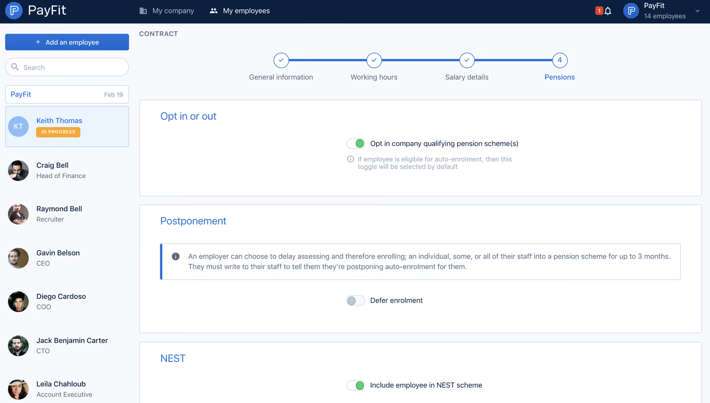
- **Style:** A light employee-setup form uses a navy header, pale workspace, blue section headings and thin outlined panels.
- **Character:** A dense employee list frames a spacious, structured working-hours form.
### Page composition
- **Capture:** The source measures 2210 × 1814 pixels. Measurements below refer to the 1400-pixel-wide inspection rendition, not verified CSS dimensions.
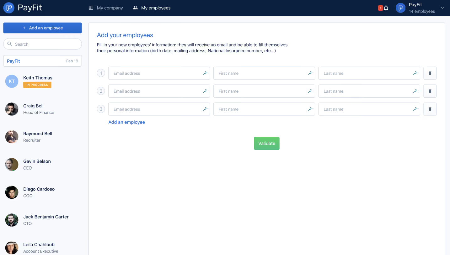
- **Header:** A dark navy bar contains brand and company/employee navigation left, with notification/account controls right.
- **Sidebar:** A roughly 270-pixel column contains Add an employee, search, organization row and a long employee list.
- **Progress:** Four connected numbered steps span the top of the main area; the second step is active and the first complete.
- **Form:** Stacked white outlined panels contain Dates, Days worked, Hours worked and Annual leave.
- **Footer actions:** A pale fixed-looking lower band contains Previous and green Next controls; content continues beneath the captured edge.
### Information hierarchy
- **Progress:** Blue line/check and active label distinguish completed/current steps from gray future steps.
- **Section headings:** Blue labels introduce each form group.
- **Fields:** Right-aligned labels precede date inputs, numeric values and unit suffixes.
- **Guidance:** Small muted information text appears beneath numeric fields.
- **Selection:** The current employee has a pale-blue card and orange In progress badge.
### Typography
- **Family:** Neutral sans serif; exact identity is unverified.
- **Section headings:** Approximately 20 inspection pixels, regular.
- **Labels/body:** Around 14 pixels.
- **Employee names:** Around 14 pixels, medium; roles are slightly smaller/muted.
- **Guidance:** Around 13 pixels with compact leading.
- **Progress:** Approximately 14 pixels.
### Colors & surfaces
- **Measured base:** White #FFFFFF and pale #F7F9FC/#F9FAFD define panels and workspace.
- **Header:** Navy #041F40 supplies strong contrast.
- **Borders:** Cool gray #D0DAE6 outlines form controls and panels.
- **Selection:** Pale blue #EAF4FF supports the active employee.
- **Actions/state:** Blue marks headings/progress, green marks weekday toggles and Next, orange marks the status badge.
### Components
- **Date fields:** Outlined rectangles with separate calendar-icon compartments.
- **Day toggles:** Seven compact switches sit in one row; weekdays are green/on and weekend switches gray/off.
- **Numeric fields:** Wide inputs end in separate hours/days unit boxes.
- **Employee rows:** Circular portraits or initials precede name/role text.
- **Progress tracker:** Four outlined circles connect by blue/gray horizontal lines.
- **Form panels:** Thin cool outlines, small corners and generous inner space.
- **Bottom controls:** Small outlined Previous and filled green Next buttons sit side by side.
### Visual rhythm
- **Panel spacing:** Consistent narrow vertical gaps separate large form groups.
- **Field alignment:** Labels and inputs form a stable two-column axis.
- **Sidebar cadence:** Even portrait-row spacing contrasts with the open main form.
- **Clipping:** The lower annual-leave content is partially obscured by the bottom band/capture edge.
### Responsive
- **Evidence:** Only desktop is shown; mobile and expanded date-picker states are unverified.
- **Recommended reflow:** Collapse employee navigation, stack labels above fields and wrap day toggles.
- **Progress:** Retain clear current-step text when four labels no longer fit.
- **Accessibility:** Associate guidance with inputs and expose switch states through labels.
### Adaptation guidance
- **Preserve:** Keep the clear step tracker, outlined groups and blue/green state system.
- **Scope:** The image shows employee working-hours setup, not a team-invitation form.
- **Content:** Use supplied employee and policy data; do not treat captured leave/hour guidance as current legal requirements.
- **Behavior:** Date selection, validation and progression results are not shown.
Use this context to reproduce the reference's visual language: layout, typography, colors, spacing, borders, radii, and distinctive elements. The screenshot takes priority if descriptions conflict.
## Direction
{{preferences.fidelityInstructions}}
## Output
{{output.instructions}}
Deliver a polished, cohesive design with precise alignment, hierarchy, and spacing. Produce the requested visual artifact, not just a description. If unsupported, explain the limitation.