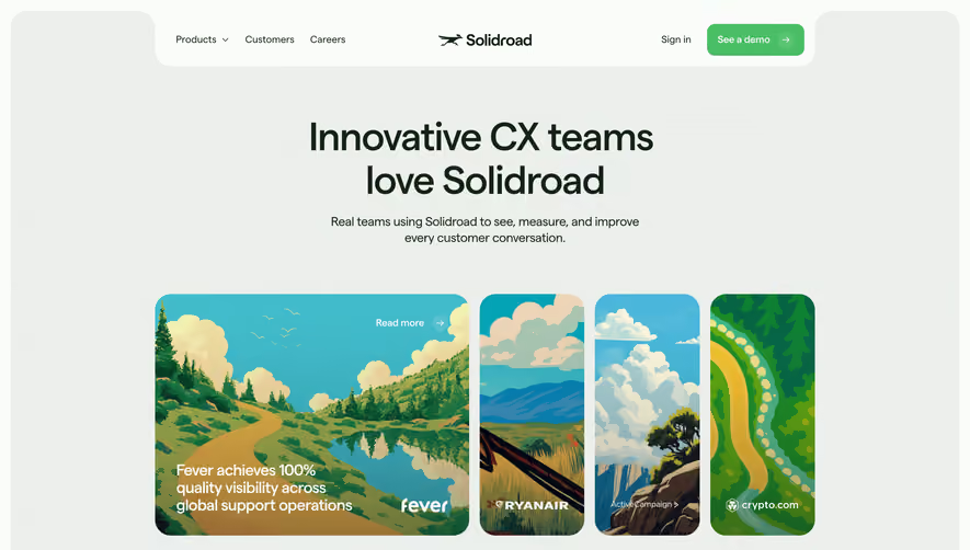
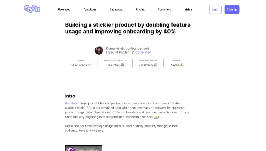
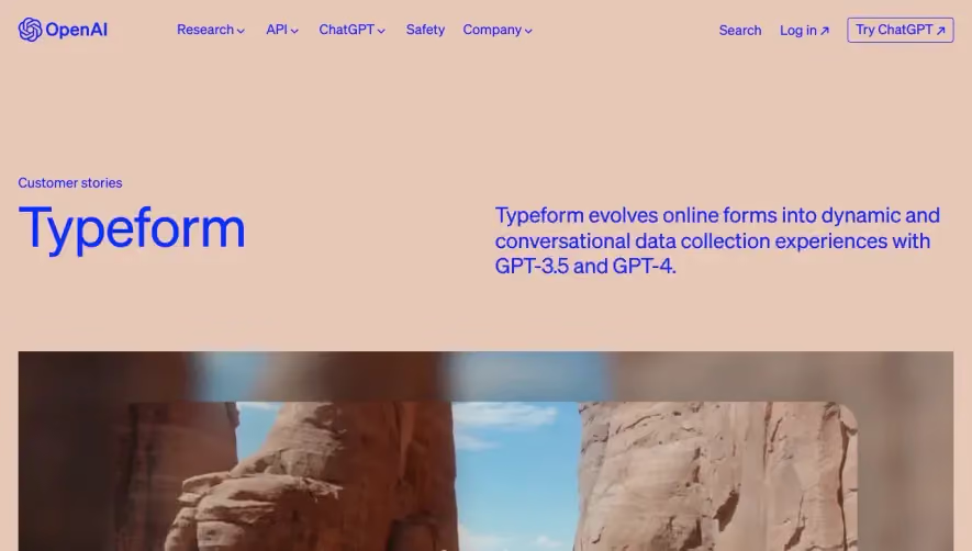
Overall Style and Aesthetic
The PandaDoc Autodesk case study page epitomizes a modern and professional SaaS aesthetic. The design is sleek and uncluttered, leveraging white space for clarity and focus. Pops of PandaDoc’s signature green provide an energetic contrast without overwhelming, keeping the tone trustworthy and business-ready but approachable. Layout and Structure
The layout follows a clear, intuitive flow. A prominent hero section features a customer quote and a visual of the Autodesk team, instantly establishing authenticity. Scrolling reveals concise sub-sections: challenge/solution highlights, measurable outcomes, and supporting testimonials. The content hierarchy guides users seamlessly from the story’s intro to actionable insights. CTAs like "Try PandaDoc free" remain visible but unobtrusive, encouraging engagement at each stage. Visual Elements
Photography takes center stage, with high-quality imagery of real clients building trust and a sense of realism. Clean iconography punctuates the data points, while subtle design accents—curved lines and background panels—soften the look and add depth. The page forgoes flashy animations in favor of crisp transitions, putting the story and results front and center. Color Palette and Typography
A disciplined color scheme combines white backgrounds, emerald green accents, and muted grays. Headings use a bold, sans-serif font for immediate readability, with subheads and body text set in lighter, complementary weights. Typography hierarchy is clear: strong headlines, punchy pull quotes, and legible details. User Experience Patterns
Navigation is streamlined—fixed header links keep resources within reach, while sticky CTAs reduce friction. Cards, bold data callouts, and scannable lists organize content efficiently. Scroll cues and content spacing enhance orientation, ensuring a frictionless reading experience. Unique or Notable Design Choices
What stands out is the blend of real customer imagery with quantifiable impact, showcased in an at-a-glance, narrative-driven layout. The design’s restraint highlights user stories and outcomes, making it a compelling reference for SaaS brands aiming to balance professionalism and personality.