Design with AI
Generate a new design based on this screen using your own content.
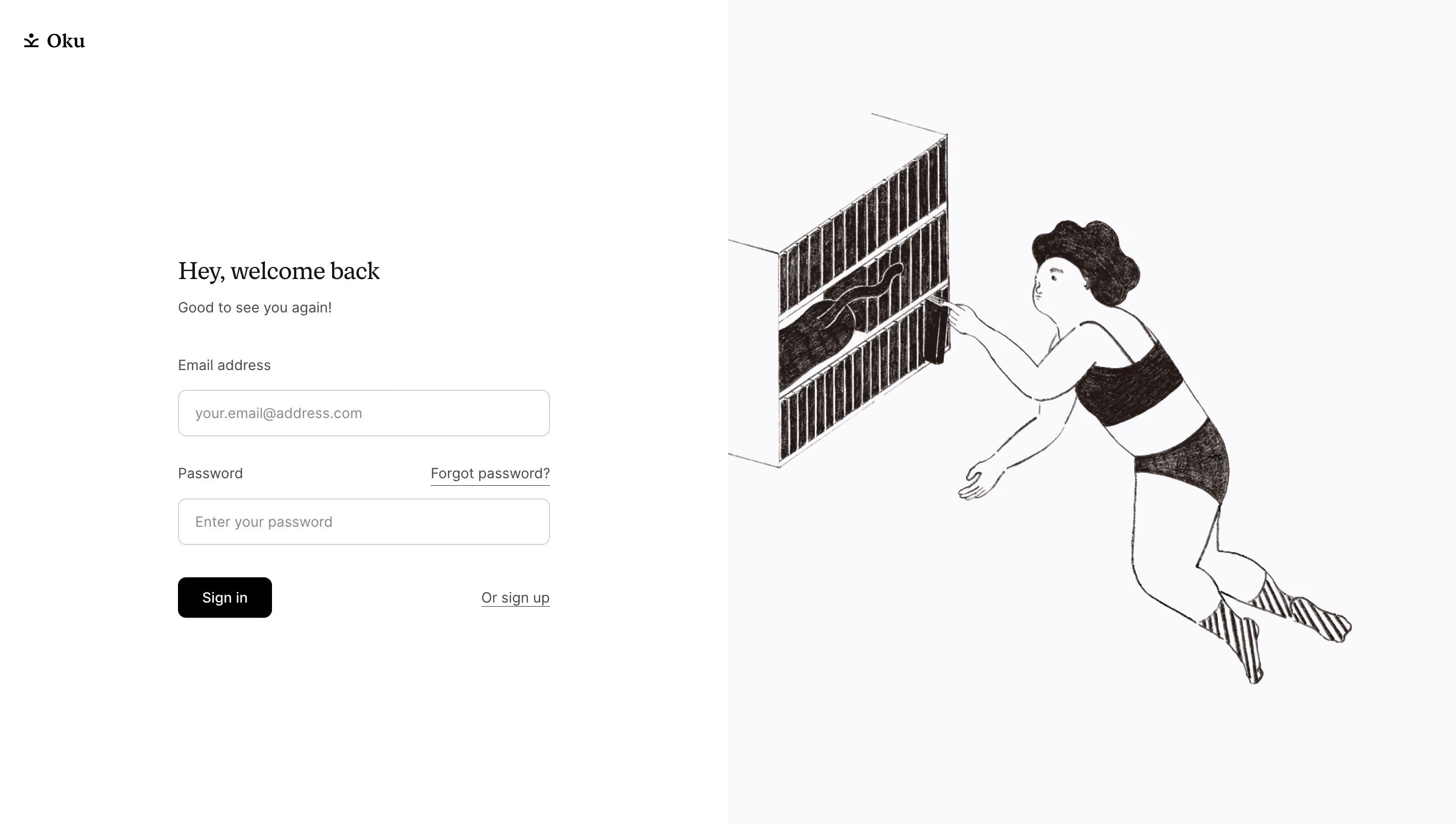
# Design from Reference: Oku Login Page
Create an original, high-fidelity visual design inspired by the reference. Prioritize composition, typography, colors, spacing, and component styling over technical implementation.
## Reference
- **Product:** Oku
- **Category:** Login
- **Screenshot:** https://cdn.prod.website-files.com/5e9dc792e1210c5325f7ebbc/6acad62bfef6904ce0090e7a_6acad5b011963fdadfb68e2b_cms-788a080de61f03b43183e9b8.webp
Analyze the screenshot first. If inaccessible, request it rather than guessing.
## Content
{{content.instructions}}
{{content.data}}
Preserve essential messaging and factual accuracy. Adapt structure and copy length for visual balance; never invent product claims.
## Visual Design
### Overall aesthetic
- **Character:** Quiet, literary login screen with a serif greeting and charming monochrome illustration.
### Page composition
- **Canvas:** 2880 × 1630 screenshot pixels; CSS estimates assume approximately 2× scale.
- **Structure:** Equal vertical halves. White left half contains a small upper-left logo and centered narrow login form; pale right half contains an oversized hand-drawn floating reader reaching toward a bookshelf.
### Information hierarchy
- **Priority:** Greeting, supporting sentence, email/password fields and black Sign in action.
- **Secondary links:** Forgot password aligns with its field label; sign-up link sits opposite the primary action.
### Typography
- **Families:** Serif greeting and brand treatment paired with sans-serif controls; exact fonts are unverified.
- **Scale:** Estimated CSS heading 24px, body/labels 14px and controls 14px.
### Colors & surfaces
- **Sampled palette:** White #FFFFFF; pale right background #FAFAFB; warm ink #231816; black #000000; border gray #D1D1D3.
- **Treatment:** Illustration retains textured dark strokes rather than flat vector fills.
### Components
- **Form:** Approximately 368px CSS wide, with 46px-high outlined inputs, 8px radii and 16px internal padding.
- **Actions:** Compact black rounded button and underlined secondary links; no enclosing form card.
### Visual rhythm
- **Spacing:** About 28–32px between field groups; large blank margins around the centered form.
- **Balance:** The large organic illustration offsets the small rectilinear login area.
### Responsive
- **Guidance:** Mobile is not shown. Keep the form primary, reduce illustration scale or move it below and retain clear label/link separation.
### Adaptation guidance
- **Transfer:** Preserve the literary serif/sans pairing, warm monochrome drawing and restrained login structure. Use original illustration and target authentication copy.
Use this context to reproduce the reference's visual language: layout, typography, colors, spacing, borders, radii, and distinctive elements. The screenshot takes priority if descriptions conflict.
## Direction
{{preferences.fidelityInstructions}}
## Output
{{output.instructions}}
Deliver a polished, cohesive design with precise alignment, hierarchy, and spacing. Produce the requested visual artifact, not just a description. If unsupported, explain the limitation.