Design with AI
Generate a new design based on this screen using your own content.
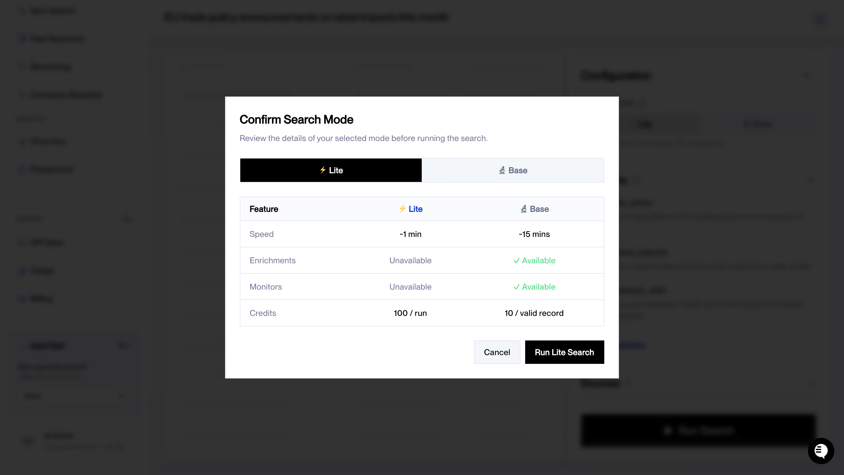
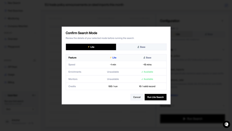
# Design from Reference: NewsCatcher Confirm Search Mode
Create an original, high-fidelity visual design inspired by the reference. Prioritize composition, typography, colors, spacing, and component styling over technical implementation.
## Reference
- **Product:** NewsCatcher
- **Category:** Confirmation
- **Screenshot:** https://cdn.prod.website-files.com/5e9dc792e1210c5325f7ebbc/6acad0e15af75170c4bbe292_6acad0735af75170c4bbc16c_cms-09f275cca8c40a515127c28b.webp
Analyze the screenshot first. If inaccessible, request it rather than guessing.
## Content
{{content.instructions}}
{{content.data}}
Preserve essential messaging and factual accuracy. Adapt structure and copy length for visual balance; never invent product claims.
## Visual Design
### Overall aesthetic
- **Character:** A utilitarian confirmation dialog uses stark black actions, white surface and a compact feature comparison.
- **Focus:** A dark blurred overlay makes the mode-selection decision the sole prominent element.
### Page composition
- **Capture scale:** The original is 2880 × 1624 pixels. A 2× capture is plausible but unverified; sizes below estimate CSS pixels at half source resolution.
- **Dialog:** A centered approximately 670 × 480-pixel white rectangle contains heading, helper sentence, two-part selector, comparison table and footer actions.
- **Backdrop:** A sidebar and search-configuration workspace remain blurred behind the overlay.
- **Actions:** Cancel and Run Lite Search align at the lower right; a small chat control remains at the screen corner.
### Information hierarchy
- **Decision:** The bold title introduces review before execution.
- **Selection:** The black Lite segment clearly contrasts with the pale Base segment.
- **Comparison:** Four rows compare speed, enrichment, monitoring and credits across two modes.
- **Commitment:** The black run action is stronger than the pale cancel control.
### Typography
- **Family:** A compact sans serif is used; exact identity is unverified.
- **Heading:** Approximately 20 pixels, bold.
- **Body/table:** Around 14 pixels, with heavier column headings and muted feature labels.
- **Controls:** Compact 14-pixel labels use white on black for the selected mode and primary action.
### Colors & surfaces
- **Measured overlay:** #333333 dominates the dimmed backdrop, with nearby #313132/#323232 variations.
- **Measured dialog:** White #FFFFFF provides the focus surface.
- **Measured action:** Black #000000 marks selected mode and run action.
- **Measured soft surface:** Near-white #FAFBFC appears in pale supporting regions; green availability text adds a localized positive cue.
### Components
- **Mode switch:** A full-width rectangular two-segment control is around 42 pixels high, with icons beside labels.
- **Comparison table:** A thin pale outline encloses header and four approximately 45-pixel rows, separated by fine horizontal rules.
- **Status cells:** Green checkmarks and availability wording distinguish supported features from muted unavailable labels.
- **Buttons:** Small square-cornered rectangles sit side by side with a narrow gap.
- **Dialog shell:** The surface has sharp corners and roughly 24-pixel internal padding.
### Visual rhythm
- **Alignment:** Selector and table share the same full-width edges.
- **Spacing:** Approximately 24-pixel gaps separate major groups, while table rows remain compact.
- **Balance:** Right-aligned actions leave generous blank space on the lower left.
### Responsive
- **Observed state:** Only desktop is shown; compact behavior is unverified.
- **Recommended dialog:** Fit within viewport padding and allow vertical scrolling.
- **Recommended comparison:** Preserve row/column labels through a readable compact table or stacked mode details.
### Adaptation guidance
- **Preserve clarity:** Keep selection, comparison and execution visibly separate.
- **State fidelity:** Reproduce Lite selection without assuming a search was run.
- **Content scope:** Treat timing and credit values as captured information rather than verified performance.
- **Accessibility:** Expose selection state, table headers and modal focus semantics.
Use this context to reproduce the reference's visual language: layout, typography, colors, spacing, borders, radii, and distinctive elements. The screenshot takes priority if descriptions conflict.
## Direction
{{preferences.fidelityInstructions}}
## Output
{{output.instructions}}
Deliver a polished, cohesive design with precise alignment, hierarchy, and spacing. Produce the requested visual artifact, not just a description. If unsupported, explain the limitation.