
Thank you! Your submission has been received!
Oops! Something went wrong while submitting the form.
Get SaaSFrame Pro
Monthly
$18
Quarterly
$48
Yearly
$180
Upgrade to access this feature
Browse all screens & flows
Filter and search screens & flows
Access Figma files
Access mobile versions
Bookmark screens & flows
Join now
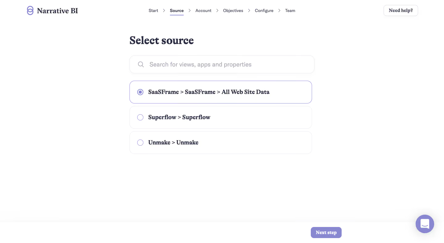
Narrative BI User Onboarding

Narrative BI
Actionable Analytics for Growth teams
Designed by


Bookmark
Bookmark

Design with AI
Thank you! Your submission has been received!
Oops! Something went wrong while submitting the form.
# Design from Reference: Narrative BI User Onboarding
Create an original, high-fidelity visual design inspired by the reference. Prioritize composition, typography, colors, spacing, and component styling over technical implementation.
## Reference
- **Product:** Narrative BI
- **Category:** User Onboarding
- **Screenshot:** https://cdn.prod.website-files.com/5e9dc792e1210c5325f7ebbc/6acc0d3aea6cae5cb6f1c27a_6acc084b8ad16bb773d3ec18_cms-a6f20c79fa0a750296ce856e-v3.webp
Analyze the screenshot first. If inaccessible, request it rather than guessing.
## Content
{{content.instructions}}
{{content.data}}
Preserve essential messaging and factual accuracy. Adapt structure and copy length for visual balance; never invent product claims.
## Visual Design
### Overall aesthetic
- **Style:** Sparse data-source selection step in a guided analytics onboarding flow.
- **Character:** White canvas, dark serif headings/option labels, lavender accents and pale rounded outlines.
- **Surface treatment:** Flat page with a few softly bordered controls, minimal shadows and a persistent lower action area.
### Page composition
- **Capture dimensions:** 1440 × 789 image px. CSS reconstruction estimates assume an unverified 1× capture.
- **Header:** Narrative BI logo left, six-step progress navigation centered and outlined Need help control right.
- **Progress sequence:** Start, Source, Account, Objectives, Configure and Team are separated by chevrons; Source is emphasized and underlined.
- **Content column:** Approximately 600 px wide, beginning around x=420, y=115 px.
- **Selection area:** Select source heading sits above a wide search field and three stacked radio-option rows.
- **Bottom region:** A white action strip runs along the bottom with Next step aligned near the content column's right edge.
- **Support:** Lavender circular chat launcher floats at the lower right. Large blank space separates options from the bottom controls.
### Information hierarchy
- **Current task:** Select source is the main heading; progress navigation establishes its place in the setup sequence.
- **Search:** A magnifier and placeholder explain that views, apps and properties can be searched.
- **Options:** Each row presents a hierarchical source path. The first is selected through a filled lavender radio and stronger border.
- **Next action:** A filled lavender Next step control is the primary continuation route.
- **Evidence limit:** No search results, loading state, unavailable source or subsequent account step is shown.
### Typography
- **Heading/labels:** Dark, bold serif treatment gives the screen a distinctive editorial tone. Exact family is unverified.
- **Heading:** Approximately 36 px bold with 42 px leading.
- **Option text:** Approximately 20 px bold serif, vertically centered within each row.
- **Search:** Approximately 20 px neutral sans serif, muted gray-lavender.
- **Progress:** Approximately 14 px sans serif; active Source is heavier.
- **Buttons:** Approximately 16 px bold serif. All values are visual CSS estimates under the assumed 1× scale.
### Colors & surfaces
- **Canvas:** Sampled sRGB #FFFFFF dominates the screen.
- **Primary ink:** Sampled #2A2C44 supplies the dark navy-purple text reference.
- **Accent:** Sampled #8788CF supplies the lavender selected-state/action reference.
- **Borders:** Sampled #ECEBF1 supplies pale control outlines.
- **Secondary text:** Muted gray-lavender appears in search and progress labels; exact value is not established by the dominant-color sample.
- **Contrast:** Selected source has a more visible lavender outline while unselected rows remain nearly neutral.
### Components
- **Search field:** Approximately 600 × 58 px, rounded around 16 px, thin pale border and leading magnifier.
- **Option rows:** Approximately 590–600 × 74 px, around 16 px radii, with roughly 10 px vertical gaps.
- **Radios:** Small outlined lavender circles, approximately 20 px across; selected option has an inner filled dot.
- **Progress navigation:** Text/chevron sequence with a thin underline under the active step.
- **Help control:** Small white outlined rounded rectangle, dark serif label.
- **Next action:** Compact lavender rounded rectangle, approximately 100 × 38 px, white label.
- **Chat launcher:** Approximately 60 px lavender circle with white speech icon and soft shadow.
### Visual rhythm
- **Alignment:** Heading, search and option rows share one left edge; the main action aligns toward their right edge.
- **Spacing:** Compact repeated option rows contrast with broad lower-page whitespace.
- **Hierarchy:** Serif weight provides emphasis without large color blocks or illustrations.
- **Progress rhythm:** Small evenly spaced step labels keep navigation secondary to source selection.
### Responsive
- **Evidence limit:** Only desktop is shown; recommendations below are not observed behavior.
- **Column recommendation:** Use available width with 20–24 px margins and allow long source paths to wrap.
- **Progress recommendation:** Simplify to current-step context or accessible horizontal scrolling on phones.
- **Action recommendation:** Keep continuation visible without covering option content.
- **Accessibility recommendation:** Group and label radios, expose current step and provide keyboard focus; these behaviors are not verified by the capture.
### Adaptation guidance
- **Preserve one clear choice:** Present real available sources with meaningful hierarchy and searchable labels.
- **Use accurate state:** Select only the actual chosen source and derive continuation availability from valid setup.
- **Retain visual identity:** Pair serif emphasis with restrained lavender accents and white space.
- **Avoid invented options:** Populate rows from the target account's available data connections.
- **Support long labels:** Preserve full source identity rather than truncating essential distinctions.
Use this context to reproduce the reference's visual language: layout, typography, colors, spacing, borders, radii, and distinctive elements. The screenshot takes priority if descriptions conflict.
## Direction
{{preferences.fidelityInstructions}}
## Output
{{output.instructions}}
Deliver a polished, cohesive design with precise alignment, hierarchy, and spacing. Produce the requested visual artifact, not just a description. If unsupported, explain the limitation.


Category
Patterns


Added on
February 4, 2023





Similar screens




Upgrade to SaaSFrame Pro now to see similar examples.
Monthly
$18 /month
Billed $18 monthly
Browse all screens & flows
Filter and search screens & flows
Search text in screenshots
Access Figma files
Access mobile versions
Join now
Quarterly
$16 /month
Billed $48 quarterly
Browse all screens & flows
Filter and search screens & flows
Search text in screenshots
Access Figma files
Access mobile versions
Join now
Yearly
$15 /month
Billed $180 yearly
Browse all screens & flows
Filter and search screens & flows
Search text in screenshots
Access Figma files
Access mobile versions
Join now