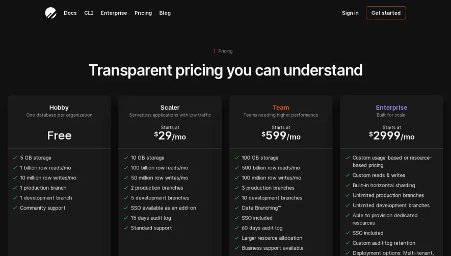
Generate a new design based on this screen using your own content.
Thank you! Your submission has been received!
Oops! Something went wrong while submitting the form.
# Design from Reference: Moderne Pricing Page
Create an original, high-fidelity visual design inspired by the reference. Prioritize composition, typography, colors, spacing, and component styling over technical implementation.
## Reference
- **Product:** Moderne
- **Category:** Pricing Page
- **Screenshot:** https://cdn.prod.website-files.com/5e9dc792e1210c5325f7ebbc/6acb6ea92837b9f3168fb6c8_6acb6ca23f1023ca3771e1e5_cms-c66265c66d062d48d03205fb.webp
Analyze the screenshot first. If inaccessible, request it rather than guessing.
## Content
{{content.instructions}}
{{content.data}}
Preserve essential messaging and factual accuracy. Adapt structure and copy length for visual balance; never invent product claims.
## Visual Design
Use this context to reproduce the reference's visual language: layout, typography, colors, spacing, borders, radii, and distinctive elements. The screenshot takes priority if descriptions conflict.
## Direction
{{preferences.fidelityInstructions}}
## Output
{{output.instructions}}
Deliver a polished, cohesive design with precise alignment, hierarchy, and spacing. Produce the requested visual artifact, not just a description. If unsupported, explain the limitation.
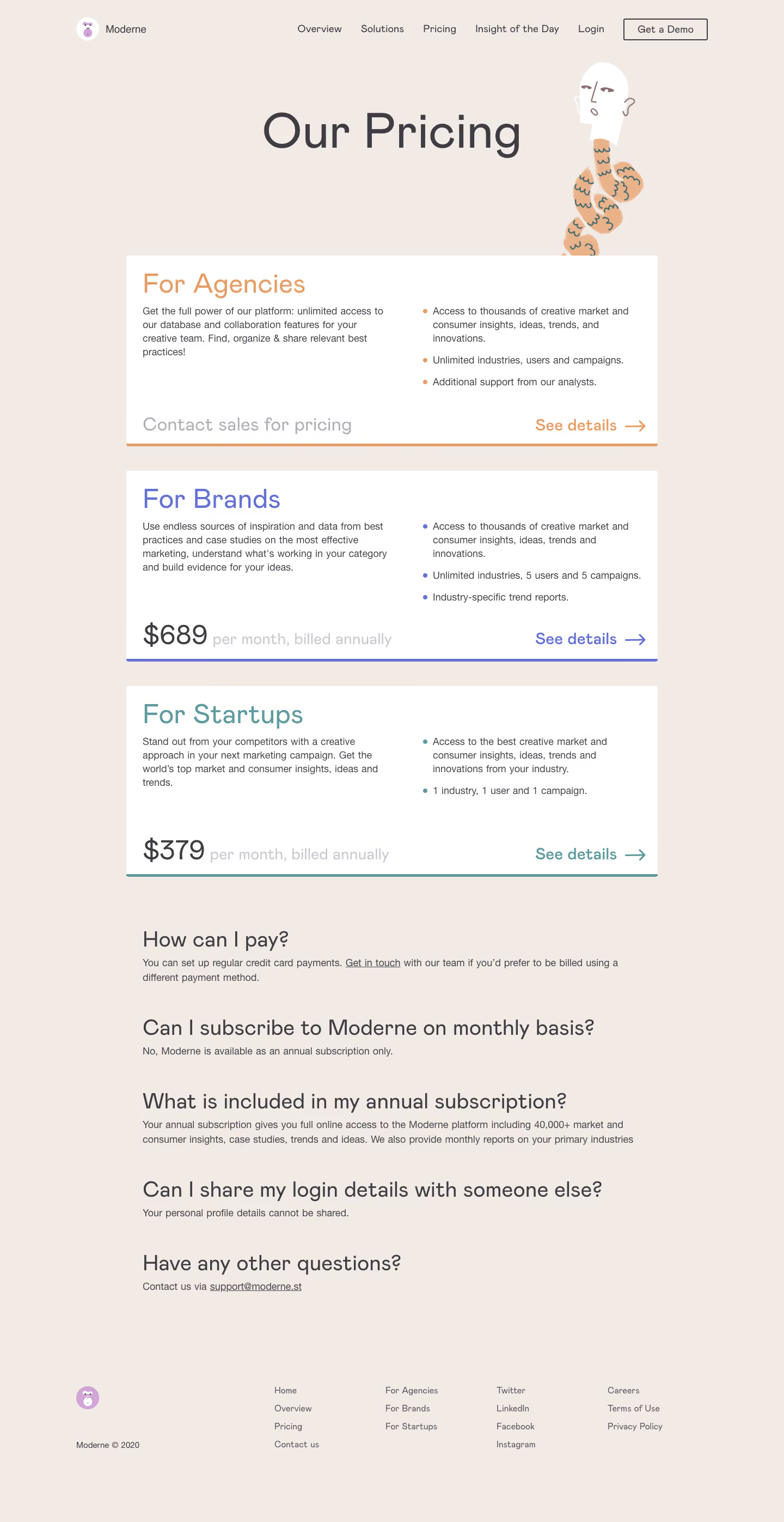
Moderne’s pricing page embodies a boldly minimalist and modern approach, intertwining ample white space with sharp geometric accents and understated animation. The overall vibe is sleek and professional, yet fresh and approachable—positioning Moderne as both advanced and user-centric.
Layout and Structure
The page structure follows a single-column flow, leading visitors naturally from a slim, functional header into an uncluttered pricing comparison grid. Each plan is encased in a pillowy container, gently elevating it from the background. Sticky navigation allows users to toggle between monthly and annual billing without losing their position, and an FAQ accordion eases lingering anxieties at the page’s conclusion. The footer is streamlined, echoing the site’s minimalist intentions.
Visual Elements
Visual hierarchy is expertly handled: playful but refined icons and subtle SVG background waves inject dynamic energy and visual context, while micro-animations guide user attention without overwhelming. The absence of stock photography keeps the focus tight on content and offer.
Color Palette and Typography
Dominated by brilliant whites and soft grays, the palette breathes clarity, punctuated strategically by teal blues and gentle purples for CTAs and highlights. Typography leans on a geometric sans-serif, delivering both precision and warmth; bold weights emphasize headings, while body copy remains legible and inviting.
User Experience Patterns
Navigation remains intuitive, with persistent CTAs (“Get Started”) and sticky options making decision paths obvious and low-friction. Pricing cards are highly scannable, features are succinctly bulleted, and support links are ever-present, fostering a frictionless journey.
Unique or Notable Design Choices
The demo scheduling CTA—tucked into the pricing table as a button—invites engagement without pulling focus. Animated toggle switches, custom checkmarks, and the gentle hover effects add tactile delight, enhancing memorability and perceived quality.
Tone and Feel
Trustworthy and polished but with a lively, modern pulse—this page reassures with clarity while enticing action, making it an inspiration for SaaS brands seeking a balance of confidence and contemporary flair.