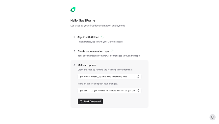
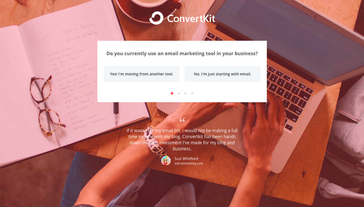
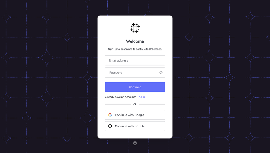
Generate a new design based on this screen using your own content.
Thank you! Your submission has been received!
Oops! Something went wrong while submitting the form.
# Design from Reference: Mintlify Signup Page
Create an original, high-fidelity visual design inspired by the reference. Prioritize composition, typography, colors, spacing, and component styling over technical implementation.
## Reference
- **Product:** Mintlify
- **Category:** Signup
- **Screenshot:** https://cdn.prod.website-files.com/5e9dc792e1210c5325f7ebbc/6acad5ced05a3f53c0a6e4c3_6acad546fef6904ce008c9b7_cms-64145b3d98d9b1c5a017ffaa.webp
Analyze the screenshot first. If inaccessible, request it rather than guessing.
## Content
{{content.instructions}}
{{content.data}}
Preserve essential messaging and factual accuracy. Adapt structure and copy length for visual balance; never invent product claims.
## Visual Design
Use this context to reproduce the reference's visual language: layout, typography, colors, spacing, borders, radii, and distinctive elements. The screenshot takes priority if descriptions conflict.
## Direction
{{preferences.fidelityInstructions}}
## Output
{{output.instructions}}
Deliver a polished, cohesive design with precise alignment, hierarchy, and spacing. Produce the requested visual artifact, not just a description. If unsupported, explain the limitation.
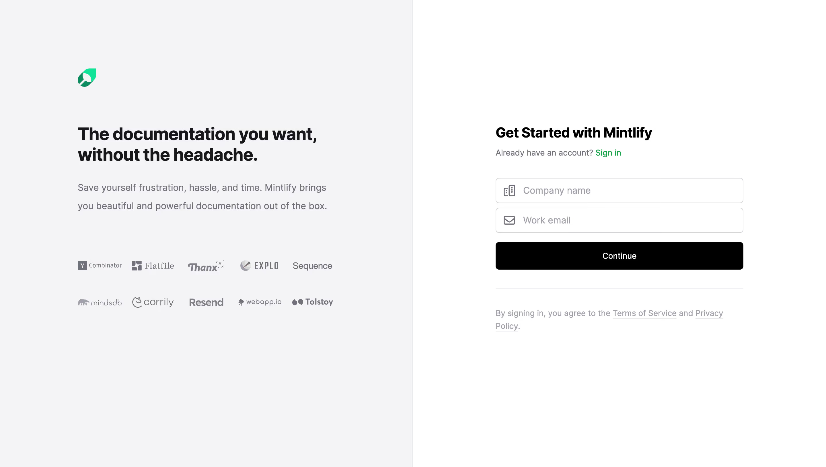
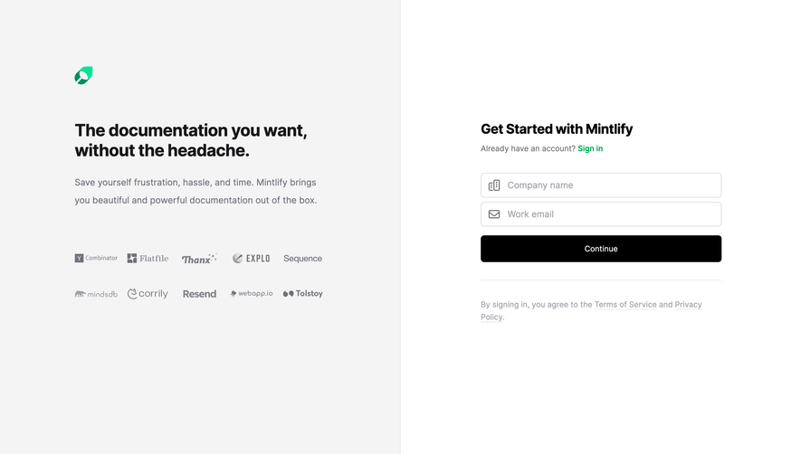
The two-panel approach here is dead simple and effective. Left side sells, right side converts. No confusion about what you're supposed to do. Mintlify's green logo sits quietly in the top left, anchoring the brand without screaming for attention.
Typography Does the Heavy Lifting
That bold headline "The documentation you want, without the headache" is doing serious work. It's big, black, and confident. The supporting text underneath drops down in weight and shifts to gray, creating a natural reading hierarchy. Nothing fancy, just well-executed fundamentals.
Trust Logos Without the Clutter
The client logos (Y Combinator, Flatfile, Resend, Tolstoy, and others) are all rendered in muted grayscale. Two neat rows. They add credibility without competing with the signup form. Smart restraint.
The Form is Refreshingly Minimal
Two fields. One button. That's it. The black "Continue" button punches hard against the light gray background. The green "Sign in" link is the only color accent on the right panel, pulling returning users exactly where they need to go.