Generate a new design based on this screen using your own content.
Thank you! Your submission has been received!
Oops! Something went wrong while submitting the form.
# Design from Reference: Mintlify Plans
Create an original, high-fidelity visual design inspired by the reference. Prioritize composition, typography, colors, spacing, and component styling over technical implementation.
## Reference
- **Product:** Mintlify
- **Category:** Plans
- **Screenshot:** https://cdn.prod.website-files.com/5e9dc792e1210c5325f7ebbc/6acad5c8d05a3f53c0a6e401_6acad504b2165b6c7f00ed07_cms-e44e1c2404171f441b80f9f1.webp
Analyze the screenshot first. If inaccessible, request it rather than guessing.
## Content
{{content.instructions}}
{{content.data}}
Preserve essential messaging and factual accuracy. Adapt structure and copy length for visual balance; never invent product claims.
## Visual Design
Use this context to reproduce the reference's visual language: layout, typography, colors, spacing, borders, radii, and distinctive elements. The screenshot takes priority if descriptions conflict.
## Direction
{{preferences.fidelityInstructions}}
## Output
{{output.instructions}}
Deliver a polished, cohesive design with precise alignment, hierarchy, and spacing. Produce the requested visual artifact, not just a description. If unsupported, explain the limitation.
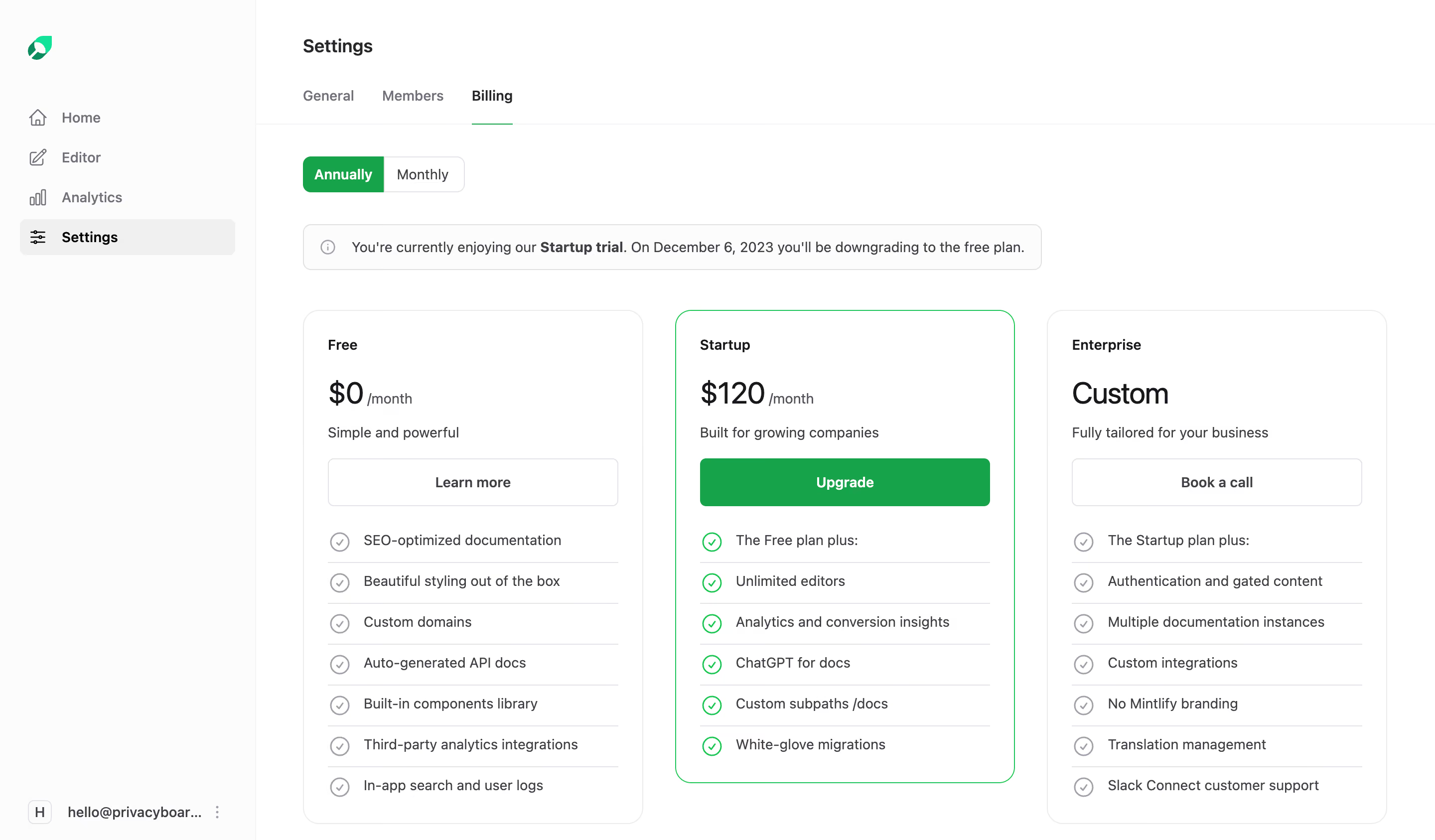
First thing you notice is the green. It's used sparingly but with intent. That Startup plan card has a subtle green dashed border that immediately pulls your eye to the middle tier. Classic anchoring done well. The green "Upgrade" button seals the deal. Everything else stays neutral.
Layout That Does the Thinking for You
Three-column pricing grid, nothing revolutionary, but the execution is tight. Each tier escalates logically: Free, Startup at $120/month, then Custom for Enterprise. The feature lists use small green checkmarks that create a satisfying visual rhythm as you scan down. The "Annually/Monthly" toggle up top is clean with that filled green pill state. Notice how the info banner about the Startup trial sits right above the cards. Smart placement. It adds urgency without being aggressive.
Typography and Restraint
The type hierarchy is solid. Big bold price numbers, lighter descriptors underneath. Nothing fights for attention. The left sidebar keeps navigation minimal with just five items. What stands out here is how much breathing room everything gets. Generous whitespace makes a dense billing page feel calm.