Overall Style and Aesthetic
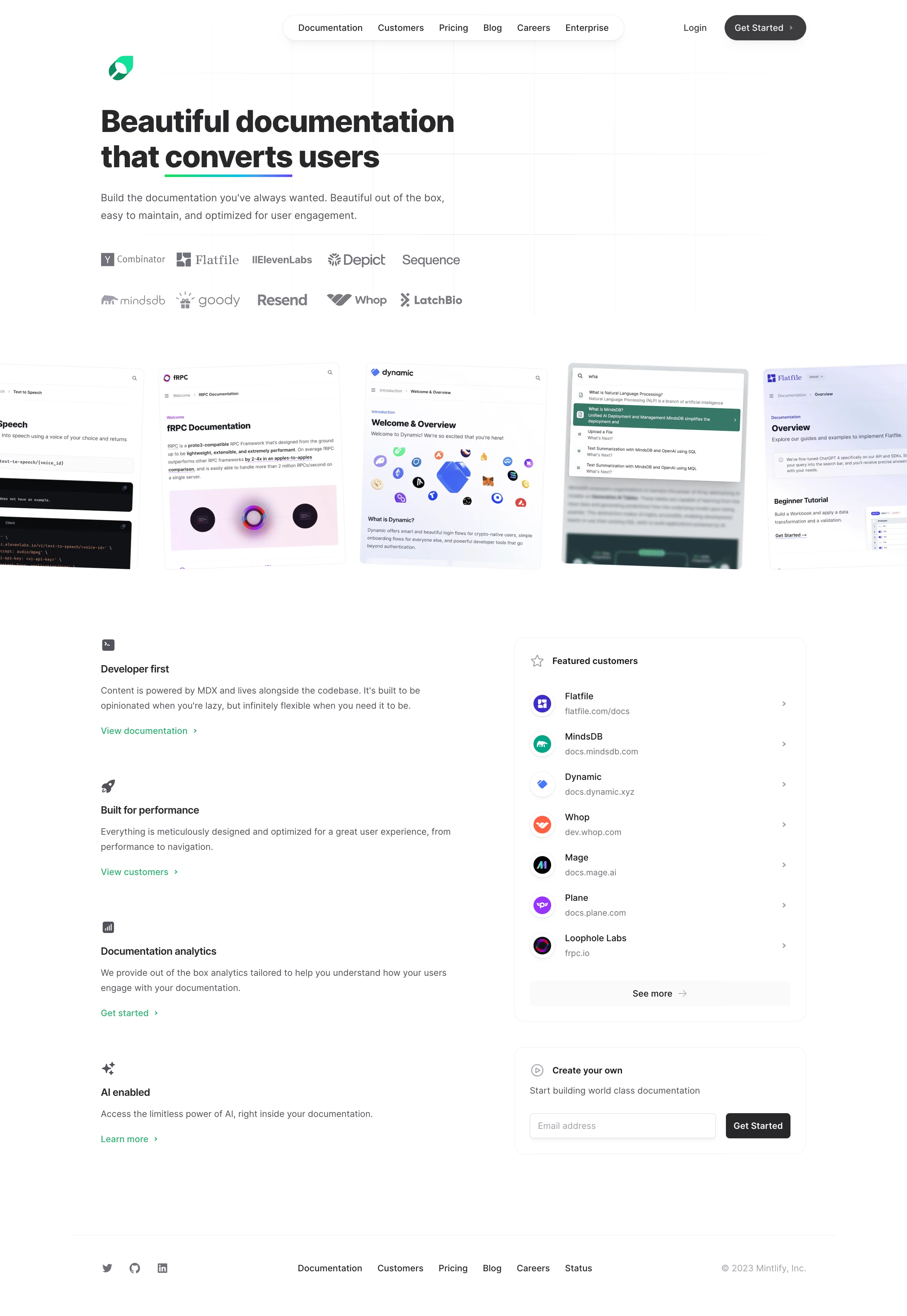
Mintlify’s homepage epitomizes minimalist modern SaaS design—crisp layouts, ample whitespace, and sleek vector graphics foster a professional yet approachable tone. The site feels high-tech without overwhelming, anchoring trust in its reliability while subtly highlighting innovation. Layout and Structure
The structure flows seamlessly from a commanding hero section with succinct copy and a direct CTA, effortlessly guiding the user to features, customer testimonials, partner logos, and a pricing summary. Logical sectional divisions, generous margins, and visual rhythm keep the narrative clear and user-centric, engaging visitors without confusion. Visual Elements
Distinctive, soft geometric illustrations animate as the user scrolls, bringing movement and personality to the page. Custom icons, unobtrusive SVG flourishes, and occasional gentle micro-interactions add sophistication. The absence of stock photography sharpens focus on the product’s digital essence. Color Palette and Typography
A refined palette emphasizes cool blues, gentle purples, and clean white backgrounds, punctuated by vibrant yet soothing gradients. Typography favors modern sans-serifs—likely Inter or a similar typeface—which establish clear hierarchy through bold headings, concise body copy, and judicious use of weight and color. User Experience Patterns
Navigation is sticky and minimal, centering user needs with prominent “View Docs” and “Get Started” CTAs. Smooth scroll cues and modular card layouts keep users engaged, while concise forms avoid friction. Subtle hover states and animated transitions add delight without distraction. Unique or Notable Design Choices
Mintlify stands out for its interactive visual storytelling—live previews, flowing animations, and real-time theme changes build immersion. The confident restraint in graphical detail and the unwavering focus on clarity create a sense of seamless, modern efficiency, perfect for SaaS inspiration.