Overall Style and Aesthetic
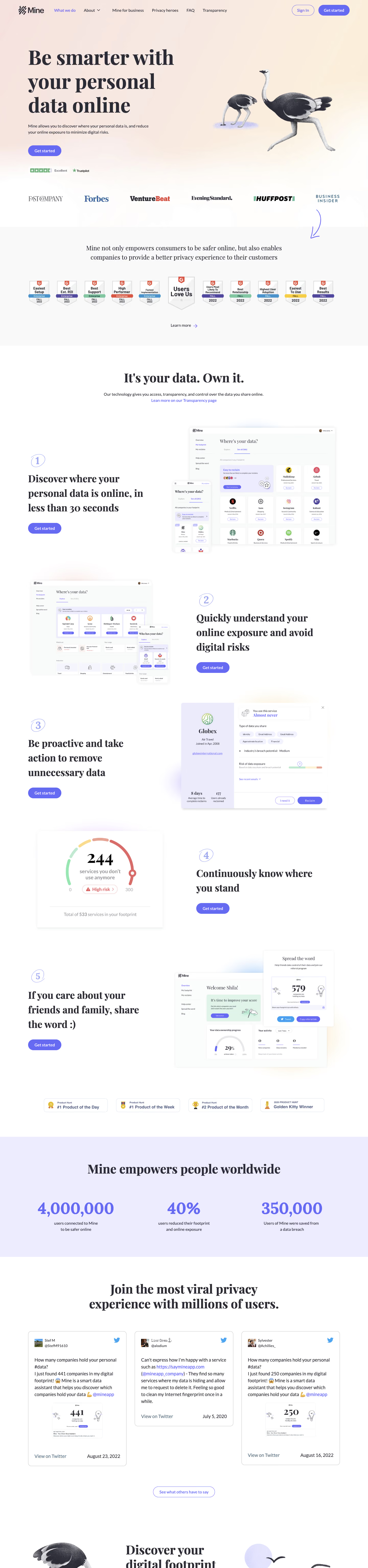
SayMine’s homepage radiates a strikingly modern minimalism, balancing professionalism with a sense of approachability. The design leverages abundant white space and soft, rounded edges, giving the interface a breathable, uncluttered feel. Subtle motion graphics add dynamism without distraction, while the overall tone conveys trustworthiness and digital intelligence—ideal for a SaaS focused on data privacy. Layout and Structure
The page follows a familiar but expertly executed structure: a captivating hero section with bold messaging and a confident CTA, followed by feature highlights, trust signals (client logos and testimonials), and a detailed footer. Each section is cleanly segmented, with consistent use of margins and padding to support legibility and guide the eye. Microinteractions and scroll-activated animations enhance engagement as visitors explore the content. Visual Elements
Illustrations throughout are custom and abstract—think simplified icons, rounded avatars, and flowing shapes—reinforcing the platform’s focus on data protection. Selected imagery and light, playful vector art add friendliness without sacrificing professionalism. Subtle animations, like floating elements or fading transitions, imbue the experience with a sense of progression and care. Color Palette and Typography
A calming palette of whites and soft blues forms the base, accented by energetic splashes of turquoise and purple. Large, bold headlines set in a modern sans-serif create instant hierarchy, while clear, legible body text assures readability. Judicious use of color direct attention to important calls to action and interactive elements. User Experience Patterns
Navigation is sticky and streamlined, with high-contrast CTAs that remain visible as users scroll. Form fields are minimal, with smart inline validation and clear affordances. The page uses intuitive scrolling cues and section transitions to encourage exploration. The experience feels frictionless and deliberately optimized for conversion. Unique or Notable Design Choices
What stands out is SayMine’s blend of playful illustration within a highly professional framework. The site makes privacy inviting—not intimidating—thanks to its color, copy, and visual warmth. The storytelling in the hero area, bolstered by lively microanimations, quickly earns user interest and trust, making it an exemplary source of SaaS design inspiration.