Design with AI
Generate a new design based on this screen using your own content.
# Design from Reference: Maze Upgrading
Create an original, high-fidelity visual design inspired by the reference. Prioritize composition, typography, colors, spacing, and component styling over technical implementation.
## Reference
- **Product:** Maze
- **Category:** Plans
- **Screenshot:** https://cdn.prod.website-files.com/5e9dc792e1210c5325f7ebbc/6acbcd8d33302e716eaa4656_6acbcb4e996643535b5d44b7_cms-c020afdeebcd68d85c27e5ba.webp
Analyze the screenshot first. If inaccessible, request it rather than guessing.
## Content
{{content.instructions}}
{{content.data}}
Preserve essential messaging and factual accuracy. Adapt structure and copy length for visual balance; never invent product claims.
## Visual Design
### Overall aesthetic
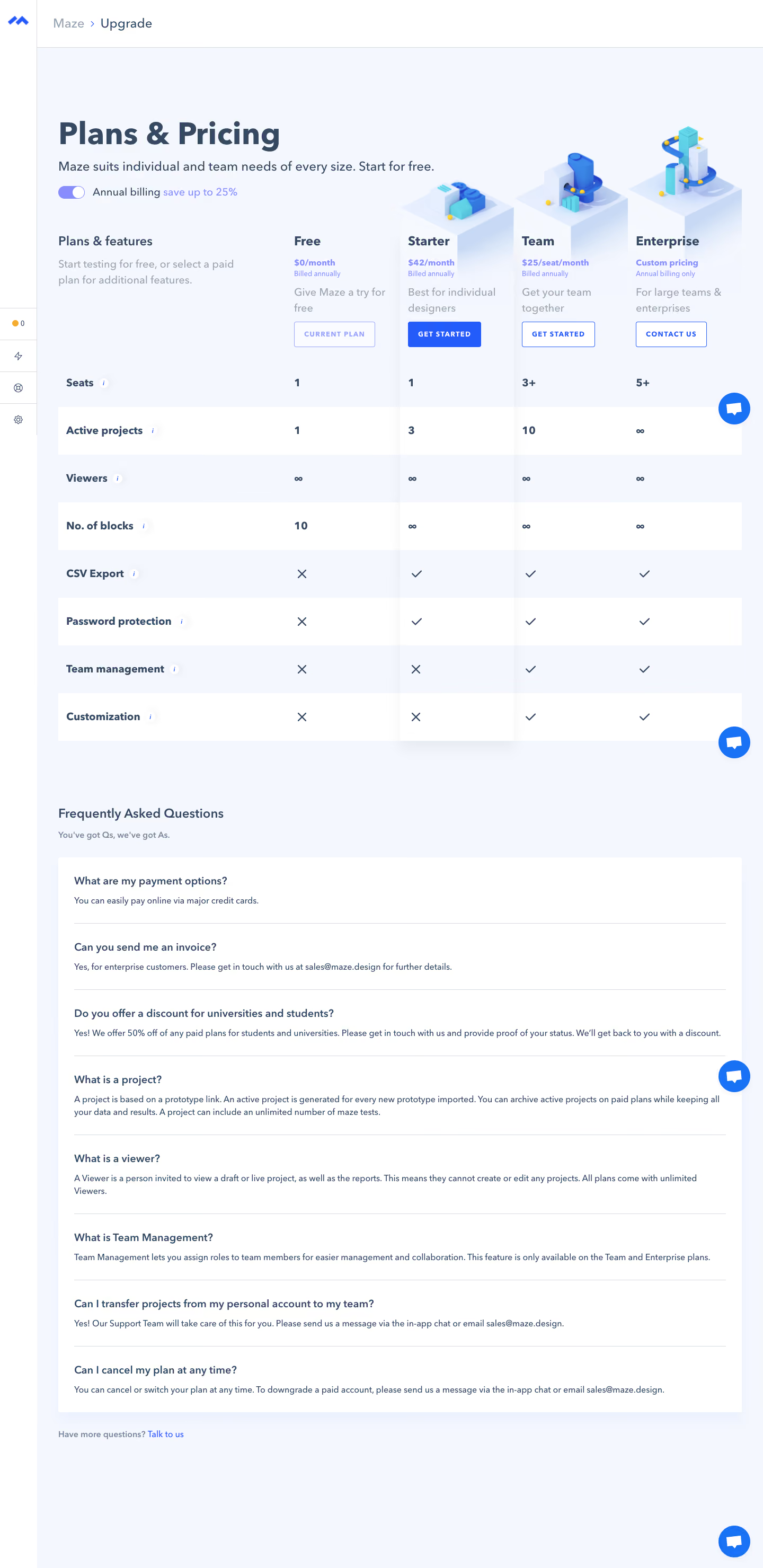
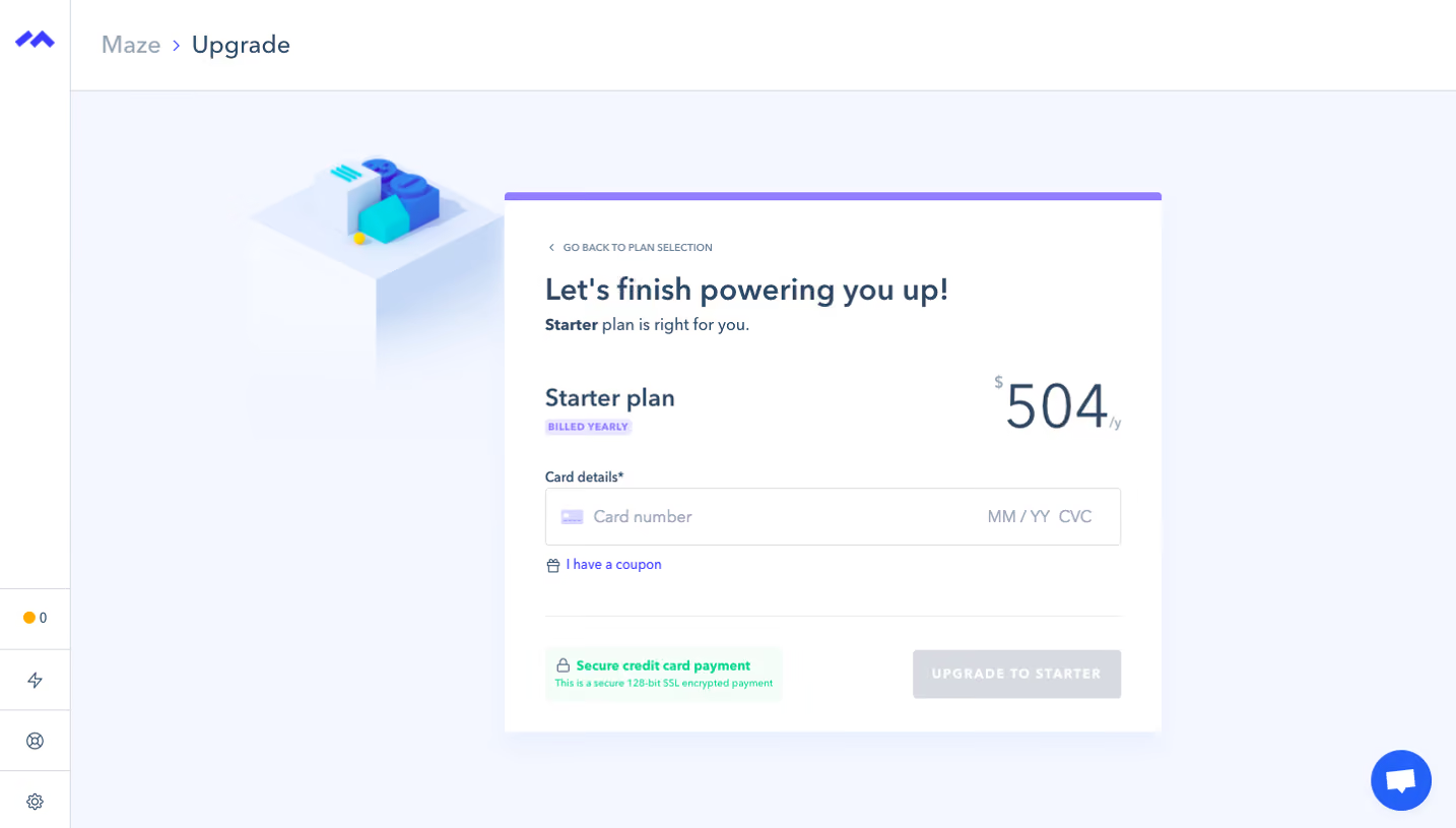
- **Character:** Light in-app upgrade page with pale-blue background, slate typography, blue actions and small colorful 3D plan illustrations.
- **Structure:** A broad comparison matrix and expanded FAQ prioritize detailed evaluation.
- **Scale:** The screenshot measures 1440 × 2959 px and was inspected in two portions. Dimensions below are image estimates; CSS scale is unverified.
### Page composition
- **Shell:** A very narrow icon rail sits left, with a white breadcrumb bar across the top.
- **Header:** Plans & Pricing, short introduction and annual-billing toggle lead.
- **Comparison:** A feature-label column and four plan columns show price, description/action and eight feature rows.
- **Illustrations:** Small blue/cyan 3D objects stand above paid-plan headings.
- **FAQ:** A large white panel below contains eight expanded question/answer groups, followed by a support link.
- **Support:** Blue chat controls recur along the right edge in this long capture.
### Information hierarchy
- **Billing mode:** Annual billing is visually enabled with savings copy.
- **Plan state:** Free is marked Current Plan; paid options show get-started/contact actions.
- **Feature matrix:** Numbers, infinity symbols, checks and crosses distinguish capabilities.
- **FAQ:** Questions are bold with plain answers and thin separators.
- **Evidence caution:** Prices/discounts/features are captured content, not verified current offers.
### Typography
- **Family:** Rounded neutral sans-serif; exact identity is unverified.
- **Title:** Approximately 56–60 image px, bold.
- **Plan headings:** Around 24–26 px bold.
- **Body/features:** Approximately 19–20 px with comfortable leading.
- **Actions:** Small uppercase tracked bold captions.
- **FAQ:** Questions around 18–20 px bold; answers smaller at 15–16 px.
### Colors & surfaces
- **Measured base:** ICC-aware sRGB sampling yields #FFFFFF and #F4F7FE.
- **Measured foreground:** #364962 is the prominent slate tone.
- **Measured neutrals:** #D7DBE0 and related pale blues define rules.
- **Accent:** Saturated blue actions and lavender billing/price text contrast with the pale canvas.
- **Depth:** Soft shadows under plan illustrations and a highlighted column add limited elevation.
### Components
- **Billing toggle:** Small lavender switch with white thumb precedes savings text.
- **Plan actions:** Current-plan outline, filled blue primary upgrade and outlined secondary actions.
- **Matrix:** Alternating white/pale rows span all columns; small information icons accompany feature labels.
- **3D art:** Blue/cyan blocks sit on pale raised plinths above paid tiers.
- **FAQ panel:** Plain expanded answers use thin gray horizontal rules.
- **Chat:** Circular blue support symbol floats at the right edge.
### Visual rhythm
- **Alignment:** Plan titles/actions/values share fixed column axes.
- **Rows:** Equal tall bands provide comparison cadence.
- **Whitespace:** Generous gaps separate header, comparison and FAQ.
- **FAQ:** Consistent question/answer spacing makes long prose scannable.
### Responsive
- **Evidence limit:** Only desktop is shown; recommendations follow.
- **Comparison:** Use horizontal scrolling or plan-focused cards without shrinking labels.
- **Header:** Wrap billing copy and scale title.
- **FAQ:** Preserve readable single-column answers.
- **Support:** Avoid covering matrix cells/actions.
### Adaptation guidance
- **Reusable pattern:** Pair current-plan context, transparent comparison and expanded purchasing questions.
- **State clarity:** Keep billing mode/current subscription explicit.
- **Data discipline:** Validate current prices and eligibility independently.
- **Accessibility:** Use semantic table relationships, labeled toggle and focusable help controls.
Use this context to reproduce the reference's visual language: layout, typography, colors, spacing, borders, radii, and distinctive elements. The screenshot takes priority if descriptions conflict.
## Direction
{{preferences.fidelityInstructions}}
## Output
{{output.instructions}}
Deliver a polished, cohesive design with precise alignment, hierarchy, and spacing. Produce the requested visual artifact, not just a description. If unsupported, explain the limitation.