Overall Style & Aesthetic
The Mapbox Sales Contact page exudes a modern, ultra-professional vibe with minimalist sensibilities. Generous white space and subtle visual cues communicate confidence and clarity, while clean lines and understated use of gradients lend an innovative touch, befitting a leading SaaS mapping platform. Layout & Structure
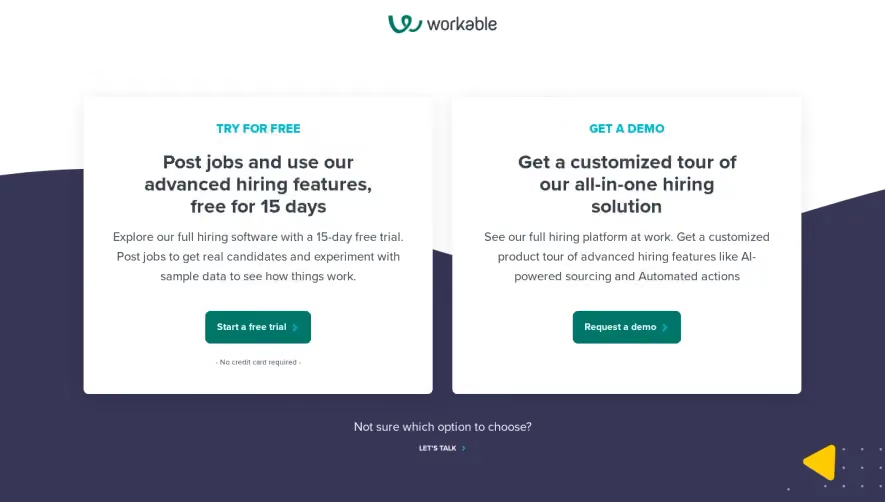
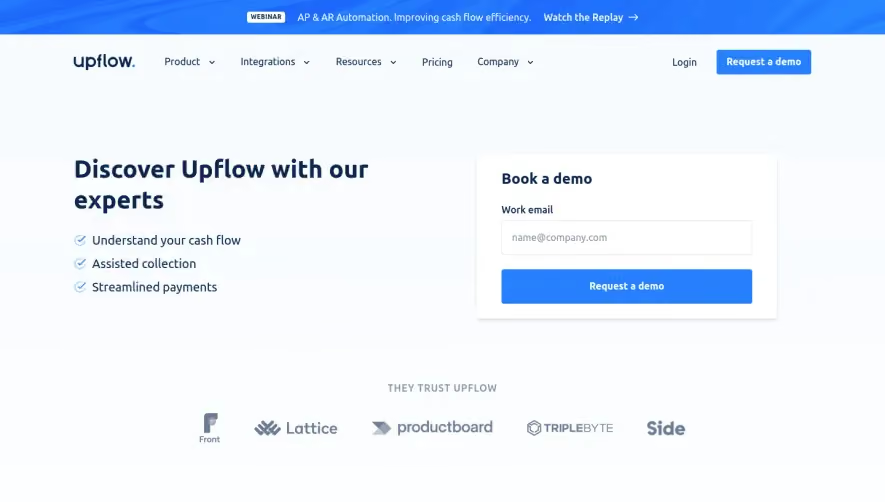
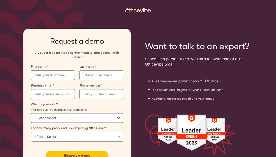
The page structure is laser-focused, beginning with a centered hero section that instantly establishes the purpose: connecting with the sales team. Content is concise, funneled toward a single, high-converting form—the lone focus above the fold. Sections are stacked vertically with ample breathing room, guiding attention through one action pathway, avoiding distractions like testimonials or pricing panels. Visual Elements
Distinctive vector-style hand illustrations inject personality without stealing focus, serving as friendly accents beside form fields. Small, monochrome icons provide visual wayfinding for map-based products, balancing approachability and professionalism. The inclusion of a dynamic, interactive map module as a subtle backdrop feels unique—evoking the brand while not overwhelming the main CTA. Color Palette & Typography
A crisp palette of deep charcoals, brilliant whites, and signature blue accents ensures brand identity and high contrast. Typography features geometric sans-serif fonts, tightly controlled for readability and visual hierarchy: bold headers, generous field labels, and smaller, lighter descriptions maintain order and flow. User Experience Patterns & CTAs
Navigation is sticky, with persistent access to the main website. The primary CTA ("Contact Sales") appears both as a button and the form itself, maximizing clarity. The form is short and intelligently grouped, using progressive disclosure for additional fields, which reduces friction for first-time visitors. Unique Design Choices & Tone
Notably, the gentle animation of lines within map illustrations creates a sense of movement and anticipation. The overall tone is inviting, reassuring, and efficient—balancing enterprise-grade security with a human-centered approach poised to inspire SaaS designers.