Design with AI
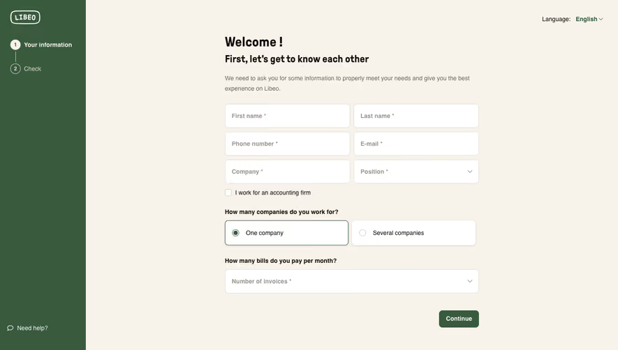
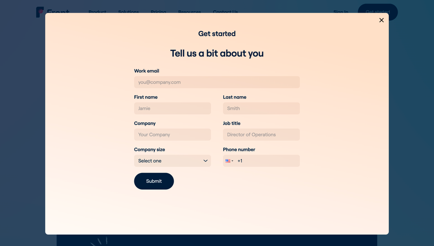
Generate a new design based on this screen using your own content.
# Design from Reference: Loops Signup
Create an original, high-fidelity visual design inspired by the reference. Prioritize composition, typography, colors, spacing, and component styling over technical implementation.
## Reference
- **Product:** Loops
- **Category:** Signup
- **Screenshot:** https://cdn.prod.website-files.com/5e9dc792e1210c5325f7ebbc/6acadbefd05a3f53c0a863bb_6acadb45afcaef5001d5de61_cms-695096d706b19640ad701af0.webp
Analyze the screenshot first. If inaccessible, request it rather than guessing.
## Content
{{content.instructions}}
{{content.data}}
Preserve essential messaging and factual accuracy. Adapt structure and copy length for visual balance; never invent product claims.
## Visual Design
### Overall aesthetic
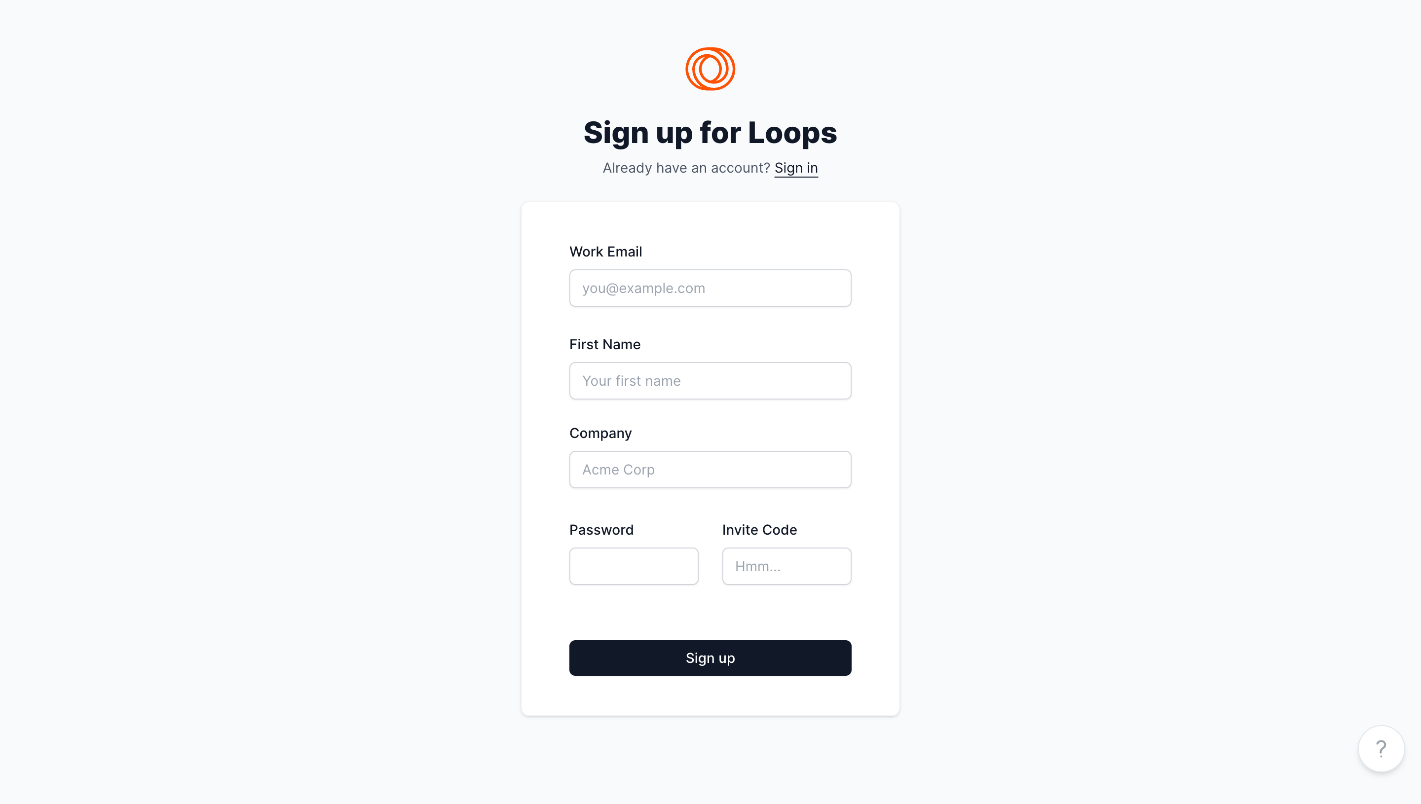
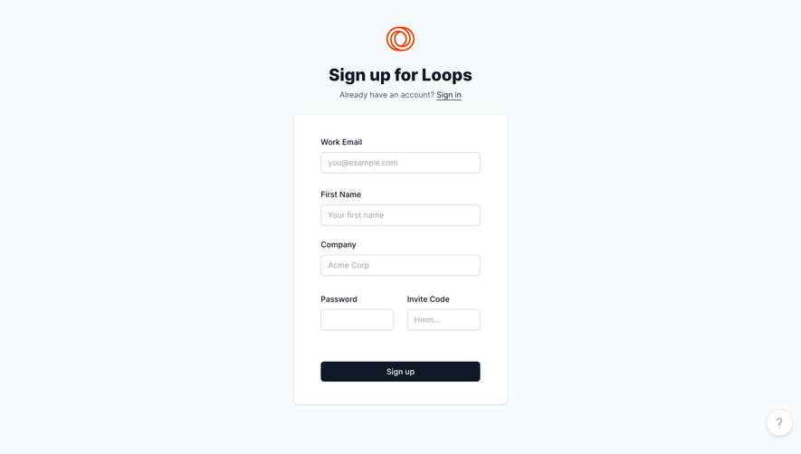
- **Character:** Minimal centered signup form with pale cool-gray ground, white card, dark navy action and a small orange brand symbol.
- **Evidence and scale:** Screenshot is 2880 × 1630 image pixels. Sizes estimate a 1440 × 815 CSS viewport at 2× capture scale; actual DPR and font family are unverified.
### Page composition
- **Header stack:** Centered orange loop mark sits above bold signup heading and a small sign-in sentence.
- **Form card:** Approximately 384 × 520px CSS white card contains three full-width fields and a split password/invite-code row.
- **Primary action:** Full-width dark Sign up button sits below the fields with a larger separating gap.
- **Support:** Small circular question-mark control sits at the lower-right page edge.
### Information hierarchy
- **Task:** Bold title and concise existing-account link establish signup versus sign-in.
- **Field sequence:** Work email, first name and company precede password and invite code.
- **Action:** Dark navy button is the strongest form element.
- **State:** Fields are empty with example placeholders; no validation or successful signup is visible.
### Typography
- **Heading:** Approximately 30–32px CSS bold neutral sans-serif.
- **Labels:** Around 14px medium; field placeholders around 14px in pale blue-gray.
- **Secondary/action:** Sign-in sentence and button label around 14px.
- **Family:** Exact sans-serif identity, weight and tracking remain unverified.
### Colors & surfaces
- **Measured ground:** Pale #F9FAFB dominates; white #FFFFFF forms the card.
- **Measured emphasis:** Dark navy #0F1828 supports heading/button.
- **Measured borders:** Gray #D0D5DB and pale #F3F4F6 support outlines/shadows.
- **Measured brand:** Orange #FF3D00 appears in the loop mark, with lighter antialiased orange pixels.
### Components
- **Card shell:** Approximately 384 × 520px, radius near 8px, thin pale border and subtle shadow.
- **Inputs:** Full-width fields around 286 × 38px CSS, 6px radii, thin gray borders and slight lower shadow.
- **Split row:** Two equal smaller fields separated by roughly 24px, each with its own label.
- **Submit:** Approximately 286 × 36px, dark navy fill, white label and radius around 5px.
- **Help control:** White circular button around 48px with gray question mark, fine outline and soft shadow.
### Visual rhythm
- **Centering:** Brand, heading, account link and card share a vertical axis.
- **Form padding:** Approximately 48px horizontal inset aligns all controls.
- **Field cadence:** Around 30–34px between groups, with small 8px label/input gaps.
- **Whitespace:** Broad outer margins isolate the task, with no promotional sidebar or heavy footer.
### Responsive
- **Observed limit:** Desktop empty form only; signup, invite validation and mobile behavior are unobserved.
- **Recommended layout:** Use a fluid capped card with 20–24px viewport margins and reduced inner padding.
- **Recommended fields:** Stack password/invite-code fields if width is insufficient.
- **Recommended accessibility:** Keep persistent labels, adequate target heights and visible focus/error states.
### Adaptation guidance
- **Preserve simplicity:** One central form, clear field order and one primary action are sufficient.
- **Keep brand compact:** Use a small orange mark against neutral surfaces rather than adding unrelated decoration.
- **Implementation:** Provide correct input semantics/autocomplete, accessible validation and clear invite-code requirements. The screenshot does not establish current signup eligibility or account creation.
Use this context to reproduce the reference's visual language: layout, typography, colors, spacing, borders, radii, and distinctive elements. The screenshot takes priority if descriptions conflict.
## Direction
{{preferences.fidelityInstructions}}
## Output
{{output.instructions}}
Deliver a polished, cohesive design with precise alignment, hierarchy, and spacing. Produce the requested visual artifact, not just a description. If unsupported, explain the limitation.