
Thank you! Your submission has been received!
Oops! Something went wrong while submitting the form.
Get SaaSFrame Pro
Monthly
$18
Quarterly
$48
Yearly
$180
Upgrade to access this feature
Browse all screens & flows
Filter and search screens & flows
Access Figma files
Access mobile versions
Bookmark screens & flows
Join now
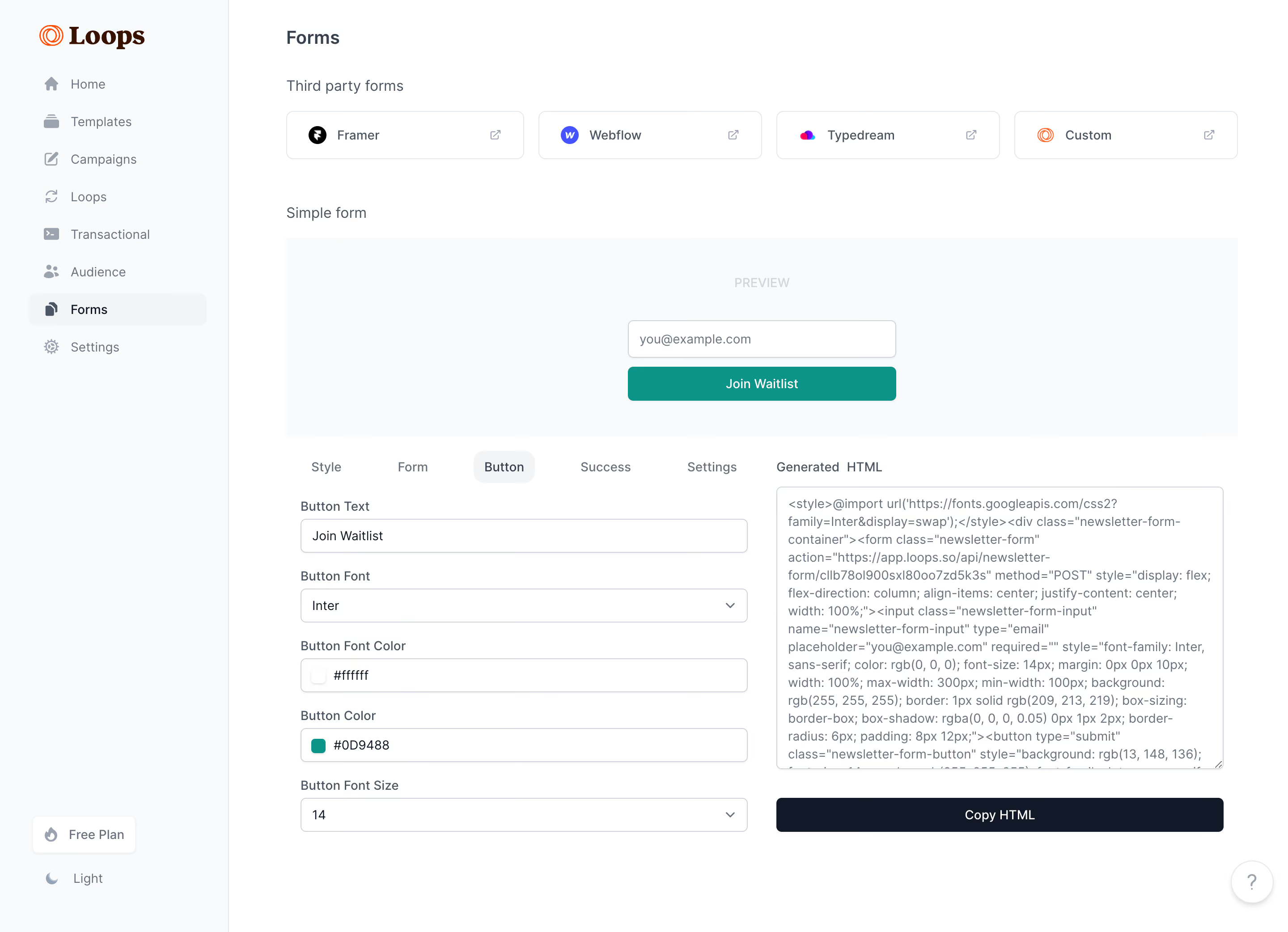
Loops Forms Builder

Loops
The email platform built for SaaS
Designed by
No items found.

Bookmark
Bookmark

Design with AI
Thank you! Your submission has been received!
Oops! Something went wrong while submitting the form.
# Design from Reference: Loops Forms Builder
Create an original, high-fidelity visual design inspired by the reference. Prioritize composition, typography, colors, spacing, and component styling over technical implementation.
## Reference
- **Product:** Loops
- **Category:** Appearance Customization
- **Screenshot:** https://cdn.prod.website-files.com/5e9dc792e1210c5325f7ebbc/6acadc455c79bb17f221ae43_6acadb99494a081980ea170c_cms-1e9a6a1a0a993760e8267eae.webp
Analyze the screenshot first. If inaccessible, request it rather than guessing.
## Content
{{content.instructions}}
{{content.data}}
Preserve essential messaging and factual accuracy. Adapt structure and copy length for visual balance; never invent product claims.
## Visual Design
### Overall aesthetic
- **Character:** A restrained form-builder dashboard uses pale-gray navigation, white controls, dark slate typography and teal for the live preview action.
- **Evidence scale:** The screenshot is 2880 × 2084 pixels. Dimensions below estimate CSS pixels at an unverified 2× capture density.
### Page composition
- **Sidebar:** A roughly 256-pixel-wide rail contains the Loops wordmark, eight icon-and-label destinations and plan/theme controls near the bottom.
- **Top content:** The Forms title precedes four third-party integration tiles for Framer, Webflow, Typedream and Custom.
- **Preview:** A large pale panel centers a simple email field and Join Waitlist button below a muted PREVIEW label.
- **Editor/output split:** The lower area places a five-tab customization editor on the left and a Generated HTML text area with a full-width copy action on the right.
### Information hierarchy
- **Location:** Forms is selected in the sidebar, with its page title repeated at the top of the main content.
- **Workflow:** Third-party options are separate from the simple-form preview, which makes the rendered result visible before configuration controls.
- **Active editing:** Button is the selected editor tab; labeled fields expose text, font, text color, fill color and size.
- **Export:** The HTML panel and dark Copy HTML action make the generated output a clear secondary destination.
### Typography
- **Page title:** Approximately 22 pixels semibold with a compact line-height.
- **Labels and navigation:** Mostly 14–16 pixels, regular-to-medium weight; field labels are smaller than section labels.
- **Preview text:** The visible font setting reads Inter and size 14. This is evidence of the selected preview configuration, not proof of the dashboard's font family.
- **Output text:** The HTML area uses compact gray text with approximately 20-pixel leading; its rendered appearance is proportional rather than strongly monospaced.
### Colors & surfaces
- **Measured base:** ICC-to-sRGB sampling identifies #FFFFFF for controls/canvas, #F9FAFB for pale surfaces, #F3F4F6 for selected backgrounds and #0F1828 for dark foreground/action areas.
- **Measured support:** #687281 supplies muted text and #D0D5DB outlines.
- **Preview accent:** The sampled dominant teal is #009788; the visible configured field reads #0D9488. Preserve the distinction between screenshot pixels and the displayed configuration value.
- **Visual depth:** Inputs use thin borders and subtle shadows; broad panels remain flat and softly differentiated.
### Components
- **Integration tiles:** Four outlined rounded rectangles, roughly 250–265 pixels wide and 54 pixels tall, with an app mark left and external-link icon right.
- **Preview form:** A centered approximately 300-pixel-wide email field and teal action stack with a small gap; both have roughly 6-pixel rounding.
- **Editor tabs:** Style, Form, Button, Success and Settings share one row; Button sits on a pale rounded active background.
- **Configuration fields:** Full-width outlined controls are about 38–40 pixels tall. Font and size fields include dropdown chevrons; color rows include small swatches.
- **Output area:** A tall bordered text area with resize grip sits above a roughly 40-pixel-high dark Copy HTML button.
- **Utilities:** The sidebar plan control is a small white chip, theme control uses a moon symbol and a circular help button sits at bottom right.
### Visual rhythm
- **Main alignment:** Content begins approximately 64 pixels after the sidebar edge; third-party tiles and preview share the same broad horizontal bounds.
- **Vertical grouping:** Clear 40–50-pixel gaps separate integration options, preview and customization areas.
- **Control cadence:** Editor labels sit close above their fields, while successive settings have consistent roughly 20-pixel separation.
- **Column balance:** The editor and output occupy similar widths, with a modest central gutter and aligned upper labels.
### Responsive
- **Observed scope:** Only the desktop Button-tab state is visible; no dropdown, focus or success view is shown.
- **Recommended layout:** Collapse the sidebar, wrap integration tiles and stack generated output beneath customization controls on narrow screens.
- **Recommended preview:** Keep the sample form fluid within padded bounds, preserve horizontal tab access and prevent long HTML content from widening the page.
### Adaptation guidance
- **Builder pattern:** Separate destination integrations, live preview, property editing and generated output into clearly labeled regions.
- **Configuration fidelity:** Keep displayed settings synchronized with preview/output; distinguish configured hex values from screenshot sampling when reconstructing tokens.
- **Interaction detail:** Provide persistent labels, accessible color inputs, clear copy feedback and keyboard focus. Use the visible Inter setting only for the configured form unless other evidence confirms the application font.
Use this context to reproduce the reference's visual language: layout, typography, colors, spacing, borders, radii, and distinctive elements. The screenshot takes priority if descriptions conflict.
## Direction
{{preferences.fidelityInstructions}}
## Output
{{output.instructions}}
Deliver a polished, cohesive design with precise alignment, hierarchy, and spacing. Produce the requested visual artifact, not just a description. If unsupported, explain the limitation.


Category
Tech Stack


Added on
August 14, 2023
Similar screens


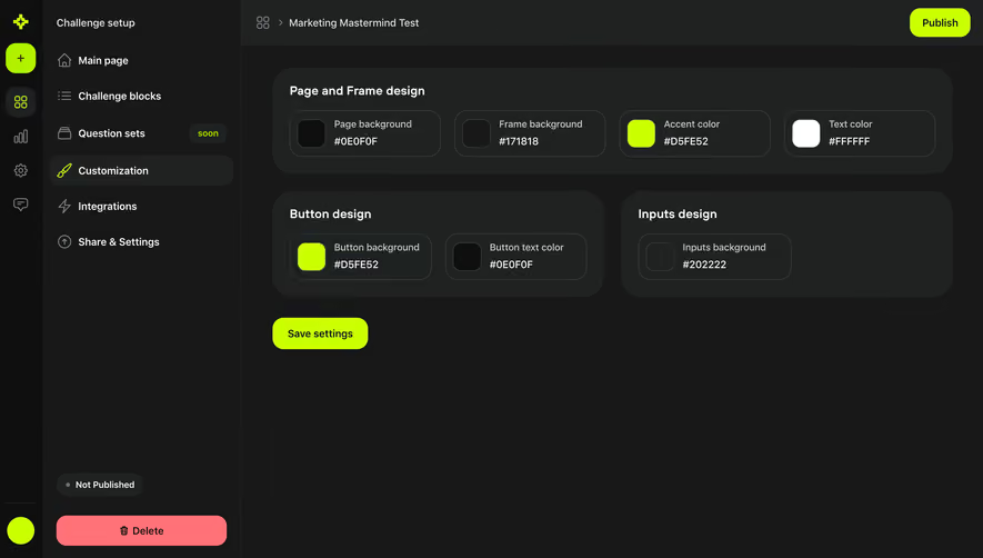

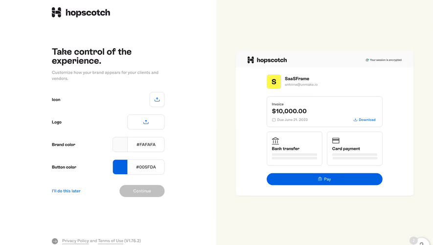

Upgrade to SaaSFrame Pro now to see similar examples.
Monthly
$18 /month
Billed $18 monthly
Browse all screens & flows
Filter and search screens & flows
Search text in screenshots
Access Figma files
Access mobile versions
Join now
Quarterly
$16 /month
Billed $48 quarterly
Browse all screens & flows
Filter and search screens & flows
Search text in screenshots
Access Figma files
Access mobile versions
Join now
Yearly
$15 /month
Billed $180 yearly
Browse all screens & flows
Filter and search screens & flows
Search text in screenshots
Access Figma files
Access mobile versions
Join now