Generate a new design based on this screen using your own content.
Thank you! Your submission has been received!
Oops! Something went wrong while submitting the form.
# Design from Reference: Loops Changelog
Create an original, high-fidelity visual design inspired by the reference. Prioritize composition, typography, colors, spacing, and component styling over technical implementation.
## Reference
- **Product:** Loops
- **Category:** Changelog
- **Screenshot:** https://cdn.prod.website-files.com/5e9dc792e1210c5325f7ebbc/6acadbedd05a3f53c0a86377_6acadb41701e38c7948995e2_cms-1e7b81b0b6dd2eacaa38cd6f.webp
Analyze the screenshot first. If inaccessible, request it rather than guessing.
## Content
{{content.instructions}}
{{content.data}}
Preserve essential messaging and factual accuracy. Adapt structure and copy length for visual balance; never invent product claims.
## Visual Design
Use this context to reproduce the reference's visual language: layout, typography, colors, spacing, borders, radii, and distinctive elements. The screenshot takes priority if descriptions conflict.
## Direction
{{preferences.fidelityInstructions}}
## Output
{{output.instructions}}
Deliver a polished, cohesive design with precise alignment, hierarchy, and spacing. Produce the requested visual artifact, not just a description. If unsupported, explain the limitation.
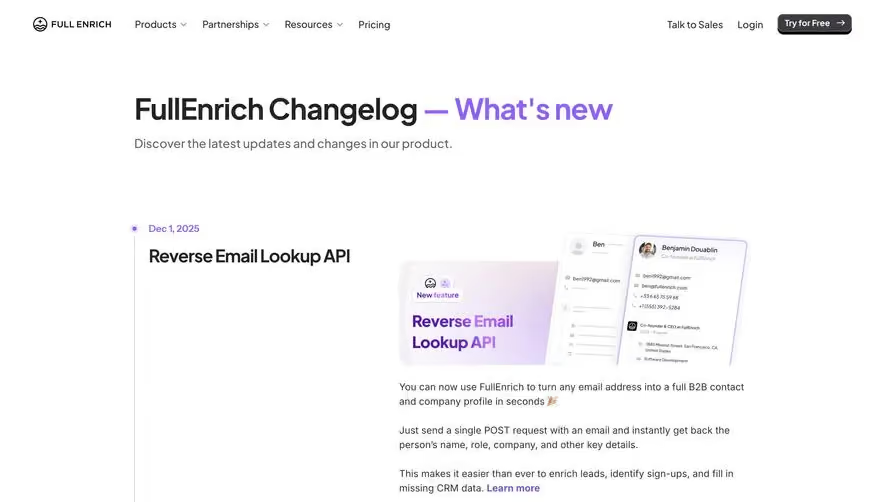
The Loops Changelog page embraces a sleek minimalist ethos, underscored by ample whitespace and clean lines. The design radiates modernity with a dash of playfulness, leveraging crisp UI elements and subtle micro-interactions that mirror the ethos of progressive SaaS platforms.
Layout and Structure
Content is organized with clear hierarchy: a prominent header with navigational breadcrumbs, followed by vertically stacked changelog cards ordered chronologically. Each card is easy to scan, with bold update tags and concise titles, making information accessible at a glance. There’s no distracting clutter—only focused content in a digestible format.
Visual Elements
Custom icons and color-coded labels (e.g., “New”, “Update”, “Fix”) add visual rhythm and immediately convey the nature of each update. Minimalist vector illustrations provide a touch of personality without overwhelming the layout. Animated transitions on hover and expandable content animations enhance interactivity while keeping the experience lightweight.
Color Palette and Typography
The palette blends a calming white background with nuanced grayscale tones and vibrant accent colors like blue and green, used sparingly to highlight actionable elements and statuses. Typography is sharp and contemporary: bold headings use strong sans-serif fonts, paired with lighter body text, creating clear visual hierarchy and improved readability.
User Experience Patterns
Sticky navigation and smart CTAs (like “Subscribe to Updates”) are placed thoughtfully, ensuring users are always one click away from key actions. The interaction design is frictionless, with smooth scrolling, intuitive card expansion, and consistent iconography providing a cohesive, trustworthy, and innovative feel.
Unique Design Choices
What sets this page apart is its editorial clarity—a technical changelog that’s as visually delightful as it is informative. The balance between personality and professionalism makes it a compelling reference for SaaS founders and designers alike.