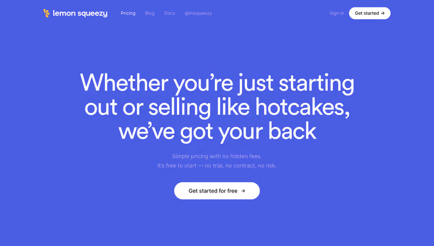
Overall Style and Aesthetic
Livestorm’s pricing page radiates a modern, minimalist professionalism. The space is uncluttered, leveraging generous white space and crisp lines that foster clarity and focus. Subtle, friendly accents, such as rounded buttons and softly animated icons, strike a balance between corporate seriousness and welcoming approachability, making the experience feel both polished and accessible. Layout and Structure
The page flows logically from a brief intro hero, which instantly orients and reassures visitors, into a straightforward pricing comparison. The pricing tables are central—bold, visually separated, and easy to scan, with feature lists neatly expandable. Below, a concise FAQ and supporting trust signals like badges or testimonials provide confidence, all anchored by a robust, information-rich footer. Visual Elements
Strategic illustration accompanies text—crisp vector graphics and micro-animations visually punctuate key product features without overpowering. Simple, purposeful icons lend to instant readability, and muted gradients add dimension. Animation is subtle—used for toggling plans or plan highlights—but always supportive, never distracting. Color Palette and Typography
Livestorm’s palette relies on soft blues, gentle grays, and clean whites, introducing vibrant blue for actionable CTAs. This controlled contrast helps guide attention. Typography is modern sans-serif, with clear hierarchy: large headlines, medium-weight subheads, and readable body text, creating effective information architecture. User Experience Patterns
Navigation is fixed and accessible, with smooth scroll cues and persistent “Start free trial” CTAs. Pricing toggles and comparison details are interactive, revealing further content painlessly. All forms are brilliantly minimal—often in a side modal—keeping conversion friction low. Unique or Notable Design Choices
This page stands out for its ultra-legible pricing comparison with expandable rows, animated plan feature highlights, and thoughtful microcopy. Reassuring trust markers—like security certifications—are displayed tastefully, and the checkout flow preview removes surprises. Tone and Feel
The tone is transparent and customer-centric, projecting innovation and trust. Every element and interaction aims to reassure, inform, and gently propel the user toward conversion, offering SaaS designers a masterclass in clarity and conversion-focused design.