Design with AI
Generate a new design based on this screen using your own content.
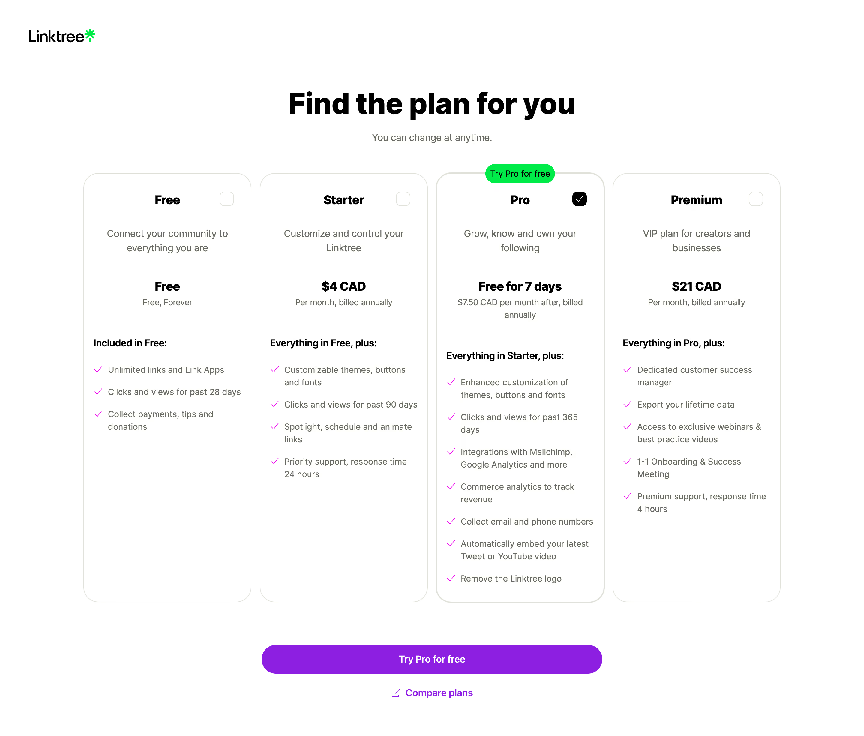
# Design from Reference: Linktree Choose A Plan
Create an original, high-fidelity visual design inspired by the reference. Prioritize composition, typography, colors, spacing, and component styling over technical implementation.
## Reference
- **Product:** Linktree
- **Category:** Account Setup
- **Screenshot:** https://cdn.prod.website-files.com/5e9dc792e1210c5325f7ebbc/6acb6466b206c0d3f8f0667e_6acb62d6096561906c23500c_cms-5bab71dc9b5dc3f4ec4fe457.webp
Analyze the screenshot first. If inaccessible, request it rather than guessing.
## Content
{{content.instructions}}
{{content.data}}
Preserve essential messaging and factual accuracy. Adapt structure and copy length for visual balance; never invent product claims.
## Visual Design
### Overall aesthetic
- **Character:** A clean, type-led pricing selection screen with generous white space, four softly outlined plans and bright green/purple conversion accents.
- **Evidence scale:** Original 2880 × 2454 pixels; estimated CSS sizes assume an unverified 2× capture scale. Colors are sampled sRGB pixels.
### Page composition
- **Brand and introduction:** Small Linktree wordmark at upper left; a large centered plan-selection heading sits above a short reassurance line.
- **Comparison grid:** Four approximately 280 × 716 px cards span a centered roughly 1164 px region, separated by 14–16 px gaps.
- **Action area:** A centered approximately 568 px pill button sits below the cards, with a smaller Compare plans link and external-link icon beneath.
- **Vertical balance:** The heading starts around 150 px down, cards around 289 px and the primary action near 1075 px.
### Information hierarchy
- **Plans:** Free, Starter, Pro and Premium use bold centered names and consistent descriptive, price and feature regions.
- **Selection:** Pro has a heavier outline, a black checked square at upper right and a bright green trial badge overlapping the top edge.
- **Pricing:** Price lines are bold; billing details beneath use smaller muted text. This describes the captured offer, not current pricing.
- **Features:** Left-aligned lists use bright checkmarks and short wrapped descriptions beneath a bold inclusion statement.
### Typography
- **Main heading:** Unverified sans-serif, approximately 48 px heavy 700–800, 58 px line height and tight tracking.
- **Plan and price roles:** Approximately 22 px bold with 28 px line height.
- **Descriptions:** Around 16 px regular, 24 px line height, centered above the feature lists.
- **Features and billing:** Approximately 14 px regular with 20–22 px line height; feature-group labels and primary action are medium/bold.
### Colors & surfaces
- **Base:** White #FFFFFF canvas and cards, with minimal tonal layering.
- **Type:** Black #000000 headings and measured gray-green #666B5E supporting copy.
- **Structure:** Pale green-gray #DEE2D8 card outlines maintain soft separation.
- **Accents:** Purple #8C1FE1 drives the primary action, bright green #00EA48 marks the trial badge and brand symbol; feature checkmarks appear pink-purple.
### Components
- **Plan cards:** Approximately 24 px corner radii, thin borders and about 16 px feature-list side padding; no strong shadow.
- **Selectors:** Roughly 24 px rounded squares at upper right; three are empty outlined controls and the Pro selector is black with a white check.
- **Trial badge:** Small green pill centered on the Pro card's top edge.
- **Feature lists:** Checkmarks occupy a narrow leading column; copy aligns consistently beside them, with variable wrapping and a generous vertical pitch.
- **Primary action:** Roughly 48 px tall, fully rounded purple button with centered white text; the secondary comparison link is unboxed.
### Visual rhythm
- **Grid alignment:** Card tops and bottoms align; plan names, descriptions and price regions follow consistent horizontal bands.
- **Internal cadence:** Large gaps separate the introductory plan content from the feature lists, while individual features use a tighter rhythm.
- **Action spacing:** Approximately 70 px separates card bottoms from the main button; the comparison link follows about 24 px below.
### Responsive
- **Observed limit:** Only desktop is shown; no smaller comparison layout is verified.
- **Recommendation:** Use two columns at intermediate widths and stack plans on mobile, retaining the selected plan and trial badge.
- **Reading order:** Keep price, billing period and included features together; make the primary action fluid within viewport gutters.
### Adaptation guidance
- **Retain:** Use consistent plan anatomy, clear selected-state controls and one shared primary action.
- **Implement:** Pair pale rounded outlines with strong black headings, quiet supporting copy and limited vivid accents.
- **Verify:** Confirm font, actual scale and offer terms separately; preserve readable feature comparisons without assuming purchase behavior.
Use this context to reproduce the reference's visual language: layout, typography, colors, spacing, borders, radii, and distinctive elements. The screenshot takes priority if descriptions conflict.
## Direction
{{preferences.fidelityInstructions}}
## Output
{{output.instructions}}
Deliver a polished, cohesive design with precise alignment, hierarchy, and spacing. Produce the requested visual artifact, not just a description. If unsupported, explain the limitation.