Overall Style and Aesthetic
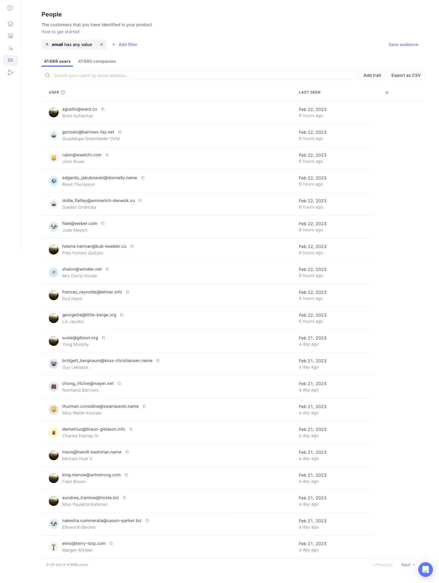
June’s People Analytics page embodies a crisp, modern minimalism tailored for SaaS professionals. The interface feels airy and uncluttered, balancing simplicity with a distinctly contemporary edge. Generous whitespace, compact cards, and clear visual separation of elements evoke both efficiency and approachability—a confident, professional tone that remains friendly. Layout and Structure
The structure revolves around function-first design: a compact header for navigation, and a workspace-centric main section where user “people” data is showcased in a sortable, tabular format. A sticky search and filter sidebar keeps powerful segmentation tools always within reach. There are no extraneous hero images or banners—content takes focus. Pagination and quick-access controls simplify browsing large datasets. Visual Elements
Rather than relying on illustrations or heavy photography, the design leverages crisp iconography—subtle, mono-weight icons for user attributes and actions—avoiding visual overload. Table rows are lightly shaded for contrast and scan-ability, while profile avatars inject a dash of color and personality. Color Palette and Typography
The palette centers on cool-neutral backgrounds punctuated by smart accents: a confident royal blue for primary actions, signal orange for highlights, and calming bisque-hued grays for surfaces. Typography feels modern and readable—sleek sans serifs in a logical hierarchy with larger bolder headings, uniform body text, and capsule-shaped buttons that “pop.” User Experience Patterns
Navigational clarity is a highlight: sticky elements, responsive tables, clearly marked CTAs (“Add People,” “Export,” etc.), and lightweight modals make data management fluid. Transitions are smooth, lending a sense of polish. Icon button tooltips, hover states, and inline error handling anticipate user needs without distraction. Unique or Notable Design Choices
Standout touches include the inline search/filter, which allows for complex queries using a single, multi-functional input—streamlining the experience for data-driven teams. The absence of visual clutter means eyes go straight to what matters: people, insights, actions. The overall feel is quietly innovative and trustworthy—ideal for teams looking to get things done, fast.