Design with AI
Generate a new design based on this screen using your own content.
# Design from Reference: Help Kit Account Setup
Create an original, high-fidelity visual design inspired by the reference. Prioritize composition, typography, colors, spacing, and component styling over technical implementation.
## Reference
- **Product:** Help Kit
- **Category:** Account Setup
- **Screenshot:** https://cdn.prod.website-files.com/5e9dc792e1210c5325f7ebbc/6acbbb59151c40fa40745f22_6acb71c49b286159c4681a72_cms-7f1dab738585e5ae885ff56e.webp
Analyze the screenshot first. If inaccessible, request it rather than guessing.
## Content
{{content.instructions}}
{{content.data}}
Preserve essential messaging and factual accuracy. Adapt structure and copy length for visual balance; never invent product claims.
## Visual Design
### Overall aesthetic
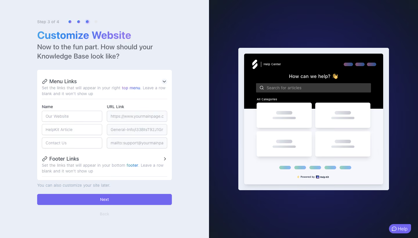
- **Character:** A split onboarding customizer pairs a pale blue-gray form area with a dark navy preview stage.
- **Accent:** Blue-to-purple heading text and a purple continuation action contrast with a mostly neutral form and black-header help-center mockup.
### Page composition
- **Capture:** The source measures 1440 × 821 image pixels. Observed dimensions below approximate CSS only under an unverified 1× capture assumption.
- **Equal halves:** The left contains a roughly 465 px wide setup column; the right centers a framed website preview over a deep gradient.
- **Setup sequence:** Step count/dots, title and two-line prompt precede a white configuration panel.
- **Configuration:** Menu Links is expanded into three name/URL pairs; Footer Links is collapsed.
- **Lower controls:** A muted reassurance line, full-width Next button and faint Back action follow the panel.
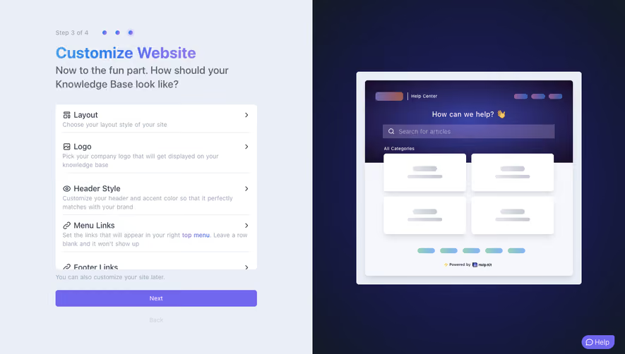
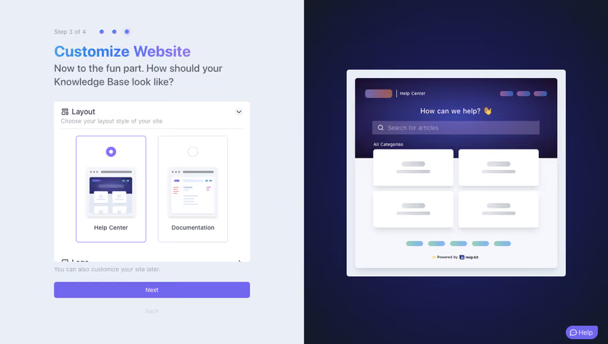
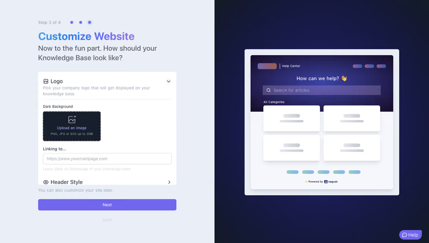
- **Preview:** A light framed mock browser/site shows dark hero/search, four category placeholders and footer-link placeholders.
### Information hierarchy
- **Progress:** Step 3 of 4 and four dots identify the current stage, with the third dot emphasized.
- **Task title:** The gradient customization heading is the strongest left-side text.
- **Expanded group:** Menu Links uses icon/title/helper text, then a two-column field grid.
- **Continuation:** A broad purple Next button stands out below the white panel.
- **Preview relationship:** The right-side mockup visually demonstrates menu/footer placement without showing detailed real content.
### Typography
- **Family:** A neutral sans serif is visible; exact identity is unverified.
- **Title:** Approximately 36 px, bold.
- **Prompt:** Approximately 24 px with 32 px leading, in muted slate.
- **Group labels:** Approximately 18 px, medium; field labels and helper text are around 14 px.
- **Preview text:** Smaller labels are embedded in the mockup and remain secondary to the setup form.
### Colors & surfaces
- **Measured foundation:** ICC-aware sRGB sampling yields pale #EAEEF6, white #FFFFFF and #F5F7FC.
- **Measured action:** Purple #7167EF fills Next.
- **Measured preview stage:** Deep navy samples include #161941 and #161940.
- **Measured dark surface:** Black #000000 fills the preview header.
- **Accent details:** Small blue/purple and mint/blue gradient pills represent links in the preview.
### Components
- **Progress dots:** Four compact circles sit beside the step label, with a halo around the active third.
- **Accordion panel:** A white rounded rectangle contains link sections, chevrons, helper text and thin rules.
- **Link grid:** Three equal-height rows pair Name and URL Link fields, with pale borders and approximately 6 px corners.
- **Next action:** A roughly 465 × 38 px observed purple button has small corners and centered white text.
- **Website preview:** A large light frame encloses a black search header, gray search field, two-by-two white category cards and small footer marks.
- **Help launcher:** A compact purple pill with conversation icon sits at the lower right.
### Visual rhythm
- **Form alignment:** Title, panel, reassurance and action share the same left/right boundaries.
- **Field cadence:** Equal-height paired inputs and narrow row gaps make link editing orderly.
- **Split contrast:** The bright form half and dark preview half create a strong functional division.
- **Preview depth:** Soft shadows lift category cards and the mock site from its outer frame.
### Responsive
- **Evidence boundary:** Only a desktop state is shown; responsive behaviors are recommendations.
- **Stacked customizer:** Place preview below the form or behind a preview toggle on narrow screens.
- **Field collapse:** Stack name/URL pairs while retaining their row association.
- **Action access:** Keep Next and Back reachable with a virtual keyboard open.
### Adaptation guidance
- **Live customization:** Reuse grouped settings with a visual preview that explains where edits appear.
- **Flexible links:** Support long labels/URLs and empty rows without truncating essential editing content.
- **Accessible controls:** Provide accordion state, field labels and visible keyboard focus.
- **State boundaries:** No preview update or next-step result is verified.
- **Scale calibration:** Validate observed pixels against the target CSS viewport before implementation.
Use this context to reproduce the reference's visual language: layout, typography, colors, spacing, borders, radii, and distinctive elements. The screenshot takes priority if descriptions conflict.
## Direction
{{preferences.fidelityInstructions}}
## Output
{{output.instructions}}
Deliver a polished, cohesive design with precise alignment, hierarchy, and spacing. Produce the requested visual artifact, not just a description. If unsupported, explain the limitation.