
Thank you! Your submission has been received!
Oops! Something went wrong while submitting the form.
Get SaaSFrame Pro
Monthly
$18
Quarterly
$48
Yearly
$180
Upgrade to access this feature
Browse all screens & flows
Filter and search screens & flows
Access Figma files
Access mobile versions
Bookmark screens & flows
Join now


GraphCMS Careers Page

GraphCMS
Rapidly deliver digital content at scale
Designed by
No items found.

Bookmark
Bookmark

Design with AI
Thank you! Your submission has been received!
Oops! Something went wrong while submitting the form.
# Design from Reference: GraphCMS Careers Page
Create an original, high-fidelity visual design inspired by the reference. Prioritize composition, typography, colors, spacing, and component styling over technical implementation.
## Reference
- **Product:** GraphCMS
- **Category:** Careers Page
- **Screenshot:** https://cdn.prod.website-files.com/5e9dc792e1210c5325f7ebbc/62f272cc63e6b550123bd4ea_1660054885430-86a74750-7602-4d44-9189-8108be57a81e-name%3DGraphCMSCareersPage.webp
Analyze the screenshot first. If inaccessible, request it rather than guessing.
## Content
{{content.instructions}}
{{content.data}}
Preserve essential messaging and factual accuracy. Adapt structure and copy length for visual balance; never invent product claims.
## Visual Design
### Overall aesthetic
- **Character:** A straightforward careers page balances a darkened team photograph with a white editorial body, black typography, simple outlined cards and generous whitespace.
- **Image evidence:** The screenshot is 1440 × 7616 pixels and visibly carries Hygraph branding. All six readable portions were inspected. CSS sizes below assume an unverified 1× capture density.
### Page composition
- **Hero:** A full-width team-at-sunset photograph, approximately 420 pixels tall, carries the white logo, compact top-right navigation/social icons and centered recruitment heading.
- **Company introduction:** A centered content container roughly 1150 pixels wide presents mission text beside a lavender platform diagram, then working-culture copy beside a remote-call photograph with a Job Openings button.
- **Benefits and locations:** Six benefit cards form a two-column, three-row grid. A location explanation leads into a wide world map with black markers, followed by a three-image team gallery with arrow controls.
- **Recruitment content:** Department tabs precede eleven job cards in two columns. Four illustrated hiring stages follow, then a talent-pool invitation and a minimal recruitment-provider footer.
### Information hierarchy
- **Entry message:** The centered Join us heading and short subtitle frame the photographic hero before detailed company content.
- **Section scanning:** Bold headings distinguish mission, culture, perks, locations, job openings and hiring process. Benefit titles and role titles provide the next level.
- **Application actions:** Black Job Openings, View job and Talent Pool buttons consistently identify the actionable paths; maps and team imagery supply supporting context.
### Typography
- **Hero and sections:** The hero heading is approximately 46–48 pixels bold; major section headings are roughly 32 pixels with about 1.2 line-height.
- **Body copy:** Approximately 20–21 pixels with 31–32-pixel line-height, producing readable multi-line paragraphs.
- **Cards:** Benefit headings are about 20 pixels bold; job titles and hiring-stage titles are roughly 23–24 pixels bold. Tab/navigation labels are around 16 pixels.
- **Family:** A neutral sans-serif resembling Arial or Helvetica is visible, but the exact family is unverified. Most copy uses normal tracking; the platform-diagram eyebrow uses uppercase spaced lettering.
### Colors & surfaces
- **Measured neutrals:** ICC-to-sRGB sampling identifies #FFFFFF as the main background and #000000 as a principal foreground/button color.
- **Measured illustration/map colors:** #D1D1FF supplies the lavender diagram background and #75CFF0 the dominant map water tone.
- **Photographic treatment:** The hero has a dark overlay for white-text contrast; later photographs retain their natural colors.
- **Card treatment:** Benefit and job cards use thin light-gray borders, white fills and very small radii. Heavy decorative shadows are absent from the main card system.
### Components
- **Benefit cards:** Roughly 545 pixels wide, with approximately 24-pixel padding and 1-pixel outlines. Row heights accommodate the longest text; some cards include compact black external-resource buttons.
- **Location map:** Approximately 1150 × 400 pixels, with black pin markers, stacked plus/minus controls in the upper right and attribution in the lower corner.
- **Photo gallery:** Three tall image areas span the content width with roughly 32-pixel gaps; black square previous/next controls overlay the outer images.
- **Job filters/cards:** A single-line department row uses count badges and an underline for the selected category. Job cards have roughly 24-pixel padding, bold wrapping titles, location/department metadata and a top-right View job button.
- **Hiring stages:** Four vertically arranged rows pair small colorful illustrations on the left with title and explanatory text on the right. The closing provider footer is separated by a fine horizontal rule.
### Visual rhythm
- **Container consistency:** Most body regions align near 144-pixel outside margins at the supplied width; introductory columns and job grids share these edges.
- **Section breathing room:** Large gaps, often around 100–180 pixels, separate company sections, map/gallery, vacancies and hiring stages.
- **Grid cadence:** Benefit columns have a broad roughly 64-pixel gutter, while job cards use a much tighter approximately 16-pixel gap.
- **Text rhythm:** Paragraphs use generous leading and clear blank space between ideas. Repeated buttons remain compact relative to the spacious content blocks.
### Responsive
- **Observed scope:** Only a desktop layout is visible; map interaction, gallery transitions and tab behavior cannot be confirmed from pixels.
- **Recommended stacking:** Collapse introductory columns, benefits and vacancies to one column, maintaining paragraph order and placing each role action after its metadata.
- **Recommended navigation/media:** Collapse top navigation, allow department tabs to scroll, retain useful map height and show fewer gallery images per view.
- **Recommended typography:** Reduce the hero heading and long role titles on phones, preserving readable body leading and touch targets of at least 44 CSS pixels.
### Adaptation guidance
- **Careers sequence:** Introduce the team and mission, explain working conditions, show benefits and distribution, then expose openings and explain the hiring process.
- **Content fidelity:** Use real team photography, genuine benefit details and accurate role metadata. The screenshot's Hygraph identity should guide the visual description despite the record's older GraphCMS title.
- **Reusable components:** Standardize outlined information cards, compact black actions, department count badges and illustrated process rows while retaining the differing grid gutters.
- **Implementation:** Confirm fonts and capture density before defining tokens. Provide accessible map alternatives, gallery labels and visible focus states for all navigation and application controls.
Use this context to reproduce the reference's visual language: layout, typography, colors, spacing, borders, radii, and distinctive elements. The screenshot takes priority if descriptions conflict.
## Direction
{{preferences.fidelityInstructions}}
## Output
{{output.instructions}}
Deliver a polished, cohesive design with precise alignment, hierarchy, and spacing. Produce the requested visual artifact, not just a description. If unsupported, explain the limitation.


Category
Patterns
No items found.
Tech Stack



Added on
June 6, 2020
Similar screens
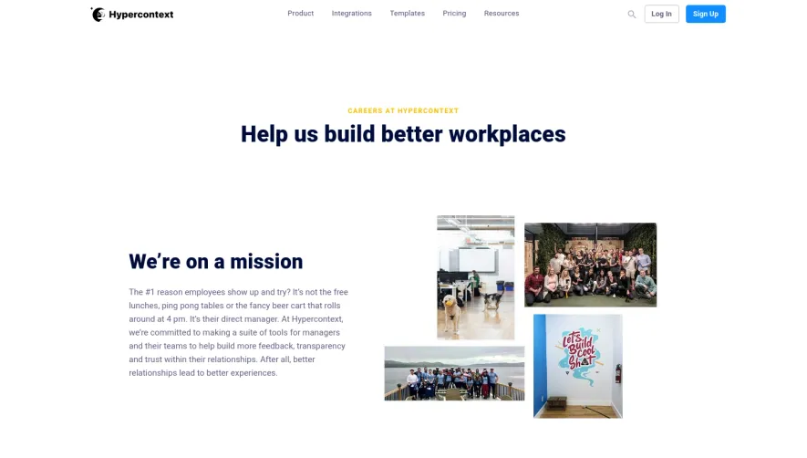


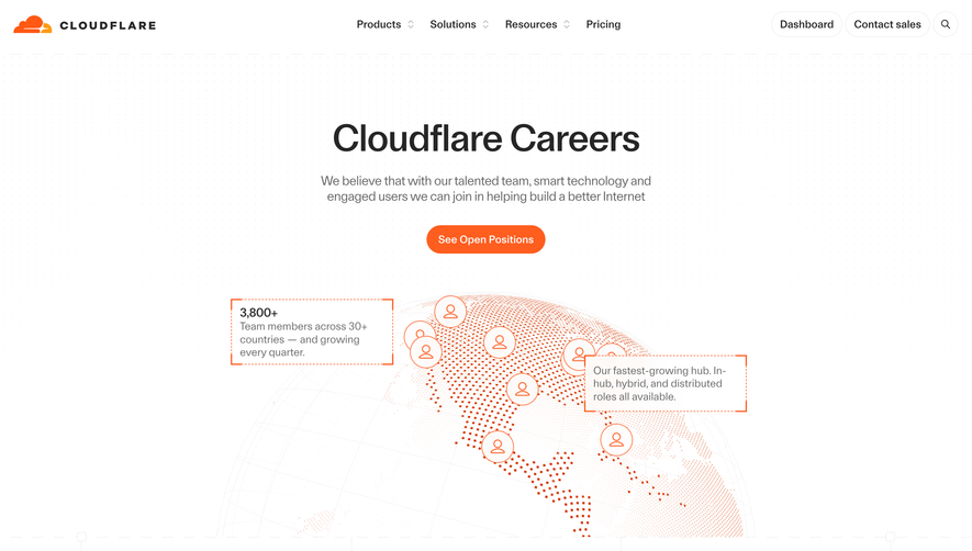

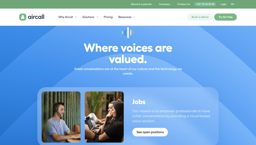

Upgrade to SaaSFrame Pro now to see similar examples.
Monthly
$18 /month
Billed $18 monthly
Browse all screens & flows
Filter and search screens & flows
Search text in screenshots
Access Figma files
Access mobile versions
Join now
Quarterly
$16 /month
Billed $48 quarterly
Browse all screens & flows
Filter and search screens & flows
Search text in screenshots
Access Figma files
Access mobile versions
Join now
Yearly
$15 /month
Billed $180 yearly
Browse all screens & flows
Filter and search screens & flows
Search text in screenshots
Access Figma files
Access mobile versions
Join now