Design with AI
Generate a new design based on this screen using your own content.
# Design from Reference: GraphCMS AI content generation prompt
Create an original, high-fidelity visual design inspired by the reference. Prioritize composition, typography, colors, spacing, and component styling over technical implementation.
## Reference
- **Product:** GraphCMS
- **Category:** Add & Edit
- **Screenshot:** https://cdn.prod.website-files.com/5e9dc792e1210c5325f7ebbc/6aca27d6aca7079066e8e533_6aca258d135ada3c80fa60fb_cms-0142eb6bcba8d2ac253dbef0.webp
Analyze the screenshot first. If inaccessible, request it rather than guessing.
## Content
{{content.instructions}}
{{content.data}}
Preserve essential messaging and factual accuracy. Adapt structure and copy length for visual balance; never invent product claims.
## Visual Design
### Overall aesthetic
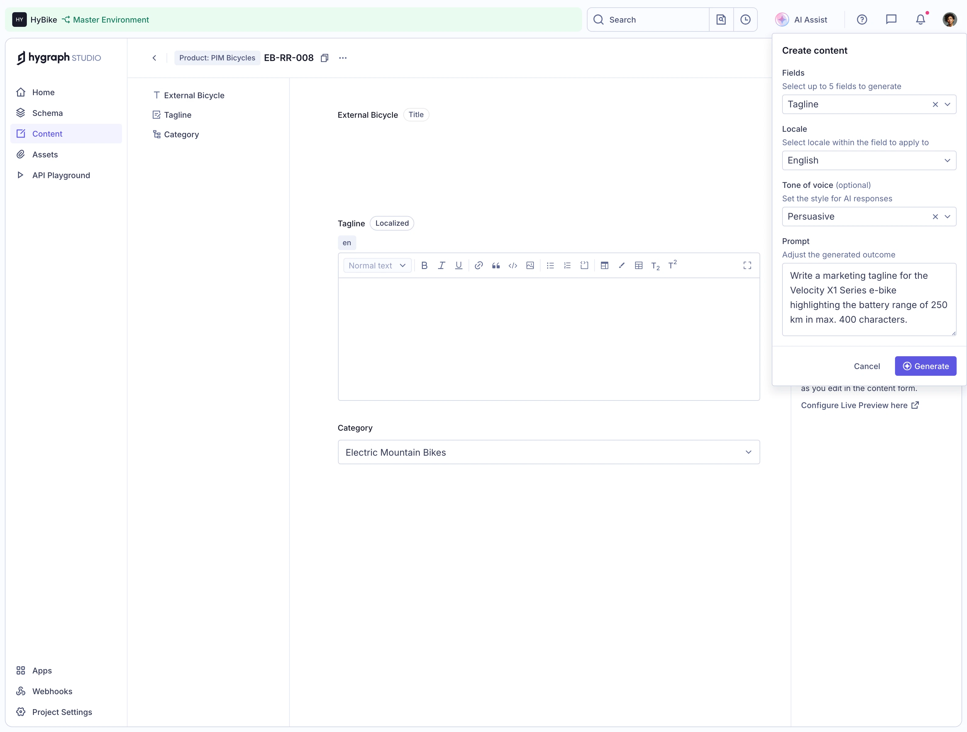
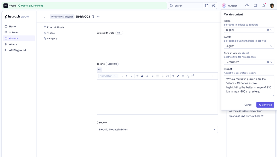
- **Style:** Light CMS editing workspace with a compact AI-generation popover anchored at the upper-right.
- **Character:** White surfaces, thin lavender-gray borders, small labels, violet actions, and a mint environment strip.
### Page composition
- **Canvas:** 3170 × 2400 image px; CSS estimates assume an unverified 2× capture.
- **Structure:** Global header, left app navigation, secondary field list, central content editor, and right contextual area.
- **Popover:** Approximately 640 × 1160 image px at top-right, containing field, locale, tone, and prompt settings.
- **Editor:** Large rich-text area and category dropdown remain visible behind the popover.
### Information hierarchy
- **Primary:** Create content popover heading and form.
- **Configuration:** Fields → locale → tone → prompt.
- **Action:** Violet Generate at bottom-right; Cancel beside it.
- **Context:** Selected Content navigation and item breadcrumb identify the edited resource.
### Typography
- **Family:** Compact interface sans serif; exact family unverified.
- **Popover title:** Approximately 16 CSS px, semibold under assumed 2×.
- **Labels/body:** Approximately 13–14px.
- **Helper text:** Approximately 12px, blue-gray.
- **Editor controls:** Approximately 12px.
- **Precision:** Sizes and scale are estimates.
### Colors & surfaces
- **Canvas/popover:** #FFFFFF.
- **Header pale surface:** #F9FBFF.
- **Environment tint:** #E9FBF1.
- **Borders:** #D0D4E5 and #E6E9F3.
- **Selected navigation:** #F3F3FF.
- **Primary text:** #343A55.
- **Secondary surface:** #EEF0F9.
- **Action:** Violet; exact flat token unverified.
### Components
- **Popover:** Thin outline, small radius, soft lower shadow.
- **Selects:** Compact full-width outlined rows with chevrons; selected fields/tone include clear X.
- **Prompt:** Multi-line textarea.
- **Generate:** Small violet rectangle with icon and white text.
- **Editor:** Full formatting toolbar above empty rich-text region.
- **Global header:** Search, AI Assist, utility icons, and profile.
### Visual rhythm
- **Density:** Compact form controls contrast with large empty content area.
- **Alignment:** Popover labels, helpers, and controls share tight consistent insets.
- **Grouping:** Footer divider separates configuration from actions.
### Responsive
- **Observed:** Desktop only.
- **Recommendation:** Convert AI settings to a drawer on narrow screens, collapse navigation, and preserve editor width.
- **Controls:** Let helper text wrap without shrinking labels.
### Adaptation guidance
- **Preserve:** Contextual generation settings alongside the actual content form.
- **Content:** Use supplied field names, locale, tone options, and prompt.
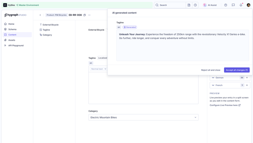
- **Behavior:** No generation result, validation, or AI behavior is demonstrated.
Use this context to reproduce the reference's visual language: layout, typography, colors, spacing, borders, radii, and distinctive elements. The screenshot takes priority if descriptions conflict.
## Direction
{{preferences.fidelityInstructions}}
## Output
{{output.instructions}}
Deliver a polished, cohesive design with precise alignment, hierarchy, and spacing. Produce the requested visual artifact, not just a description. If unsupported, explain the limitation.