Design with AI
Generate a new design based on this screen using your own content.
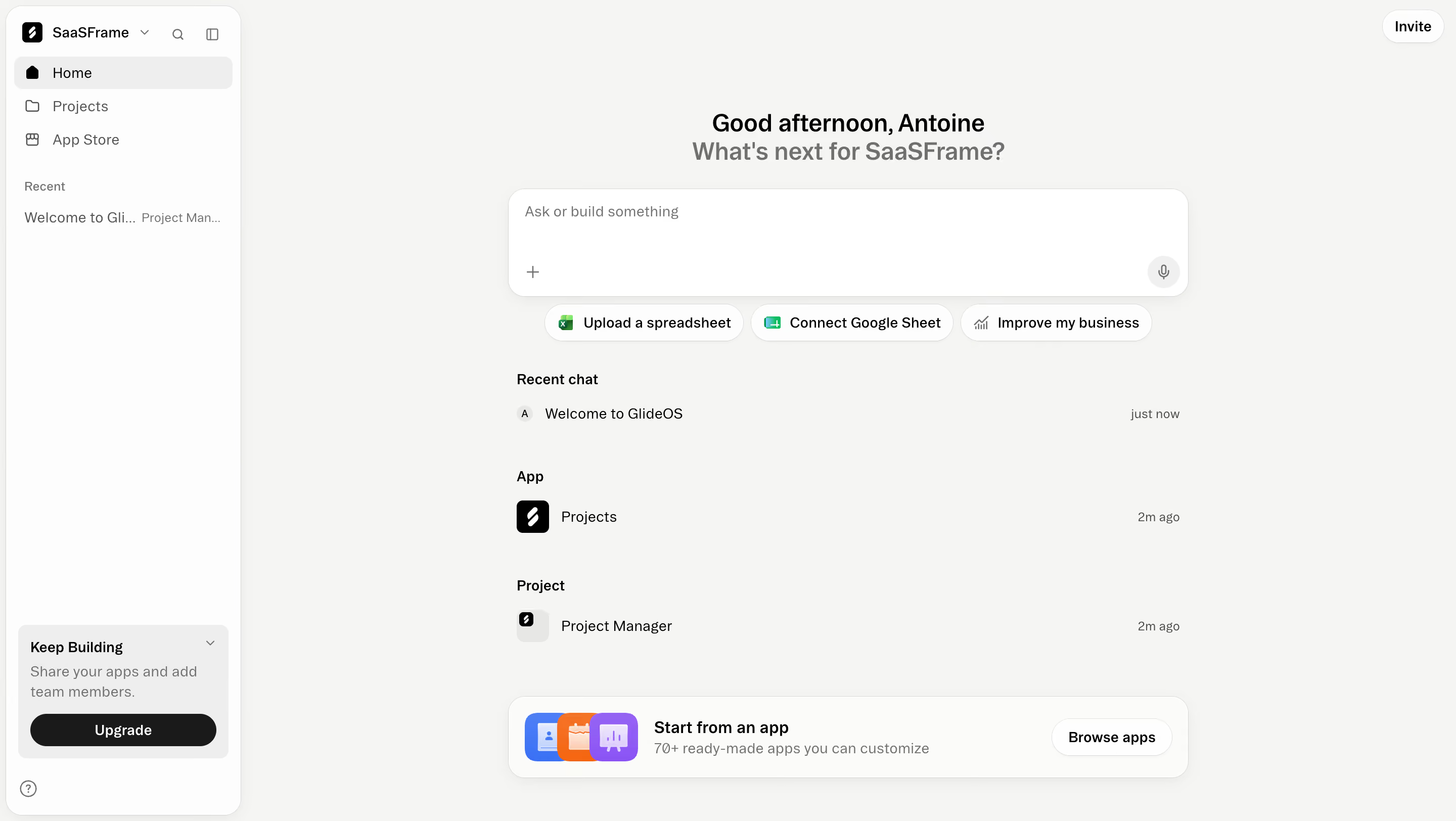
# Design from Reference: Glide AI app builder home
Create an original, high-fidelity visual design inspired by the reference. Prioritize composition, typography, colors, spacing, and component styling over technical implementation.
## Reference
- **Product:** Glide
- **Category:** Chat
- **Screenshot:** https://cdn.prod.website-files.com/5e9dc792e1210c5325f7ebbc/6acacffd7796407cec141733_6ac5731998a63f7d8fca004e_richtext-f1048b90fce0cd807558.webp
Analyze the screenshot first. If inaccessible, request it rather than guessing.
## Content
{{content.instructions}}
{{content.data}}
Preserve essential messaging and factual accuracy. Adapt structure and copy length for visual balance; never invent product claims.
## Visual Design
### Overall aesthetic
- **Style:** Calm AI app-builder home with warm off-white canvas, slim white navigation, and centered prompt composer.
### Page composition
- **Canvas:** 2880 × 1624 image px; CSS estimates assume an unverified 2× capture.
- **Sidebar:** Approximately 240 CSS px wide, rounded outer container.
- **Main:** Centered greeting, broad prompt field, three suggestion pills, recent chat/app/project rows, and starter-app banner.
- **Top-right:** Small Invite pill.
### Information hierarchy
- **Primary:** Greeting and Ask or build something composer.
- **Shortcuts:** Spreadsheet upload, Google Sheet connection, and business-improvement prompts.
- **History:** Recent chat, app, and project grouped below.
- **Discovery:** Start from an app banner at bottom.
### Typography
- **Family:** Neutral sans serif; exact family unverified.
- **Greeting:** Approximately 24 CSS px, semibold.
- **Prompt/body:** Approximately 14px.
- **Group labels:** Approximately 14px, semibold.
- **Banner title:** Approximately 16px, semibold.
- **Precision:** Font values and scale are estimates.
### Colors & surfaces
- **Canvas:** #F5F5F2.
- **Sidebar/banner pale surfaces:** #FDFDFC and #FBFBF9.
- **Composer:** #FFFFFF.
- **Selected navigation:** #EEEEEE.
- **Primary text:** Black/near-black.
- **Secondary text:** Medium gray.
- **Artwork:** Blue, orange, and violet app icons.
- **Precision:** Flat sampled screenshot colors.
### Components
- **Composer:** Approximately 670 × 108 CSS px, white, rounded, soft shadow.
- **Input controls:** Plus at lower-left and circular microphone at lower-right.
- **Suggestions:** Small outlined white pills with icons.
- **History rows:** Icon/name left and timestamp right, no strong enclosing cards.
- **Starter banner:** Rounded white panel, overlapping colorful app icons, Browse apps pill.
- **Sidebar upsell:** Pale box with dark Upgrade pill.
### Visual rhythm
- **Whitespace:** Broad empty margins around narrow central content.
- **Alignment:** Composer, suggestions, history, and starter banner share a centered column.
- **Density:** Small history groups separated by generous vertical gaps.
### Responsive
- **Observed:** Desktop only.
- **Recommendation:** Collapse sidebar, make composer fluid, and wrap suggestion pills.
- **History:** Keep timestamps secondary and allow long names to truncate accessibly.
### Adaptation guidance
- **Preserve:** Prompt-first entry, useful starter actions, and quiet history organization.
- **Privacy:** Replace workspace names and recent items.
- **Behavior:** AI generation, uploads, and microphone behavior are not demonstrated.
Use this context to reproduce the reference's visual language: layout, typography, colors, spacing, borders, radii, and distinctive elements. The screenshot takes priority if descriptions conflict.
## Direction
{{preferences.fidelityInstructions}}
## Output
{{output.instructions}}
Deliver a polished, cohesive design with precise alignment, hierarchy, and spacing. Produce the requested visual artifact, not just a description. If unsupported, explain the limitation.