
Thank you! Your submission has been received!
Oops! Something went wrong while submitting the form.
Get SaaSFrame Pro
Monthly
$18
Quarterly
$48
Yearly
$180
Upgrade to access this feature
Browse all screens & flows
Filter and search screens & flows
Access Figma files
Access mobile versions
Bookmark screens & flows
Join now
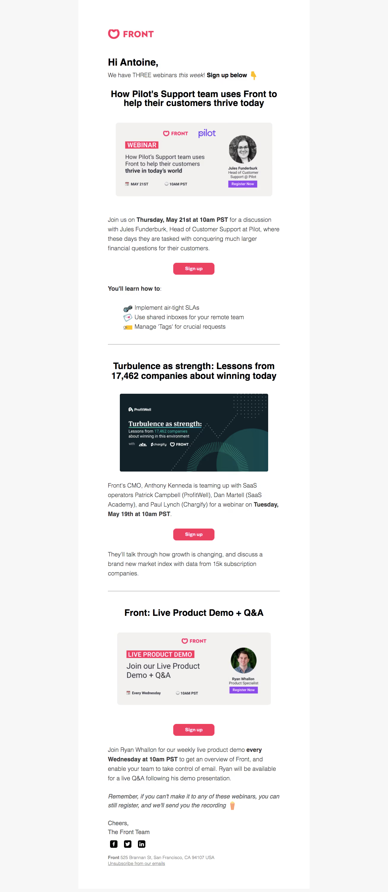
Front Webinars Emails

Front
Email client
Designed by
No items found.

Bookmark
Bookmark

Design with AI
Thank you! Your submission has been received!
Oops! Something went wrong while submitting the form.
# Design from Reference: Front Webinars Emails
Create an original, high-fidelity visual design inspired by the reference. Prioritize composition, typography, colors, spacing, and component styling over technical implementation.
## Reference
- **Product:** Front
- **Category:** Webinars Emails
- **Screenshot:** https://cdn.prod.website-files.com/5e9dc792e1210c5325f7ebbc/6acbd0488f05a14579f047a5_6acbcd11996643535b5db148_cms-afcd1afedb17626448c74d59.webp
Analyze the screenshot first. If inaccessible, request it rather than guessing.
## Content
{{content.instructions}}
{{content.data}}
Preserve essential messaging and factual accuracy. Adapt structure and copy length for visual balance; never invent product claims.
## Visual Design
### Overall aesthetic
- **Character:** A long promotional email uses a white reading column, generous vertical spacing, bold centered webinar headings, and repeated pink signup actions.
- **Evidence:** The screenshot measures 1308 × 3004 image pixels. Dimensions below refer to observed source pixels; the email's actual CSS scale and capture device ratio are unverified.
### Page composition
- **Container:** A white column approximately 780 px wide sits between very pale gray side gutters. The inner reading measure is about 580 px, with roughly 100 px side padding.
- **Opening:** A pink Front logo precedes a bold personal greeting and a short introductory line with inline bold/italic emphasis.
- **Webinar sequence:** Three vertically stacked event sections contain a centered heading, landscape promotional artwork, explanatory live text, and a centered pink Sign up button.
- **Section variation:** The first event includes a three-item emoji-led learning list. The second has an additional explanatory paragraph after its button. The third finishes with body copy, an italic reminder, and a team sign-off.
- **Footer:** Three black social icons, a muted address line, and an underlined unsubscribe link close the message.
### Information hierarchy
- **Headings:** Bold event titles are the major landmarks. The greeting is left-aligned while event headings are centered and wrap into two lines where needed.
- **Schedule emphasis:** Dates and times are bold within otherwise regular paragraphs, allowing readers to scan practical information.
- **Actions:** Each event repeats an identically styled pink signup button. Purple registration labels inside artwork remain part of the image, distinct from the live email buttons.
- **Separation:** Thin horizontal rules divide the events; the learning list and italic recording reminder add secondary emphasis without new panels.
### Typography
- **Family:** Most text resembles a familiar email-safe sans serif; exact font identity is unverified. Promotional images contain their own type treatments.
- **Greeting and titles:** Greeting is approximately 34 px bold. Event headings are approximately 30–32 px bold with tight 32–35 px line-height.
- **Body:** Paragraphs are approximately 20–21 px with 31–32 px line-height. Bold schedule fragments and occasional italics remain within the same scale.
- **Controls and footer:** Button labels are about 16 px bold; address and unsubscribe text are around 14–15 px. The final reminder uses italic body text.
### Colors & surfaces
- **Measured foundations:** Sampled source colors include white #FFFFFF, pale background #F8F7F8, warm artwork gray #F3F1F0, deep blue-black #122128, black #000000, and brand pink #E94361.
- **Semantic accents:** Pink identifies the brand and repeated signup controls. Purple appears in embedded registration artwork, while the second event banner uses deep teal with fine geometric motifs.
- **Surface treatment:** The email itself is flat, without a visible card shadow. Light rounded promotional banners provide local contrast against the white reading area.
### Components
- **Promotional banners:** Approximately 500–530 px wide and 245–250 px tall, with small 6–8 px corner radii. Two use pale backgrounds, presenter portraits, logos, and schedule details; the middle banner uses a dark graphic treatment.
- **Signup buttons:** Approximately 139 × 40 px, pink fill, 10–11 px corner radii, and centered white bold text. All three share the same dimensions.
- **Learning list:** Three compact lines pair emoji icons with text. Icons align in a narrow left column, with text beginning consistently beside them.
- **Dividers:** Thin gray rules span the inner reading width, with substantial white space above and below.
- **Footer icons:** Three small black square social marks sit on one horizontal line; the address and underlined unsubscribe link appear underneath.
### Visual rhythm
- **Reading alignment:** Paragraphs, introduction, rules, and footer share the inner left edge near x364 px. Centered headings, imagery, and buttons sit within this measure.
- **Vertical cadence:** Sections alternate title, artwork, prose, and action, with roughly 40–70 px breaks between major elements.
- **Density:** Body paragraphs use open leading; bold schedule fragments help scan the long message. The first learning list is tighter than surrounding prose.
- **Closure:** The final reminder and sign-off reduce the visual intensity before the smaller footer.
### Responsive
- **Observed limit:** A single desktop email rendering is available. Actual client-specific behavior and mobile breakpoints are unverified.
- **Recommended layout:** Use a fluid single column with 20–24 CSS px mobile gutters, proportional images, and titles that wrap naturally.
- **Recommended controls:** Keep signup actions comfortably tappable and preserve body size rather than shrinking the entire desktop email as one image.
- **Recommended artwork:** Supply useful image alternatives because embedded schedule and presenter details may become too small on narrow devices; repeat essential event information as live text.
### Adaptation guidance
- **Preserve:** Keep a repeatable event module, clear schedule emphasis, consistent pink actions, and simple dividers between distinct webinars.
- **Implement:** Use email-compatible tables and inline styles, with live headings, prose, lists, and links. Treat the banners as supplied editorial assets.
- **Content discipline:** Keep each event's title, artwork, details, and CTA together; avoid introducing extra CTA variants that compete with registration.
- **Validate:** Check image-blocked rendering, long headings, dark-mode contrast, link targets, and mobile spacing. No registration or external messaging was performed; interactive states are not shown.
Use this context to reproduce the reference's visual language: layout, typography, colors, spacing, borders, radii, and distinctive elements. The screenshot takes priority if descriptions conflict.
## Direction
{{preferences.fidelityInstructions}}
## Output
{{output.instructions}}
Deliver a polished, cohesive design with precise alignment, hierarchy, and spacing. Produce the requested visual artifact, not just a description. If unsupported, explain the limitation.


Category
Patterns
No items found.


Added on
April 26, 2020
Found in 1 flow

Similar screens






Upgrade to SaaSFrame Pro now to see similar examples.
Monthly
$18 /month
Billed $18 monthly
Browse all screens & flows
Filter and search screens & flows
Search text in screenshots
Access Figma files
Access mobile versions
Join now
Quarterly
$16 /month
Billed $48 quarterly
Browse all screens & flows
Filter and search screens & flows
Search text in screenshots
Access Figma files
Access mobile versions
Join now
Yearly
$15 /month
Billed $180 yearly
Browse all screens & flows
Filter and search screens & flows
Search text in screenshots
Access Figma files
Access mobile versions
Join now