
Thank you! Your submission has been received!
Oops! Something went wrong while submitting the form.
Get SaaSFrame Pro
Monthly
$18
Quarterly
$48
Yearly
$180
Upgrade to access this feature
Browse all screens & flows
Filter and search screens & flows
Access Figma files
Access mobile versions
Bookmark screens & flows
Join now


Formcarry Landing Page

Formcarry
Form backend
Designed by


Bookmark
Bookmark

Design with AI
Thank you! Your submission has been received!
Oops! Something went wrong while submitting the form.
# Design from Reference: Formcarry Landing Page
Create an original, high-fidelity visual design inspired by the reference. Prioritize composition, typography, colors, spacing, and component styling over technical implementation.
## Reference
- **Product:** Formcarry
- **Category:** Landing Page
- **Screenshot:** https://cdn.prod.website-files.com/5e9dc792e1210c5325f7ebbc/6acbbe3f476aea3982e3fb22_6acbbd70a4008ddb7476c044_cms-935404b7da1821cac5064315.webp
Analyze the screenshot first. If inaccessible, request it rather than guessing.
## Content
{{content.instructions}}
{{content.data}}
Preserve essential messaging and factual accuracy. Adapt structure and copy length for visual balance; never invent product claims.
## Visual Design
### Overall aesthetic
- **Style:** A polished developer-SaaS landing page with bold navy typography, electric-blue actions, softly textured lavender/cyan artwork, and layered product mockups.
- **Character:** Playful and approachable, using small emoji-like characters, floating interface fragments, and curved decorative sheets while keeping the main page white.
### Page composition
- **Capture and scale:** The screenshot measures 1440 × 11423 pixels. Approximate dimensions below refer to screenshot pixels; CSS scale is unverified.
- **Hero:** A centered navigation/header leads into an uppercase eyebrow, large two-line headline with inline blue symbols, supporting paragraph, and a stylized email/signup control above a floating form-endpoint mockup. Customer logos follow.
- **Technical setup:** A centered framework-introduction section includes HTML/jQuery/React/Vue tabs, a syntax-colored code-window illustration, and documentation action.
- **Feature sequence:** A large dark rounded panel contains a feature introduction, four-option tab strip, and an upload-files example. A pale collaboration panel and alternating integrations panel follow.
- **Lower sequence:** A dark conversion banner precedes a coming-soon payments section with a large Stripe-style product mockup. Spam protection, a six-row FAQ panel, three article cards, and a final dark dashboard/signup composition follow.
- **Footer:** A centered brand/app icon and short sentiment lead into four broad link columns with nested groups, then a pale rounded legal/social bar.
### Information hierarchy
- **Primary narrative:** The page progresses from collecting submissions to implementation, capabilities, collaboration/integrations, payments, protection, help, and activation.
- **Evidence:** Large layered interface illustrations demonstrate each capability; short copy and pill documentation actions support them.
- **Availability:** Coming Soon badges are visible in collaboration/payment regions. Preserve this availability distinction rather than presenting every illustrated feature as live.
- **Conversion:** Email/signup controls recur in hero and dark banners, with documentation and integration links as secondary paths.
### Typography
- **Family:** A rounded contemporary sans serif is visible; code samples use monospace. Exact font identities are unverified.
- **Display:** Hero title is approximately 58–62 px bold with 1.2 line-height and tight tracking. Major section headings are around 44–48 px.
- **Body:** Main paragraphs are about 18 px with 30–32 px line-height. Feature details and article copy are around 15–16 px.
- **Labels:** Eyebrows and badges use compact uppercase 13–14 px text. Tabs/buttons are roughly 14–15 px; code uses smaller regular monospace with line numbers.
### Colors & surfaces
- **Foundation:** Sampled sRGB #FFFFFF dominates, with pale blue-gray #F7F9FC supporting feature/FAQ surfaces.
- **Navy system:** Sampled #020721, #09123C, and #151830 define dark panels, headings, and deep decorative layers.
- **Accents:** Electric blue marks primary actions and inline icons; violet/lavender/cyan tint the decorative sheets and feature badges. Exact accent hex values are unverified.
- **Supporting color:** Orange marks spam messaging, yellow emphasizes part of the dark feature introduction, and pastel article artwork varies by topic.
### Components
- **Signup control:** A white floating email/action assembly is slightly skewed/curved in the artwork, with blue Get Started segment and subtle shadow.
- **Mockup windows:** White browser-like frames use colored window dots, rounded corners, layered floating labels, and soft glows. Examples include endpoint copying, code, member invitations, payments, submission rows, and dashboard charts.
- **Dark feature panel:** A broad navy rectangle with roughly 24 px radii contains a white active-tab pill, muted alternate tabs, left copy/action, and right upload form illustration.
- **FAQ:** A narrower pale rounded panel contains six separate white rows with right chevrons and a centered See All action; answers are not visible.
- **Article cards:** Three equal outlined cards pair pastel illustrated thumbnails with title and excerpt, using modest 12 px radii.
- **Conversion artwork:** Dark rounded banners combine centered copy/actions with translucent textured sheets; the final one overlays a large dashboard window and another email action.
- **Footer:** Unboxed link groups use clear headings and muted text. A separate pale rounded bar contains copyright, terms/privacy, and social icons.
### Visual rhythm
- **Major spacing:** Use generous 140–200 px intervals between major modules. Broad feature panels occupy around 1110 px centered width.
- **Internal rhythm:** Keep eyebrows, headings, paragraphs, and controls grouped at 20–35 px intervals, with larger 50–70 px gaps before media.
- **Layering:** Restrict overlapping sheets/labels to illustrations so live reading copy and controls remain clear.
- **Contrast pacing:** Alternate white technical explanations, pale feature panels, and occasional deep navy conversion/features rather than using one continuous colored background.
### Responsive
- **Observed state:** Only desktop is visible; alternate tab states and media behavior are not established.
- **Recommended reflow:** Stack text/media pairs, make tabs scrollable or wrapping, collapse article/footer columns, and simplify overlapping artwork on narrow screens.
- **Legibility:** Provide readable code/product crops instead of shrinking detailed mockups excessively. Use a straightforward full-width email/action stack on phones.
### Adaptation guidance
- **Preserve:** Retain navy/blue hierarchy, rounded product evidence, restrained textured sheets, technical setup section, and repeated concise activation paths.
- **Adapt:** Use authentic product capabilities, code examples, availability badges, integration marks, and screenshots.
- **Avoid:** Do not import performance/accuracy claims, customer counts, or coming-soon promises. Keep decorative complexity subordinate to the new content.
Use this context to reproduce the reference's visual language: layout, typography, colors, spacing, borders, radii, and distinctive elements. The screenshot takes priority if descriptions conflict.
## Direction
{{preferences.fidelityInstructions}}
## Output
{{output.instructions}}
Deliver a polished, cohesive design with precise alignment, hierarchy, and spacing. Produce the requested visual artifact, not just a description. If unsupported, explain the limitation.


Category
Patterns
No items found.
Tech Stack


Added on
February 5, 2023
Similar screens
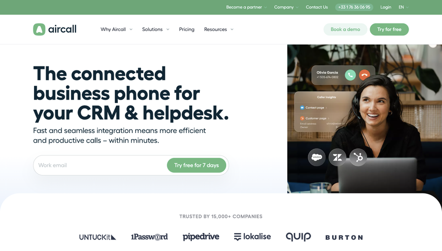


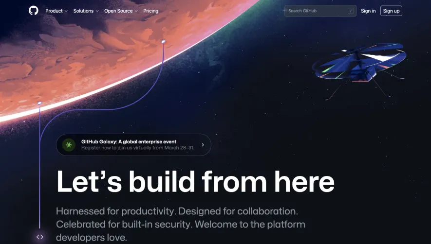



Upgrade to SaaSFrame Pro now to see similar examples.
Monthly
$18 /month
Billed $18 monthly
Browse all screens & flows
Filter and search screens & flows
Search text in screenshots
Access Figma files
Access mobile versions
Join now
Quarterly
$16 /month
Billed $48 quarterly
Browse all screens & flows
Filter and search screens & flows
Search text in screenshots
Access Figma files
Access mobile versions
Join now
Yearly
$15 /month
Billed $180 yearly
Browse all screens & flows
Filter and search screens & flows
Search text in screenshots
Access Figma files
Access mobile versions
Join now