
Thank you! Your submission has been received!
Oops! Something went wrong while submitting the form.
Get SaaSFrame Pro
Monthly
$18
Quarterly
$48
Yearly
$180
Upgrade to access this feature
Browse all screens & flows
Filter and search screens & flows
Access Figma files
Access mobile versions
Bookmark screens & flows
Join now
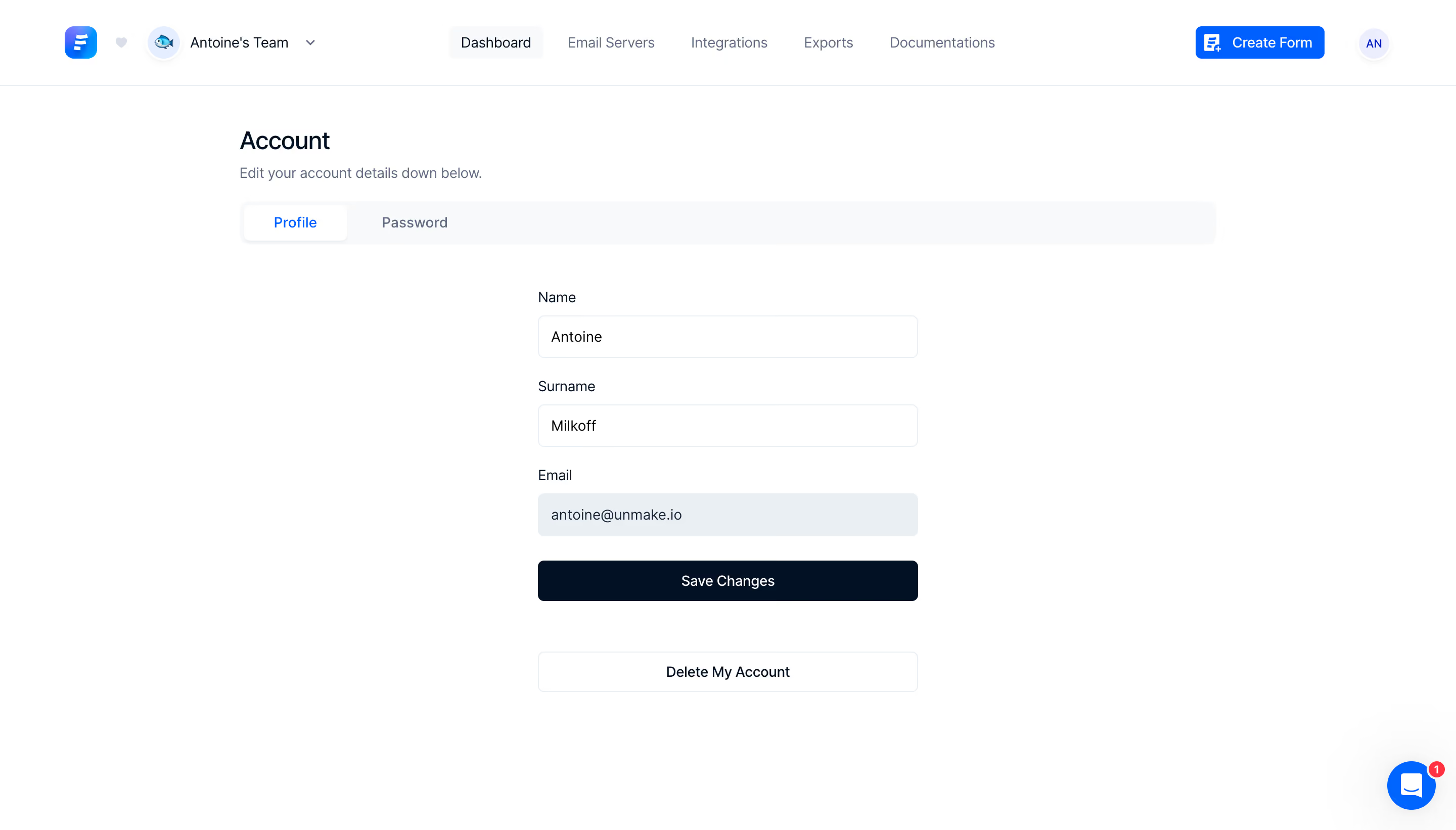
Formcarry Account Settings

Formcarry
Form backend
Designed by


Bookmark
Bookmark

Design with AI
Thank you! Your submission has been received!
Oops! Something went wrong while submitting the form.
# Design from Reference: Formcarry Account Settings
Create an original, high-fidelity visual design inspired by the reference. Prioritize composition, typography, colors, spacing, and component styling over technical implementation.
## Reference
- **Product:** Formcarry
- **Category:** Settings
- **Screenshot:** https://cdn.prod.website-files.com/5e9dc792e1210c5325f7ebbc/6acb722e10423f7ec1f650a7_6acb70789382ba3bdd6e56e9_cms-b3790d38ee4abe4630df0636.webp
Analyze the screenshot first. If inaccessible, request it rather than guessing.
## Content
{{content.instructions}}
{{content.data}}
Preserve essential messaging and factual accuracy. Adapt structure and copy length for visual balance; never invent product claims.
## Visual Design
### Overall aesthetic
- **Character:** A minimal account-settings page combines a white workspace, pale controls and dark navy form actions.
- **Capture scale:** The screenshot measures 2880 × 1642 image pixels. Approximate CSS dimensions assume a 1440 × 821 viewport at 2× density; this is unverified.
- **Tone:** Large open margins and a compact form keep the screen practical and uncluttered.
### Page composition
- **Top bar:** Brand/workspace controls sit left, five navigation destinations span the center and Create Form plus avatar sit right.
- **Account area:** A roughly 965px-wide centered region starts with Account and a short subtitle.
- **Tabs:** A full-width pale strip contains Profile and Password, with Profile selected.
- **Form:** A narrower roughly 376px-wide centered stack contains Name, Surname and Email fields.
- **Actions:** A dark Save Changes button follows the fields; a separate outlined account-deletion action sits lower down.
- **Utility:** A blue circular chat control with a red unread badge appears at the lower right.
### Information hierarchy
- **Page context:** Account and its supporting sentence precede the selected profile tab.
- **Editable details:** Persistent labels sit above each value; the email field is visibly tinted compared with the two white name fields.
- **Primary action:** Save Changes is dark and full width.
- **Secondary action:** The deletion control is separated by a large gap and uses a neutral outline rather than the primary fill.
- **Navigation state:** Dashboard has a pale selected background in the top navigation.
### Typography
- **Family:** A neutral sans-serif is visible; exact identity is unverified.
- **Page heading:** Approximately 24px CSS, medium weight, around 30px line-height.
- **Subtitle:** Approximately 14px muted text.
- **Navigation and tabs:** Approximately 14px, with the selected tab colored blue.
- **Field labels and values:** Approximately 14px regular-to-medium with compact line-height.
- **Actions:** Approximately 14px medium; the top creation action includes a small leading icon.
### Colors & surfaces
- **Canvas:** Sampled #FFFFFF supplies the workspace and white fields.
- **Tab surface:** Sampled #F8F9FB supplies the pale tab strip and navigation state.
- **Email fill:** Sampled #E9EFF3 creates the visibly tinted email field.
- **Primary ink:** Sampled #031124 supplies dark navy text and the save-action fill.
- **Blue accent:** Sampled #005FFF supplies the selected tab, creation action and chat accent.
- **Boundaries:** Fine cool-gray outlines distinguish inputs and the secondary action.
### Components
- **Tab strip:** Approximately 44px high with around 10px outer radii; the selected white tab has subtle elevation.
- **Inputs:** Roughly 376 × 42px CSS, thin pale borders, 6px radii and 12px horizontal padding.
- **Save button:** A full-width dark rectangle around 40px high with white centered label and 6px radii.
- **Deletion control:** A matching-width white outlined button appears roughly 50px below the save action.
- **Top creation action:** Compact blue button with white form-plus icon and small rounded corners.
- **Chat launcher:** Approximately 48px circle with white chat glyph and a small red count badge.
### Visual rhythm
- **Main spacing:** Account heading, subtitle and tabs form a compact opening group.
- **Form separation:** Roughly 44px of space separates tabs from the first label.
- **Field cadence:** Around 22–24px separates field groups, with labels close above inputs.
- **Whitespace:** Broad side margins and lower blank space isolate the short form.
- **Action spacing:** The deletion action is deliberately separated from the main save flow.
### Responsive
- **Evidence limit:** Only one desktop state is observed; field editability, validation and mobile behavior are unverified.
- **Layout recommendation:** Make the main region and form fluid with 20–24px side padding.
- **Navigation recommendation:** Collapse secondary destinations into a menu while preserving workspace access.
- **Form recommendation:** Keep labels visible and controls full width; retain clear separation between save and deletion actions.
- **Utility recommendation:** Ensure chat does not cover lower actions.
### Adaptation guidance
- **Form consistency:** Reuse thin bordered fields, a pale read-only treatment where appropriate and one dark save action.
- **State specification:** Explicitly define email editability and communicate it semantically; tint alone is insufficient.
- **Privacy:** Use representative profile values rather than copying account identifiers.
- **Accessibility:** Associate labels with fields, provide visible focus and announce validation/save feedback.
- **Destructive flow:** Specify confirmation and consequences for deletion separately; the screenshot only shows the entry control.
Use this context to reproduce the reference's visual language: layout, typography, colors, spacing, borders, radii, and distinctive elements. The screenshot takes priority if descriptions conflict.
## Direction
{{preferences.fidelityInstructions}}
## Output
{{output.instructions}}
Deliver a polished, cohesive design with precise alignment, hierarchy, and spacing. Produce the requested visual artifact, not just a description. If unsupported, explain the limitation.


Category
Patterns
Tech Stack


Added on
April 27, 2023
Similar screens





Upgrade to SaaSFrame Pro now to see similar examples.
Monthly
$18 /month
Billed $18 monthly
Browse all screens & flows
Filter and search screens & flows
Search text in screenshots
Access Figma files
Access mobile versions
Join now
Quarterly
$16 /month
Billed $48 quarterly
Browse all screens & flows
Filter and search screens & flows
Search text in screenshots
Access Figma files
Access mobile versions
Join now
Yearly
$15 /month
Billed $180 yearly
Browse all screens & flows
Filter and search screens & flows
Search text in screenshots
Access Figma files
Access mobile versions
Join now