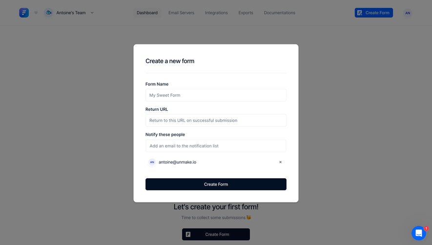
Design with AI
Generate a new design based on this screen using your own content.
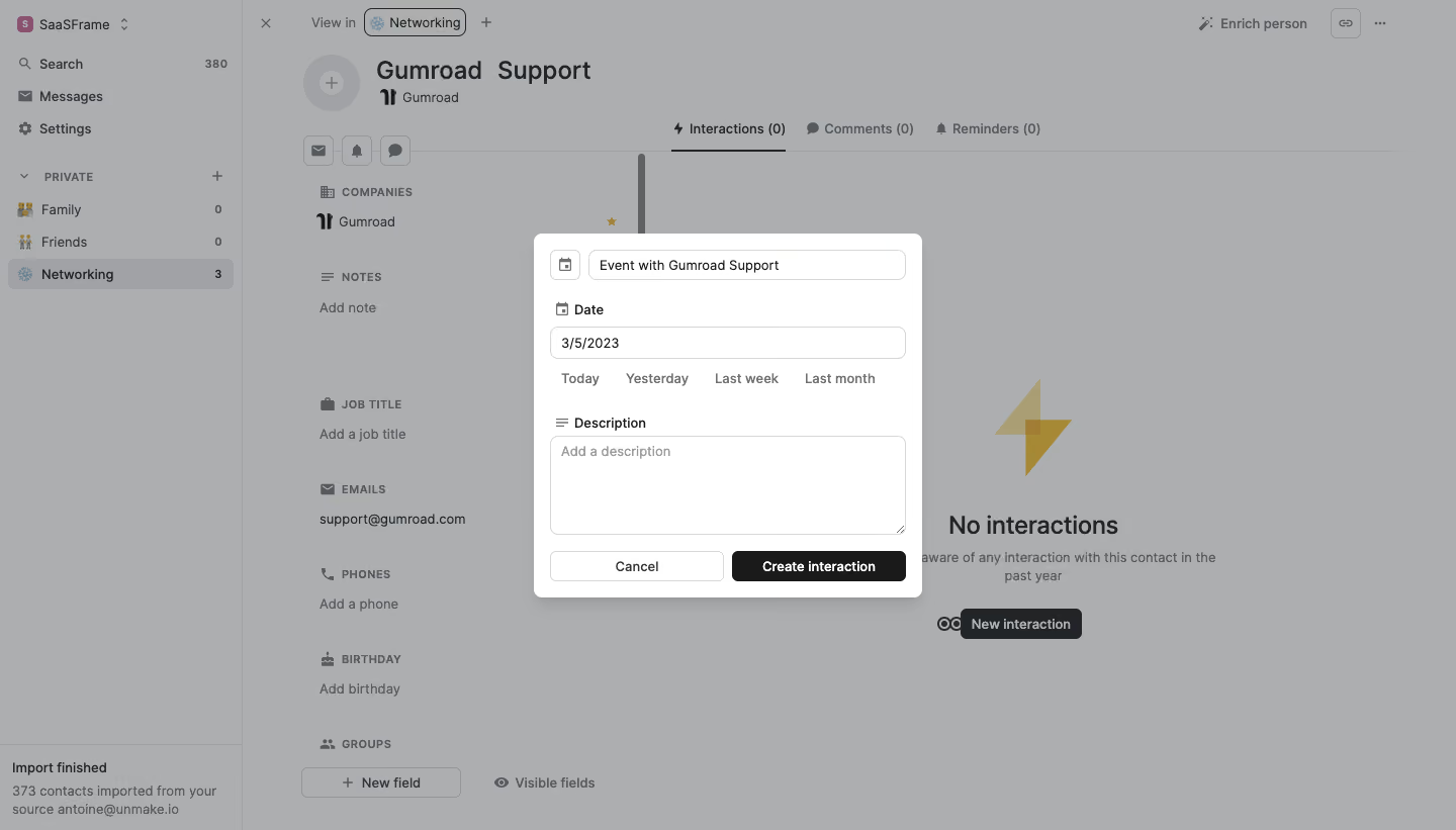
# Design from Reference: Folk Create An Interaction
Create an original, high-fidelity visual design inspired by the reference. Prioritize composition, typography, colors, spacing, and component styling over technical implementation.
## Reference
- **Product:** Folk
- **Category:** Add & Edit
- **Screenshot:** https://cdn.prod.website-files.com/5e9dc792e1210c5325f7ebbc/6acbb9edd37e66e942ffba4d_6acb707c5a8f98ddabbfe338_cms-aef8ff127e218b1b39337466.webp
Analyze the screenshot first. If inaccessible, request it rather than guessing.
## Content
{{content.instructions}}
{{content.data}}
Preserve essential messaging and factual accuracy. Adapt structure and copy length for visual balance; never invent product claims.
## Visual Design
### Overall aesthetic
- **Style:** Compact interaction-creation modal over a muted contact-management workspace.
- **Character:** White dialog, neutral gray fields, near-black primary action, small icons, and concise form structure.
- **Focus treatment:** Gray dimming suppresses the underlying contact profile and empty interaction view.
### Page composition
- **Capture and scale:** 1440 × 821 image px. CSS estimates assume approximately 1× capture; scale is unverified.
- **Backdrop:** Left workspace/group rail, contact information middle, and interactions/comments/reminders area right.
- **Dialog:** Approximately 384 × 360px centered near the viewport’s middle.
- **Title entry:** Small calendar-icon square beside an event-title field at the top.
- **Date group:** Labeled date input followed by four quick-date text options.
- **Description:** Labeled multiline textarea below a clear vertical gap.
- **Actions:** Equal-width Cancel and dark Create interaction controls across the bottom.
### Information hierarchy
- **Event identity:** Prefilled title field introduces the interaction being recorded.
- **Date:** Input and quick shortcuts provide the next level.
- **Description:** Large empty area invites additional detail.
- **Primary action:** Dark creation button contrasts with outlined Cancel.
- **Background:** No-interactions message remains visible under the overlay, establishing the empty state.
### Typography
- **Family:** Neutral proportional sans serif; exact identity is unverified.
- **Field values / labels:** Approximately 14px, with semibold labels.
- **Quick dates:** Approximately 14px medium in gray.
- **Buttons:** Approximately 14px semibold.
- **Background heading:** Larger contact title around 24px, visually suppressed by the overlay.
- **Precision:** CSS sizes and weights are visual estimates.
### Colors & surfaces
- **Dialog:** Sampled #FFFFFF.
- **Backdrop composite:** Sampled #ACAEB0.
- **Secondary composite:** Sampled #A0A2A5 and #ABADAF.
- **Primary dark control:** Sampled #181A1B.
- **Dark text:** Sampled #222527.
- **Muted text:** Sampled #56595D.
- **Boundaries:** Sampled #D6D7D7.
- **Interpretation:** Gray overlay samples describe composited pixels rather than a verified CSS opacity.
### Components
- **Modal shell:** Approximately 8px radius, soft shadow, and 16px padding.
- **Title row:** Roughly 30px square calendar control beside a full remaining-width input.
- **Inputs:** Approximately 32px high, white fill, thin gray outline, and 7px radius.
- **Quick-date row:** Four evenly distributed unboxed text choices.
- **Textarea:** Approximately 352 × 98px with light outline, rounded corners, muted placeholder, and resize grip.
- **Actions:** Approximately 172 × 30px each with 6px radius; outlined white Cancel and near-black create button.
- **State limits:** Date/title are filled, description empty; no submission confirmation or date picker is open.
### Visual rhythm
- **Alignment:** Labels, inputs, textarea, and actions share consistent left/right edges.
- **Grouping:** Compact date controls contrast with a larger gap before description.
- **Action balance:** Equal-width buttons create a stable footer row.
- **Backdrop contrast:** Small crisp dialog dominates the larger low-contrast application.
### Responsive
- **Observed state:** Desktop only; mobile behavior is unverified.
- **Dialog recommendation:** Use a fluid width with 16–24px viewport gutters.
- **Quick dates recommendation:** Wrap shortcuts if needed without reducing touch targets.
- **Form recommendation:** Allow vertical scrolling on short screens.
- **Accessibility recommendation:** Use dialog focus management and associated labels.
### Adaptation guidance
- **Preserve:** Compact event/date/description sequence, quick-date choices, and clear dark confirmation.
- **Starting geometry:** Approximately 384px dialog, 16px padding, 32px fields, and 98px textarea under the unverified 1× assumption.
- **Data fidelity:** Use actual contact/event data and explicit date handling rather than copying reference identifiers.
- **Implementation recommendation:** Provide validation and saved-state feedback.
- **State fidelity:** No interaction was created from the screenshot; the reference shows an entry form only.
Use this context to reproduce the reference's visual language: layout, typography, colors, spacing, borders, radii, and distinctive elements. The screenshot takes priority if descriptions conflict.
## Direction
{{preferences.fidelityInstructions}}
## Output
{{output.instructions}}
Deliver a polished, cohesive design with precise alignment, hierarchy, and spacing. Produce the requested visual artifact, not just a description. If unsupported, explain the limitation.