Design with AI
Generate a new design based on this screen using your own content.
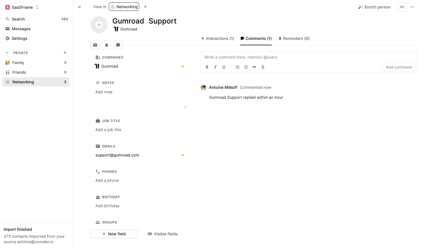
# Design from Reference: Folk Comments List
Create an original, high-fidelity visual design inspired by the reference. Prioritize composition, typography, colors, spacing, and component styling over technical implementation.
## Reference
- **Product:** Folk
- **Category:** Dashboard
- **Screenshot:** https://cdn.prod.website-files.com/5e9dc792e1210c5325f7ebbc/6acbb9edd37e66e942ffba4a_6acb707c2c985439fc0fada2_cms-0ede621349cb98407e8bc3cf.webp
Analyze the screenshot first. If inaccessible, request it rather than guessing.
## Content
{{content.instructions}}
{{content.data}}
Preserve essential messaging and factual accuracy. Adapt structure and copy length for visual balance; never invent product claims.
## Visual Design
### Overall aesthetic
- **Character:** A sparse contact-detail workspace uses a white canvas, fine gray dividers, compact gray metadata, and a focused comments composer.
- **Evidence:** Source dimensions are 1440 × 821 px. Measurements below refer approximately to image pixels; CSS scale is unverified.
### Page composition
- **Sidebar:** A roughly 240 px rail contains workspace switcher, search/messages/settings, private groups, and a lower import-completion notice.
- **Contact column:** Avatar placeholder, bold contact name, company, quick actions, and stacked profile fields occupy the middle-left region.
- **Activity area:** Interactions, Comments, and Reminders tabs sit above a wide comment composer and one visible comment.
- **Top utilities:** View/group selector, enrichment action, link icon, and overflow appear across the upper region.
- **Whitespace:** Most of the activity area beneath the single comment is empty.
### Information hierarchy
- **Identity:** Large contact name and company mark establish the record.
- **Selected tab:** Comments is dark and underlined; other activity tabs are muted.
- **Composer:** Placeholder, formatting toolbar, and a pale Add comment action identify the entry area.
- **Comment:** Avatar/name/time metadata precede a single short text line.
- **Fields:** Small uppercase profile captions distinguish company, notes, job title, email, phone, birthday, and groups.
### Typography
- **Family:** A neutral interface sans serif is used; exact identity is unverified.
- **Contact name:** Approximately 24 px semibold.
- **Body/navigation:** Around 13–14 px.
- **Field captions:** About 11–12 px uppercase semibold with slight tracking.
- **Metadata:** Small muted time/helper text around 12–13 px.
### Colors & surfaces
- **Measured palette:** Source samples include white #FFFFFF, divider gray #EBEBEC, muted #6F7275, dark #181A1B, #E5E7EB, and #D6D7D7.
- **Semantic accents:** Small gold stars mark favored field values; category/workspace icons add limited color.
- **Selection:** A pale-gray sidebar row identifies the active group.
- **Flat treatment:** The page has no large shadows or elevated cards; fine rules define regions.
### Components
- **Composer:** Wide outlined rectangle with small 5 px radii, muted placeholder, formatting icons, attachment control, and trailing action button.
- **Activity tabs:** Icons, labels, counts, and a thin dark active underline.
- **Comment row:** Small circular avatar, bold name, muted timestamp, and indented text.
- **Quick actions:** Three small outlined square icon controls beneath contact identity.
- **Field groups:** Icon/caption pairs sit above values or add-value prompts.
- **Footer tools:** Outlined New field control and visible-fields option sit below the profile column.
### Visual rhythm
- **Columns:** Profile fields occupy a narrower column than comments, separated by generous whitespace.
- **Alignment:** Field captions/values share a left edge; composer and comment align independently in the activity region.
- **Spacing:** Large vertical gaps separate sparse profile fields.
- **Density:** Compact controls and one comment leave an intentionally quiet workspace.
### Responsive
- **Observed limit:** Only desktop is shown; actual mobile/comment behavior is unverified.
- **Recommended layout:** Collapse sidebar and stack contact fields above activity when needed.
- **Recommended composer:** Let formatting controls wrap or use accessible overflow without shrinking targets.
- **Recommended comments:** Allow long text and metadata to wrap naturally.
### Adaptation guidance
- **Preserve:** Keep clear contact identity, profile/activity separation, active-comment tab, and compact composer.
- **Implement:** Provide labeled editing controls, accessible tabs, named icons, and visible focus.
- **Content:** Use appropriate example contact/comment data rather than copying account details.
- **Validate:** Confirm fonts, CSS scale, composer enabled states, long comments, and narrow-screen layout. No newly submitted comment is evidenced.
Use this context to reproduce the reference's visual language: layout, typography, colors, spacing, borders, radii, and distinctive elements. The screenshot takes priority if descriptions conflict.
## Direction
{{preferences.fidelityInstructions}}
## Output
{{output.instructions}}
Deliver a polished, cohesive design with precise alignment, hierarchy, and spacing. Produce the requested visual artifact, not just a description. If unsupported, explain the limitation.