Design with AI
Generate a new design based on this screen using your own content.
# Design from Reference: Folio Integration Settings
Create an original, high-fidelity visual design inspired by the reference. Prioritize composition, typography, colors, spacing, and component styling over technical implementation.
## Reference
- **Product:** Folio
- **Category:** Settings
- **Screenshot:** https://cdn.prod.website-files.com/5e9dc792e1210c5325f7ebbc/6acb67fac08cd859ff86939c_6acb66db2500c91871cdb132_cms-eda452b36c584ed56b7e5c1c.webp
Analyze the screenshot first. If inaccessible, request it rather than guessing.
## Content
{{content.instructions}}
{{content.data}}
Preserve essential messaging and factual accuracy. Adapt structure and copy length for visual balance; never invent product claims.
## Visual Design
### Overall aesthetic
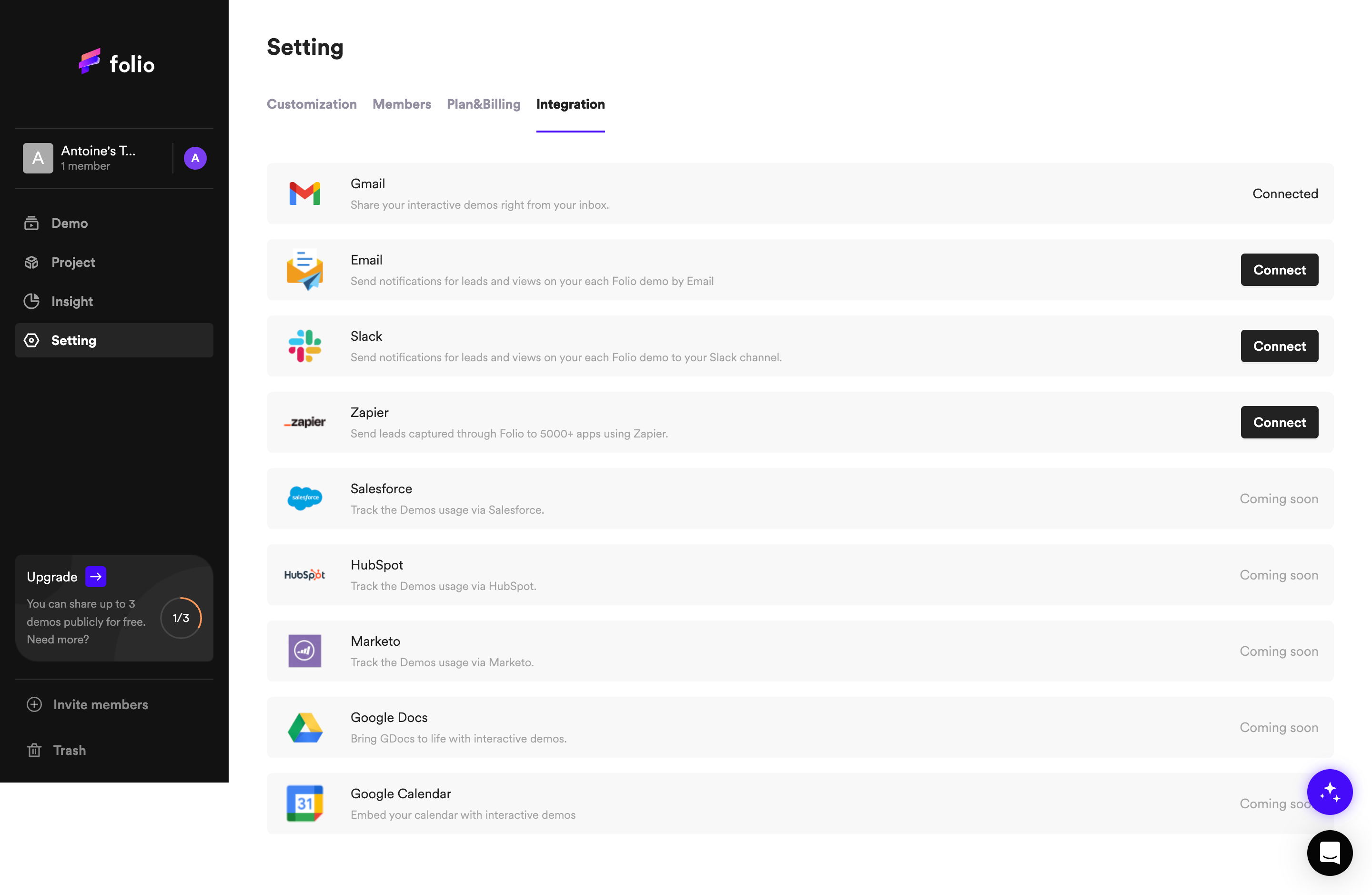
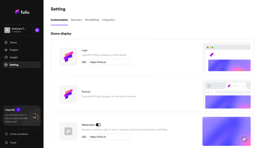
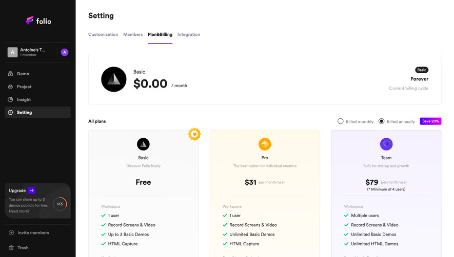
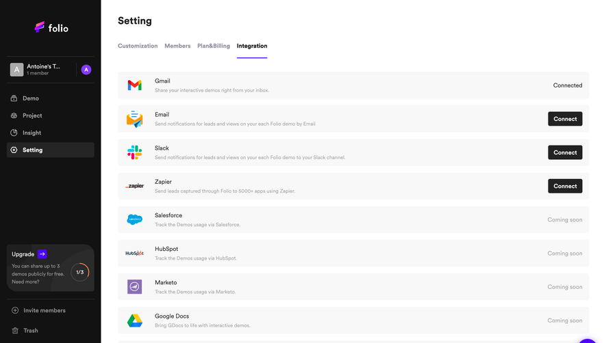
- **Character:** Simple integration settings with dark navigation and stacked neutral service rows.
### Page composition
- **Canvas:** 2880 × 1878 screenshot px. Black sidebar and white workspace; Setting heading and tabs precede nine integration rows.
### Information hierarchy
- **Priority:** Integration tab is underlined violet. Each row presents logo, service, short explanation, and right-aligned Connected, Connect, or Coming soon state.
### Typography
- **Scale:** Estimated CSS at assumed 2× capture: title 24 px bold, service 14 px, helper 12 px, tabs 14 px semibold. Font family unverified.
### Colors & surfaces
- **Palette:** Sampled sRGB #F8F8F8 rows, #FFFFFF workspace, sidebar #121212, and selected/button shades #252525/#222222/#2B2B2B. Violet accents appear on active tab and floating tool.
### Components
- **Details:** About 8 CSS px row corners, black compact Connect buttons, recognizable service logos, and sidebar upgrade panel with circular usage indicator.
### Visual rhythm
- **Spacing:** Estimated 240 CSS px sidebar, 40 px workspace inset, 64 px rows, and 16 px gaps create an even list rhythm.
### Responsive
- **Adaptation:** Mobile is not shown. Collapse sidebar and place connection state below each service description.
### Adaptation guidance
- **Transfer:** Retain explicit connected/available/forthcoming states. Use real integration availability and connection status.
Use this context to reproduce the reference's visual language: layout, typography, colors, spacing, borders, radii, and distinctive elements. The screenshot takes priority if descriptions conflict.
## Direction
{{preferences.fidelityInstructions}}
## Output
{{output.instructions}}
Deliver a polished, cohesive design with precise alignment, hierarchy, and spacing. Produce the requested visual artifact, not just a description. If unsupported, explain the limitation.