



```html

Thank you! Your submission has been received!
Oops! Something went wrong while submitting the form.
Get SaaSFrame Pro
Monthly
$18
Quarterly
$48
Yearly
$180
Upgrade to access this feature
Browse all screens & flows
Filter and search screens & flows
Access Figma files
Access mobile versions
Bookmark screens & flows
Join now
FlowMapp Landing Page

FlowMapp
UX tools for web design
Designed by
No items found.

Bookmark
Bookmark
Design with AI
Thank you! Your submission has been received!
Oops! Something went wrong while submitting the form.
# Design from Reference: FlowMapp Landing Page
Create an original, high-fidelity visual design inspired by the reference. Prioritize composition, typography, colors, spacing, and component styling over technical implementation.
## Reference
- **Product:** FlowMapp
- **Category:** Landing Page
- **Screenshot:** https://cdn.prod.website-files.com/5e9dc792e1210c5325f7ebbc/6ac6127d848730a1e2429e1b_6ac6111fe8d31e225484c5b1_flowmapp-landing-page-desktop-compressed.avif
Analyze the screenshot first. If inaccessible, request it rather than guessing.
## Content
{{content.instructions}}
{{content.data}}
Preserve essential messaging and factual accuracy. Adapt structure and copy length for visual balance; never invent product claims.
## Visual Design
### Overall aesthetic
- **Style:** Expressive product landing page built around oversized black typography, electric-blue pill actions, visual flow diagrams, and large rounded feature panels.
- **Character:** Playful diagramming vocabulary, colorful status chips, floating toolbars, soft gray-blue surfaces, and extensive whitespace.
- **Decoration:** Dotted canvases, blue connector arrows, avatar stacks, icon-like inline words, and translucent pill trails reinforce the product’s visual-planning theme.
- **Capture condition:** Some text and product scenes contain abrupt joins, overlapping animation-like positions, repeated testimonial fragments, and partially clipped words. Motion and intended transitions are unverified.
### Page composition
- **Capture and scale:** 2880 × 25432 image px. CSS estimates assume a 2× capture, approximately 1440 × 12716 CSS px; scale is unverified. All readable portions were inspected.
- **Header:** Floating white rounded navigation bar inset around 12px from the viewport edges, with brand left, demo/features/pricing/help/blog center, and login/trial actions right.
- **Hero:** Small version label, huge centered two-line headline, dotted diagram canvas with connected page thumbnails, large blue Start for free pill, and a muted six-logo trust row.
- **Hero details:** Mode switch near the upper-right and a vertical stack of circular avatars with add control along the right edge.
- **Audience/product intro:** Large headline with a blue audience-word pill, followed by a broad rounded sitemap screenshot and a bold explanatory paragraph with inline colored UI motifs.
- **Feature transition:** Giant multiline headline left overlaps a smaller product screenshot right; a subsequent large heading introduces six compact feature cards in a three-by-two grid.
- **Tools gallery:** One broad wireframe panel, two half-width user-flow/sitemap panels, then one broad content-editor panel; white text overlays identify each tool.
- **Details grid:** Eight illustrated tiles arranged three, two, then three across, covering collaboration, page covers, wireframes, statuses, drag/drop, notes, shapes, and icons.
- **Workflow benefits:** Four text/checklist groups in a two-by-two layout for presale, planning, design/content, and development.
- **Social proof:** Oversized blue Improve toggle-like graphic above a three-column testimonial wall with faded edges and a centered feedback link.
- **Editorial block:** Large heading above a white rounded panel containing a reader statement/action left and six article links in two columns right.
- **Final conversion / footer:** Oversized blue trial pill, small reassurance capsule, broad footer divider, multiple link groups, rating badges, promotion pill, legal row, builder badge, and socials.
### Information hierarchy
- **Hero dominance:** Enormous black headline establishes the product proposition before the blue primary action.
- **Proof sequence:** Trusted-brand marks precede detailed product imagery, capability grids, workflow benefits, testimonials, and blog resources.
- **Tool hierarchy:** Large screenshot panels carry the visual evidence; white overlay cards provide a small outlined tool label and short benefit.
- **Feature text:** Black lead phrases transition into muted blue-gray supporting words within the same line.
- **Workflow grouping:** Large icon/headings precede five blue checked items in each of four groups.
- **Conversion hierarchy:** Black compact header trial action, medium hero blue pill, and giant closing blue pill form repeated conversion opportunities.
- **Capture uncertainty:** Overlapped words, fading testimonial text, and cut scene boundaries are described as observed states rather than invented animation behavior.
### Typography
- **Family:** Compact proportional sans serif with heavy display forms; exact font identity is unverified.
- **Hero heading:** Approximately 96–100px bold with 100–104px line-height and tight negative tracking.
- **Major display headings:** Approximately 72–96px bold, often mixing black and blue-gray words.
- **Explanatory statement:** Approximately 36px bold with 50px line-height, incorporating inline colored shapes and symbols.
- **Workflow headings:** Approximately 36–40px bold; checklist copy around 24px medium with 42px row pitch.
- **Tool/card descriptions:** Approximately 18–20px with 26–28px line-height.
- **Small feature cards:** Approximately 16px bold titles and 16px muted descriptions with 22px leading.
- **Header / footer:** Approximately 14–16px; footer group labels muted and links dark.
- **Buttons:** Hero action around 30px bold; final oversized action around 96px; compact header actions around 16px.
- **Precision:** All CSS sizes, weights, and tracking are pixel-based reconstruction estimates.
### Colors & surfaces
- **Primary canvas:** Sampled #F5F8FA.
- **Nearby pale surfaces:** Sampled #F7F8FA and #F8F9FB.
- **White panels:** Sampled #FFFFFF.
- **Product-tile gray:** Sampled #E8EDF1 and #E7EBEF.
- **Demo background:** Sampled #F6F6F6.
- **Primary blue:** Sampled #0080FF across actions, connectors, selection indicators, and checks.
- **Primary black:** Sampled #000000.
- **Secondary text:** Cool blue-gray across descriptions, muted headline words, and trust logos.
- **Local accents:** Green, cyan, purple, yellow, orange, and pink appear in diagram/status illustrations and inline decorative controls.
- **Depth:** Soft gray shadows under navigation, screenshots, and floating toolbars; pale-blue outer rings and glow reinforce major blue pills.
### Components
- **Floating header:** Approximately 70px tall with 14px radius and broad soft shadow; outlined login and black trial buttons at right.
- **Hero diagram:** Small tilted page thumbnails connected by bright-blue orthogonal arrows over a dotted perspective-like canvas.
- **Hero primary action:** Approximately 440 × 96px with fully rounded ends, white label/flow symbol, pale-blue outer ring, and blue glow.
- **Mode switch:** Compact blue track with right-position white thumb; only this static state is shown.
- **Sitemap demo:** Broad rounded image panel with black connector lines, outlined page nodes, colored blocks, blue selection handles, plus controls, and a floating toolbar.
- **Feature cards:** Six white rounded rectangles with large black line icons, short title, and muted description; about 24px padding and generous radii.
- **Tool panels:** Large gray-blue image containers with roughly 28px radii; angled/cropped product scenes behind white overlay cards.
- **Tool overlays:** White rounded cards with black outlined pill labels and two-tone explanatory text, typically anchored near lower corners.
- **Detail tiles:** Gray-blue rounded surfaces with centered illustration above bottom-aligned descriptive copy; status tile includes multicolor rounded labels.
- **Workflow checks:** Small blue filled circles with white checks and consistent text indent.
- **Testimonial cards:** White rounded rectangles with small avatar, muted identity line, black quote, and occasional blue links; outer cards fade toward the section boundaries.
- **Blog panel:** Large white rounded container with black pill Read More action and evenly spaced title/category/read-time entries.
- **Final trial pill:** Nearly full content width, roughly 240px tall, with pale-blue ring and oversized white label.
- **Footer extras:** White rating badges with stars, compact promotion pill, black builder badge, and small circular white social tiles.
- **State limits:** Product controls and cursors are part of reference imagery; drag/drop, switches, and testimonial motion are not demonstrated.
### Visual rhythm
- **Broad container:** Most lower sections align within roughly 1280px; some text blocks narrow to about 1060px.
- **Section spacing:** Very large vertical intervals separate major display statements and galleries, often several hundred CSS pixels.
- **Grid rhythm:** Three-column compact features, alternating full/half-width tool panels, mixed-width detail tiles, then two-column workflow lists create deliberate variation.
- **Type contrast:** Huge headlines alternate with compact cards and short supporting sentences.
- **Rounded motif:** Pills, large panel radii, circular avatars, checks, and floating controls repeat throughout.
- **Capture caution:** Abrupt scene cuts and overlapping animation-like text should not be reproduced as intentional static layout defects.
### Responsive
- **Observed state:** Wide desktop only; mobile and actual animation behavior are unverified.
- **Display recommendation:** Scale hero/headlines toward 40–56px on mobile, allowing deliberate line breaks and removing overflow.
- **Grid recommendation:** Reduce three-column grids to two then one; stack half-width tools and workflow groups.
- **Imagery recommendation:** Crop or simplify large diagram visuals while retaining meaningful labels outside the image.
- **Action recommendation:** Keep large blue pills proportional to viewport width with practical touch heights.
- **Navigation recommendation:** Collapse the floating menu while retaining brand and trial access.
- **Motion recommendation:** Provide a stable readable presentation and reduced-motion alternative if implementing the suggested animated motifs.
### Adaptation guidance
- **Preserve:** Bold black display type, electric-blue conversion system, product-diagram storytelling, rounded gray/white panels, and varied grid cadence.
- **Starting geometry:** Approximately 1280px broad container, 96px hero type, 28px panel radii, 24px card padding, and 16–20px descriptive copy under the unverified 2× assumption.
- **Content structure:** Introduce the product, demonstrate core tools, explain detailed capabilities, map benefits to workflow stages, provide proof/resources, and close with a clear action.
- **Visual fidelity:** Use real supplied product screenshots and deliberately authored diagrams; do not invent tool functionality from decorative controls.
- **Claim fidelity:** Customer counts, ratings, free-plan terms, and testimonials must come from approved content rather than assuming captured historical claims are current.
- **Capture cleanup:** Reconstruct stable text and coherent imagery instead of copying seams, translucent trails, duplicated fragments, or clipped words.
- **Implementation recommendation:** Make real navigation/actions accessible, keep illustrative toolbars inert, and provide responsive alternatives for dense diagrams.
Use this context to reproduce the reference's visual language: layout, typography, colors, spacing, borders, radii, and distinctive elements. The screenshot takes priority if descriptions conflict.
## Direction
{{preferences.fidelityInstructions}}
## Output
{{output.instructions}}
Deliver a polished, cohesive design with precise alignment, hierarchy, and spacing. Produce the requested visual artifact, not just a description. If unsupported, explain the limitation.
Category
Patterns
No items found.
Tech Stack
Added on
November 3, 2023
Similar screens
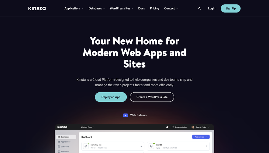


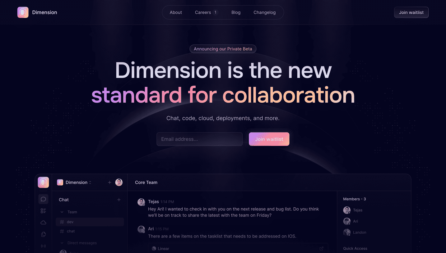

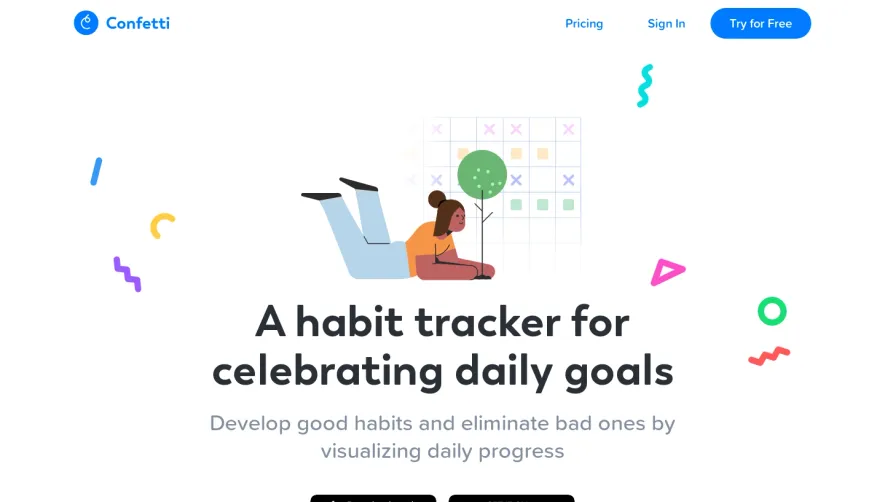

Upgrade to SaaSFrame Pro now to see similar examples.
Monthly
$18 /month
Billed $18 monthly
Browse all screens & flows
Filter and search screens & flows
Search text in screenshots
Access Figma files
Access mobile versions
Join now
Quarterly
$16 /month
Billed $48 quarterly
Browse all screens & flows
Filter and search screens & flows
Search text in screenshots
Access Figma files
Access mobile versions
Join now
Yearly
$15 /month
Billed $180 yearly
Browse all screens & flows
Filter and search screens & flows
Search text in screenshots
Access Figma files
Access mobile versions
Join now